Week 1: Android Basics
Kotlin Basics
Kotlin is a modern programming language that allows you to be more concise and write fewer lines of code for the same functionality compared to other programming languages. Apps that are built with Kotlin are also less likely to crash, resulting in a more stable and robust app for users.
To practice the basics of the Kotlin language, you’ll use an interactive cloud-based code editor called the Kotlin Playground. This is for learning Kotlin, but not for building Android apps. Later, you’ll use a tool called Android Studio for building Android apps.
Open the Kotlin Playground. Add the code below, then click ▶️ to run the program.
fun main() {
    println("is delulu the solulu? may your yololu come trululu at smululu")
}
Code in the Kotlin programming language is meant to be understood by humans. However, your computer doesn’t understand this language. You need something called the Kotlin compiler, which takes the Kotlin code you wrote, looks at it line by line, and translates it into something that the computer can understand. This process is called compiling your code. It is also called building your code. The terms compile and build are synonymous. They refer to the process of translating your human-readable source code into a computer-readable form.
If your code compiles successfully, your program will run (or execute). When the computer executes your program, it performs each of your instructions. Executing instructions are like following steps in a recipe.
A Kotlin program needs a
main()function, which is the specific place in your code where the program starts running. Themain()function is the entry point, or starting point, of the program.
Style guide
The Kotlin style guide decribes Google’s Android coding style standards. The purpose of following the style guide is to make your code easier to read and more consistent with how other Android developers write their code. This consistency is important when collaborating on large projects together, so that the style of code is the same throughout all the files in the project.
Some relevant style guide recommendations:
Function names should be in camel case and should be verbs or verb phrases.
Each statement should be on its own line.
Opening curly brace should appear at the end of the line where the function begins.
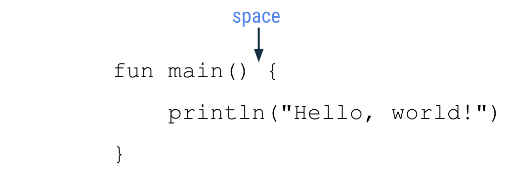
There should be a space before the opening curly brace.
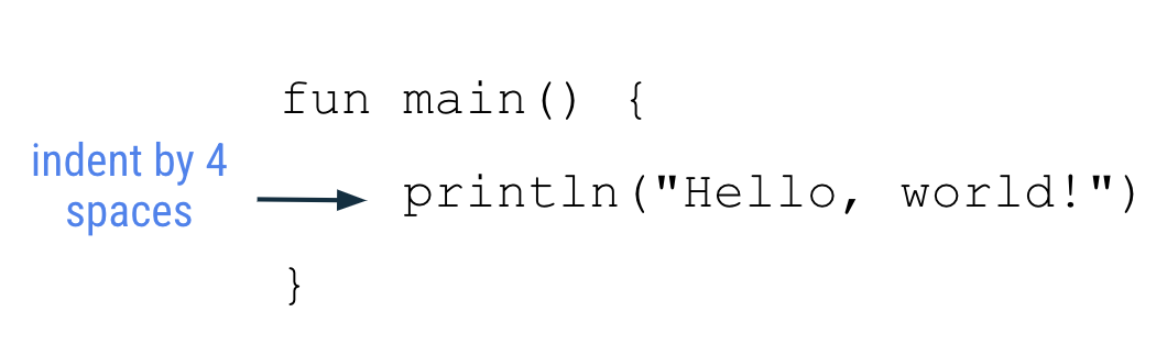
The function body should be indented in by 4 spaces. Do not use tabs to indent your code. Unlike Python, there won’t be any errors if the indentation is missing.
The closing curly brace is on its own line after the last line of code in the function body. The closing brace should line up with the
funkeyword at the beginning of the function.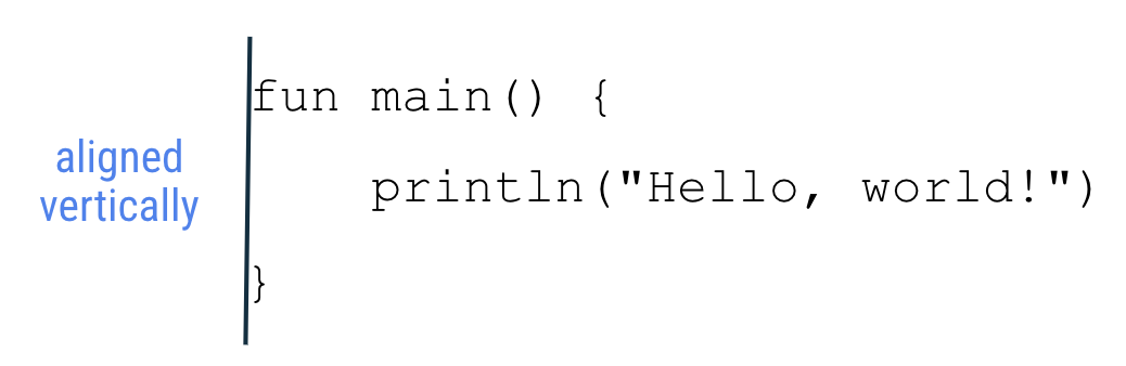
Variables
In Kotlin, it’s necessary to specify what type of data can be stored in variables. This is one difference between Kotlin and other languages like Python. The table below shows some common data types:
Data type |
What kind of data it can contain |
Example literal values |
|---|---|---|
|
Text |
"Huat Ah""Cooking""Cooked" |
|
Integer number |
321293490-59281 |
|
Decimal number |
2.0123.567-31723.99999 |
|
Decimal number (that is less precise than a Double). Has an |
5.0f-1630.209f1.2940278F |
|
|
truefalse |
You must define a variable first in your code before you can use the variable. This is also known as declaring a variable.

Example:
val count: Int = 2
val this_mod: String = "slaps"
The value and data type of the variable must match. For instance, you can’t do
val i: Int = "slay"An expression is a small unit of code that evaluates to a value. An expression can be made up of variables, function calls, and more. For example, an expression can be made up of a single variable:
countEvaluate means determining the value of an expression. If the variable
countholds the value2, then the above expression evaluates to2.Variable names should follow the camel case convention, where the first word of the function name is all lower case, and all other words begin with a capital letter. Examples:
numberOfEmailscityNamebookPublicationDate
String template: contains a template expression, which is a
$followed by a variable name. A template expression is evaluated, and its value gets substituted into the string. Examples:fun main() { val count: Int = 2 println("You have $count unread messages.") }
fun main() {
    val unreadCount = 5
    val readCount = 100
    println("You have ${unreadCount + readCount} total messages in your inbox.")
}
Type inference: the Kotlin compiler can infer what data type a variable should be. That means you can omit the data type, if you provide an initial value for the variable.
In this example, the Kotlin compiler knows that you want to store
2(a whole number integer) into the variablecount, so it can infer that thecountvariable is of typeInt.val count = 2
A mutable variable means its value can change. Declare mutable variables with the Kotlin keyword
var, instead ofval. Think ofvalas a fixed value andvaras variable.val: for immutable valuesvar: for mutable variables
For example, if the variable
cartTotalis mutable:fun main() { var cartTotal = 0 println("Total: $cartTotal") cartTotal = 20 println("Total: $cartTotal") }
Only use
varto declare a variable if you expect the value to change. Otherwise, useval. This practice makes your code safer. Usingvalensures that variables won’t get changed unintentionally.
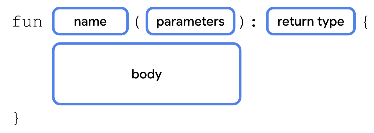
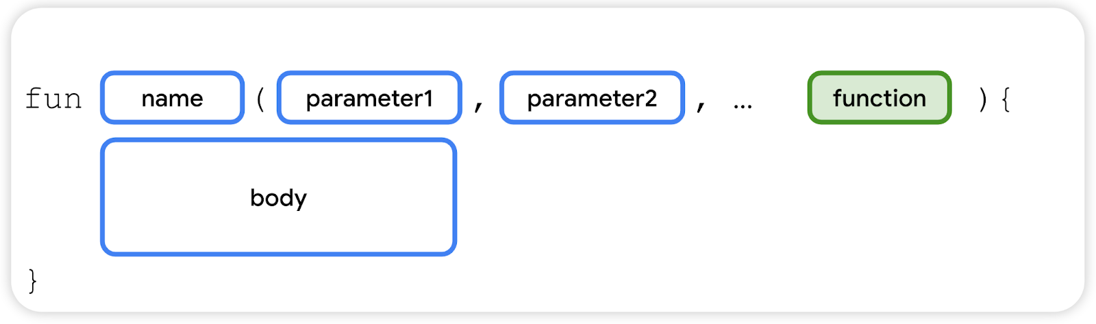
Functions
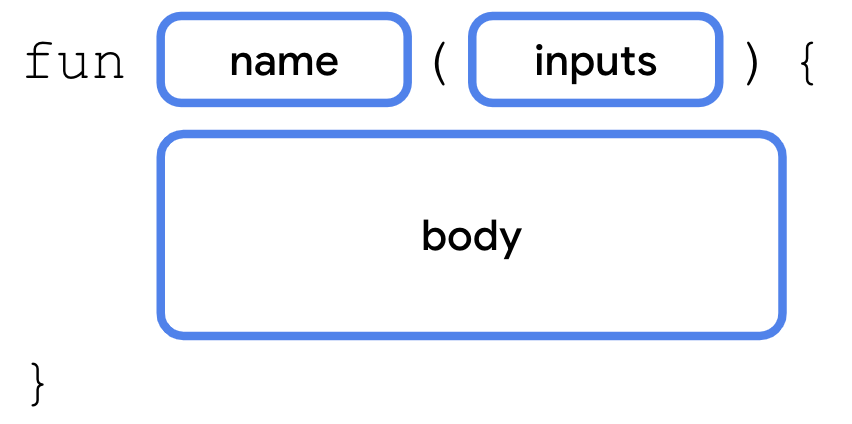
In Kotlin, function definitions begin with the keyword
fun, followed by the:function name, usually a verb or verb phrase
inputs in parentheses
curly braces around the function body
Function names should follow the camel case convention. Examples:
lookLeftLookRight()displayErrorMessage()takePhoto()
Declaring (or defining) a function uses the
funkeyword and includes code within the curly braces which contains the instructions needed to execute a task.Calling a function causes all the code contained in that function to execute.
When defining a function, you can specify the data type of the return value:

Example:
fun getQuote(): String {
    return "At the end of the day, the day ends"
}
If you don’t specify a return type, the default return type is
Unit.Unitmeans the function doesn’t return a value.Unitis equivalent to void return types in other languages (e.g.voidin Java and C,Nonein Python). Any function that doesn’t return a value implicitly returnsUnit. Example:fun main() { birthdayGreeting() } fun birthdayGreeting(): Unit { println("Happy Birthday, Rover!") println("You are now 5 years old!") }
For functions that don’t return anything,
returnis optional.Function parameters are declared like this:
Example:
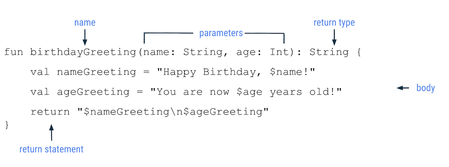
fun birthdayGreeting(name: String): String {
    val nameGreeting = "Happy Birthday, $name!"
    val ageGreeting = "You are now 5 years old!"
    return "$nameGreeting\n$ageGreeting"
}
For functions with multiple parameters:
fun birthdayGreeting(name: String, age: Int): String {
    val nameGreeting = "Happy Birthday, $name!"
    val ageGreeting = "You are now $age years old!"
    return "$nameGreeting\n$ageGreeting"
}
The function name with its inputs (parameters) are collectively known as the function signature. The function signature consists of everything before the return type:
fun birthdayGreeting(name: String, age: Int)
Parameters in Kotlin are immutable. You cannot reassign the value of a parameter from within the function body.
A recap of function syntax:
Note
A parameter and an argument are two different things. When you define a function, you define the parameters that are to be passed to it when the function is called. When you call a function, you pass arguments for the parameters. Parameters are the variables accessible to the function, such as a name variable, while arguments are the actual values that you pass, such as the "Rover" string.
When you include the parameter name when you call a function, it’s called a named argument. Example:
println(birthdayGreeting(name = "Rex", age = 2))
Named arguments can be reordered:
println(birthdayGreeting(age = 2, name = "Rex"))
Function parameters can also specify default arguments. When you call a function, you can choose to omit arguments for which there is a default.
Example: in the
birthdayGreeting()function, set the name parameter to the default value"Rover".fun birthdayGreeting(name: String = "Rover", age: Int): String { return "Happy Birthday, $name! You are now $age years old!" }
Since
ageis defined aftername, to use the default argument forname, you need to use the named argumentage. Without named arguments, Kotlin assumes the order of arguments is the same order in which parameters are defined. The named argument is used to ensure Kotlin is expecting anIntfor theageparameter.println(birthdayGreeting(age = 5)) println(birthdayGreeting("Rex", 2))
This would not work, because Kotlin will think that the
5is the argument to thenameparameter, butnameis aString, not anInt.println(birthdayGreeting(5))
Practice: Kotlin Basics
Need more practice? Try these exercises.
String templates. This program informs users about the upcoming promotional sale on a particular item. It has a string template, which relies on the
discountPercentagevariable for the percent discount and theitemvariable for the item on sale. However, there are compilation errors in the code.fun main() { val discountPercentage: Int = 0 val offer: String = "" val item = "Google Chromecast" discountPercentage = 20 offer = "Sale - Up to $discountPercentage% discount on $item! Hurry up!" println(offer) }
Can you figure out the root cause of the errors and fix them?
Can you determine the output of this program before you run the code in Kotlin Playground?
After you fix the errors, the program should compile without errors and print this output:
Sale - Up to 20% discount on Google Chromecast! Hurry up!
Default parameters. Gmail has a feature that sends a notification to the user whenever a login attempt is made on a new device. In this exercise, you write a program that displays a message to users with this message template:
There's a new sign-in request on $operatingSystem for your Google Account $emailId.
You need to implement a function that accepts an
operatingSystemparameter and anemailIdparameter, constructs a message in the given format, and returns the message.For example, if the function was called with
"Chrome OS"for theoperatingSystemand"sample@gmail.com"for theemailId, it should return this string:There's a new sign-in request on Chrome OS for your Google Account sample@gmail.com.
Implement the
displayAlertMessage()function in this program so that it prints the output displayed. If the operating system is unknown, the function should default toUnknown OS.fun main() { val firstUserEmailId = "user_one@gmail.com" // The following line of code assumes that you named your parameter as emailId. // If you named it differently, feel free to update the name. println(displayAlertMessage(emailId = firstUserEmailId)) println() val secondUserOperatingSystem = "Windows" val secondUserEmailId = "user_two@gmail.com" println(displayAlertMessage(secondUserOperatingSystem, secondUserEmailId)) println() val thirdUserOperatingSystem = "Mac OS" val thirdUserEmailId = "user_three@gmail.com" println(displayAlertMessage(thirdUserOperatingSystem, thirdUserEmailId)) println() } // Define your displayAlertMessage() below this line.
Android Studio Setup
Download and install Android Studio
Download: Android Studio Meerkat Feature Drop | 2024.3.2 RC 4 April 28, 2025
Extract the archive:
$ cd ~/Downloads
$ tar -xzvf android-studio-*-linux.tar.gz
Navigate to the
android-studio/bindirectory and run thestudio.shscript:$ cd ~/Downloads/android-studio/bin $ ./studio.sh
Select Do not import settings, click OK.
Continue with the installer.
The Welcome to Android Studio dialog displays and you’re ready to start creating apps!
Download: Android Studio Meerkat Feature Drop | 2024.3.2 RC 4 April 28, 2025
Look for the downloaded file in your
Downloadsfolder, and run it.Drag the Android Studio icon to the Applications folder.
In the Applications folder, double-click the Android Studio icon to launch the Android Studio Setup Wizard.
Follow the Android Studio Setup Wizard and accept the default settings for all steps. During the installation, the setup wizard downloads and installs additional components and tools needed for Android app development.
When the installation completes, Android Studio starts automatically.
The Welcome to Android Studio window opens and you’re ready to start creating apps!
Download: Android Studio Meerkat Feature Drop | 2024.3.2 RC 4 April 28, 2025
After the download completes, look for the downloaded installer in your
Downloadsfolder, and run it.If you see User Account Control dialogs about allowing the installer and Windows Command Processor to make changes to your computer, click Yes.
You may also receive a Windows Security Alert about
adb.exe. Click Allow access.After the installation completes, the Welcome to Android Studio window displays and you’re ready to start creating apps!
Any issues? Read the troubleshooting guide.
Create your first Android app
Create a project using the template
Launch Android Studio.
In the Welcome to Android Studio dialog, click New Project.
The New Project window opens with a list of templates provided by Android Studio. A project template provides the blueprint for a certain type of app. Templates create the structure of the project and the files needed for Android Studio to build your project.
Select the Phone and Tablet tab.
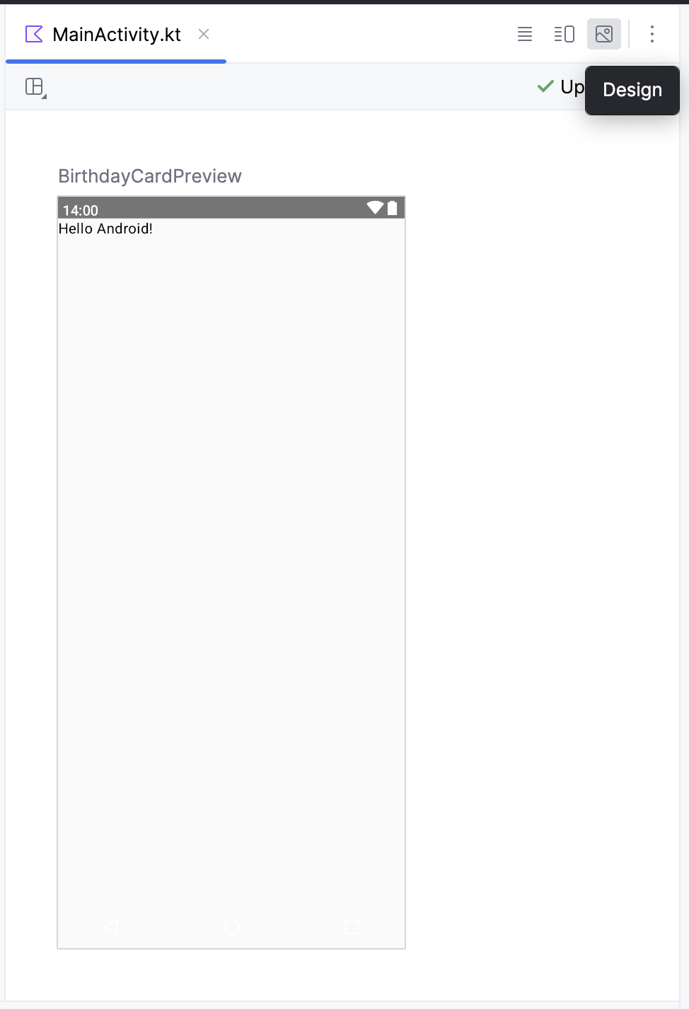
Select the Empty Activity template. The Empty Activity template has a single screen and displays the text
"Hello Android!".Click Next. The New Project dialog opens. This has some fields to configure your project.
Configure the project:
Name: “Greeting Card”. This is the project name.
Package name:
com.example.greetingcard. This is how your files will be organized in the file structure.Save location: Leave as is. It contains the location where all the files related to your project are saved. Note this location so that you can find your files later.
Minimum SDK: indicates the minimum version of Android that your app can run on. Select API 24: Android 7.0 (Nougat).
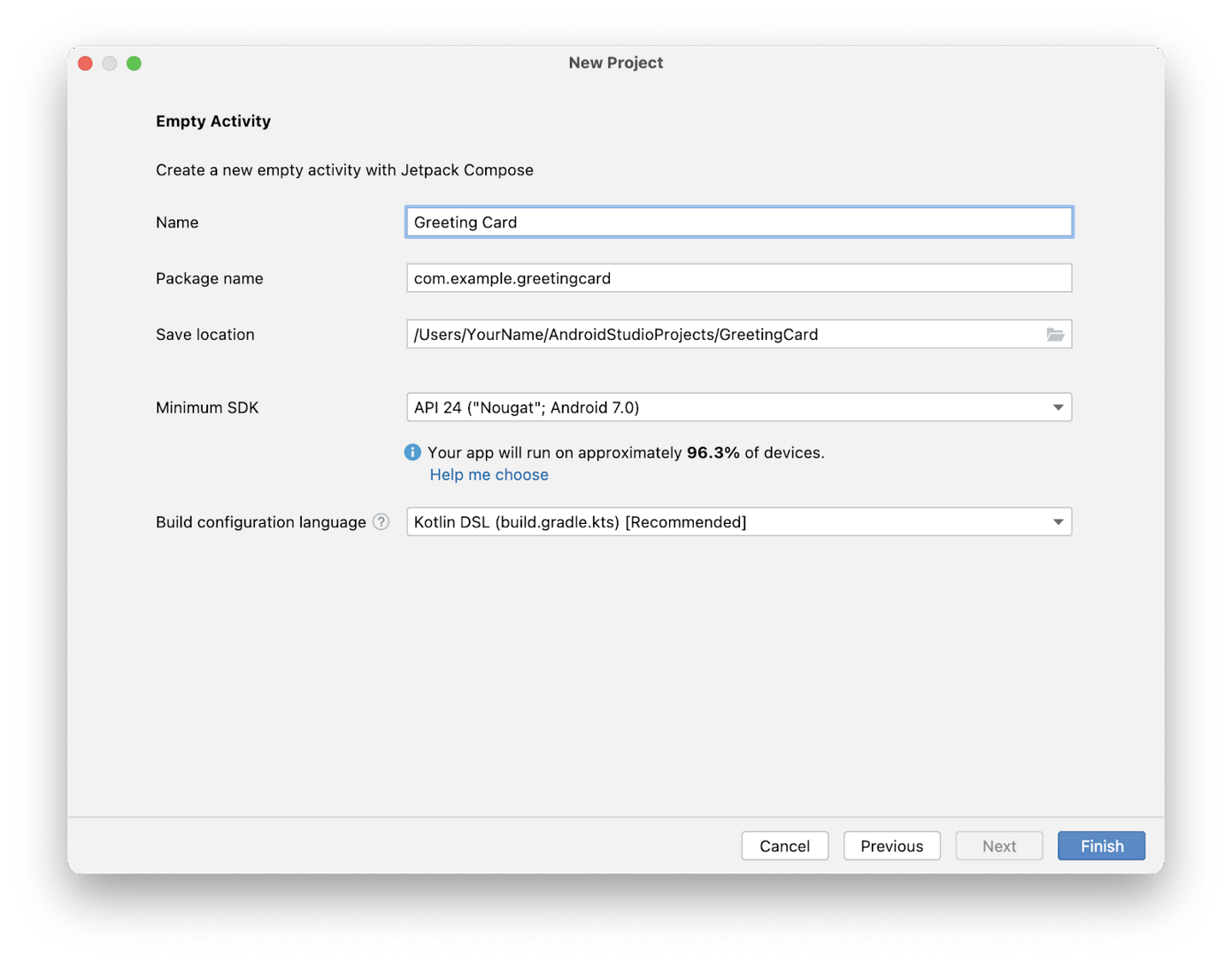
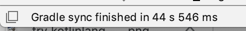
Click Finish. This may take a while. A progress bar and message indicates whether Android Studio is still setting up your project. It may look like this:

A message that looks similar to this informs you when the project set up is created.
You may see a What’s New pane which contains updates on new features in Android Studio. Close it for now.
Click Split on the top right. This allows you to view both code and design. You can also click Code to view code only or click Design to view design only.
After clicking Split you should see three areas:
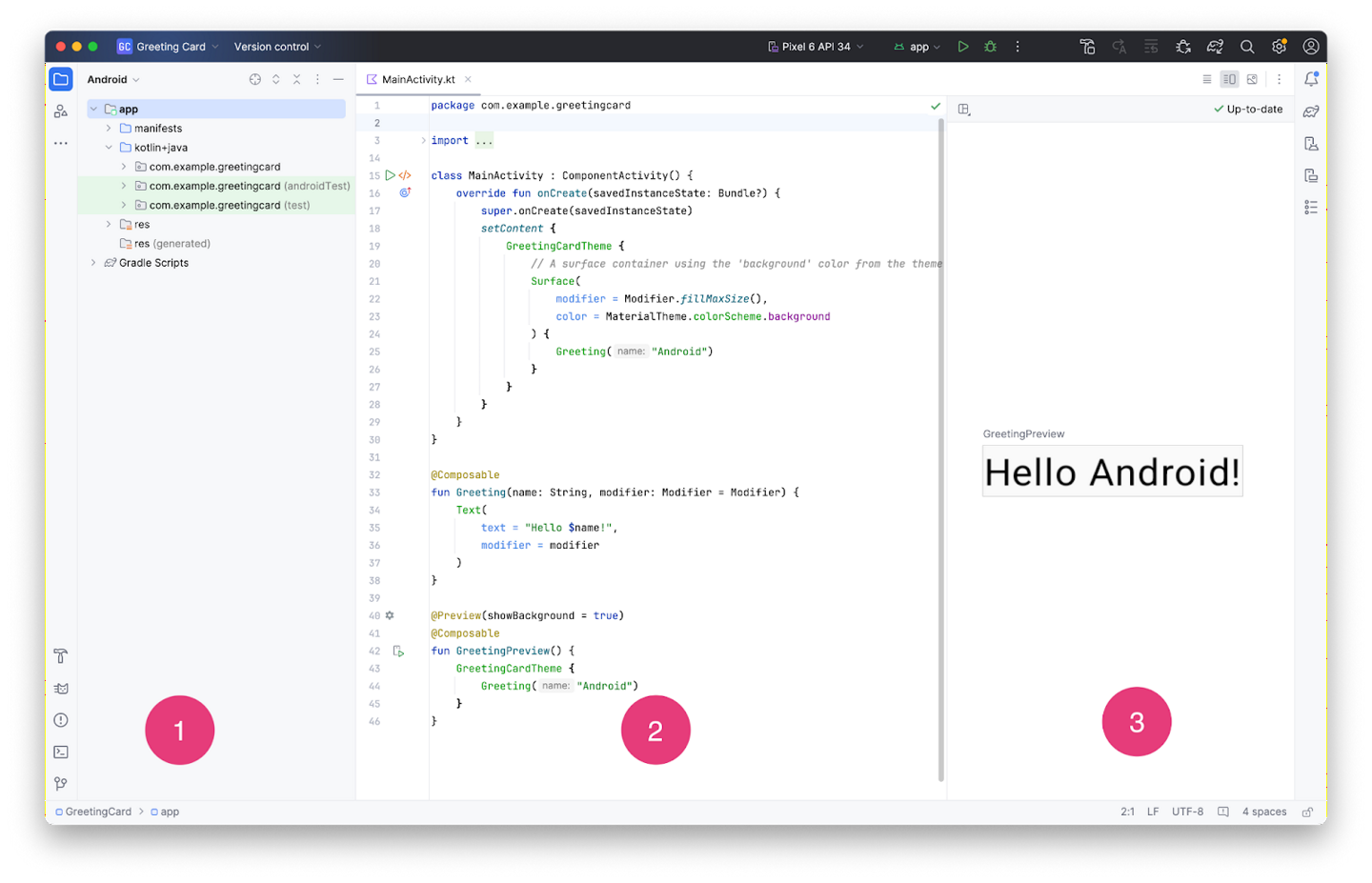
Project view: shows the files and folders of your project
Code view: for editing code
Design view: preview of your app
In the Design view, you see a blank pane with the text Build & Refresh. Click Build & Refresh. It may take a while to build. When it is done, the preview shows a text box that says “Hello Android!”.
To rebuild the app later: Design view ➜ ✓ Up-to-date ➜ Build & Refresh
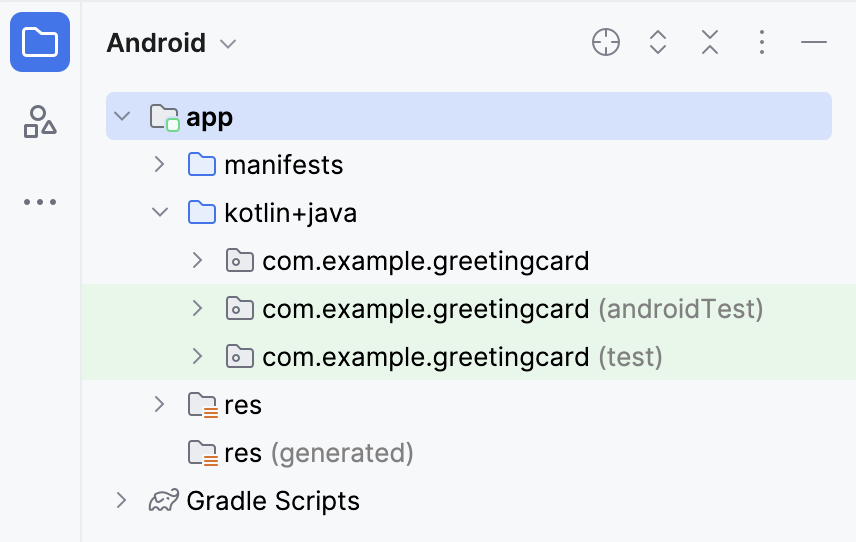
Find project files
The Project tab shows the files and folders of your project. When you were setting up your project the package name was com.example.greetingcard. You can see that package in the Project tab. A package is basically a folder where code is located. Android Studio organizes the project in a directory structure made up of a set of packages.
If necessary, select Android from the drop-down menu in the Project tab.
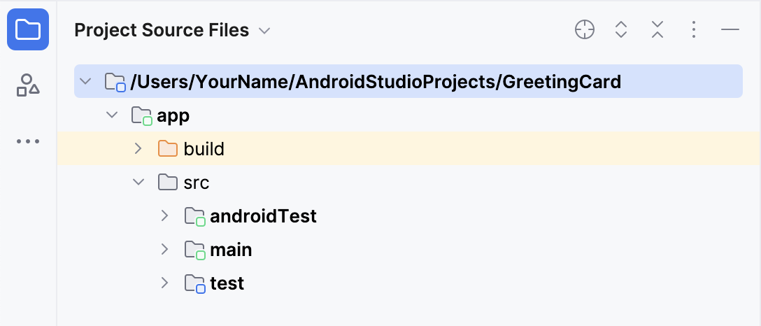
This is the standard view of files that you use. It’s useful because you can easily access the files you will be working on in your app. However, if you look at the files in a file browser, the file hierarchy is organized very differently.
Select Project Source Files from the drop-down menu. You can now browse the files in the same way as in a file browser.
Select Android again to switch back to the Android view. If your file structure ever looks strange, check to make sure you’re still in Android view.
Modify the app
Look at the Code view of the
MainActivity.ktfile.class MainActivity : ComponentActivity() { override fun onCreate(savedInstanceState: Bundle?) { super.onCreate(savedInstanceState) enableEdgeToEdge() setContent { GreetingCardTheme { Scaffold(modifier = Modifier.fillMaxSize()) { innerPadding -> Greeting( name = "Android", modifier = Modifier.padding(innerPadding) ) } } } } }
The
onCreate()function is the entry point to this Android app and calls other functions to build the user interface.The
setContent,GreedingCardTheme, andScaffoldlook like function definitions, but they are not. They are function calls. More on the strange notation later.The
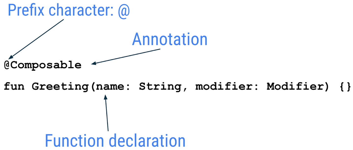
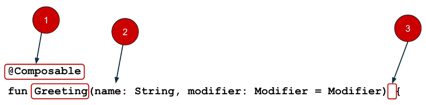
setContent()function is called to define the app layout. All functions marked with the@Composableannotation can be called fromsetContent()or from other Composable functions. The annotation tells the Kotlin compiler that this function is used by Jetpack Compose to generate the UI.Next, look at the
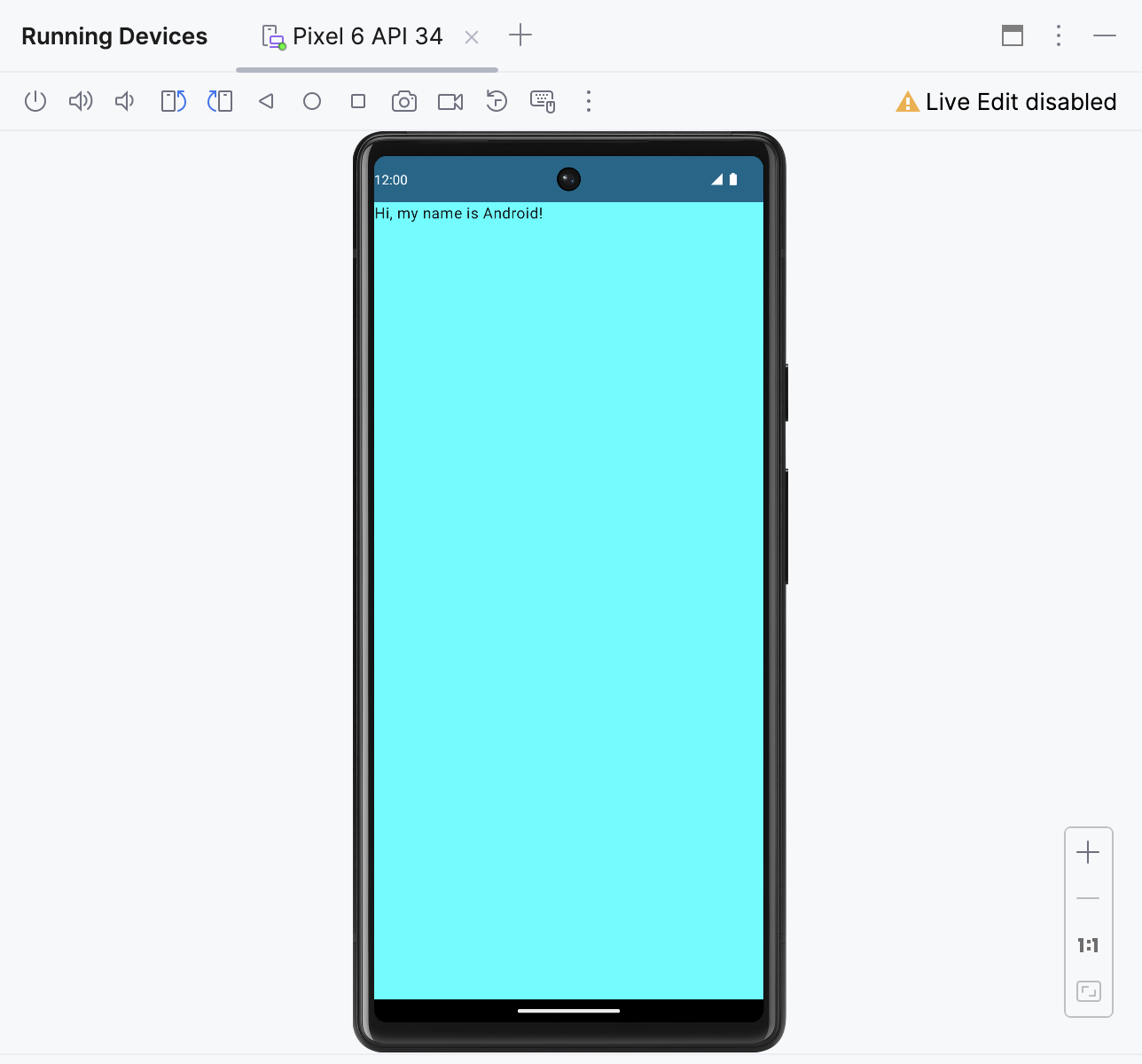
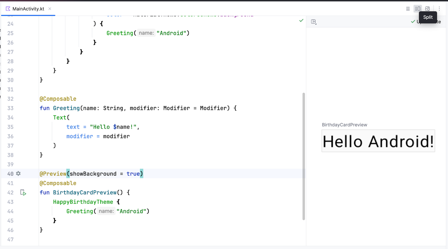
Greeting()function. TheGreeting()function is a composable function. Notice the@Composableannotation above it. This composable function takes some input and generates what’s shown on the screen.@Composable fun Greeting(name: String, modifier: Modifier = Modifier) { Text( text = "Hello $name!", modifier = modifier ) }
Change the
Greeting()function to:@Composable fun Greeting(name: String, modifier: Modifier = Modifier) { Text( text = "Hi, my name is $name!", modifier = modifier ) }
Android Studio should automatically update the preview.
The
GreetingPreview()function lets you see what your composable looks like without having to build your entire app. To enable a preview of a composable, annotate with@Composableand@Preview. The@Previewannotation tells Android Studio that this composable should be shown in the design view.The
@Previewannotation takes in a parameter calledshowBackground. IfshowBackgroundis set totrue, it will add a background to your composable preview. Since Android Studio by default uses a light theme for the editor, it can be hard to see the difference betweenshowBackground = trueandshowBackground = false.Update
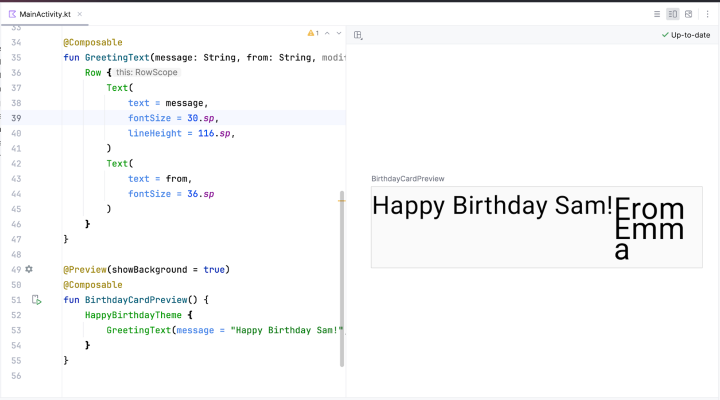
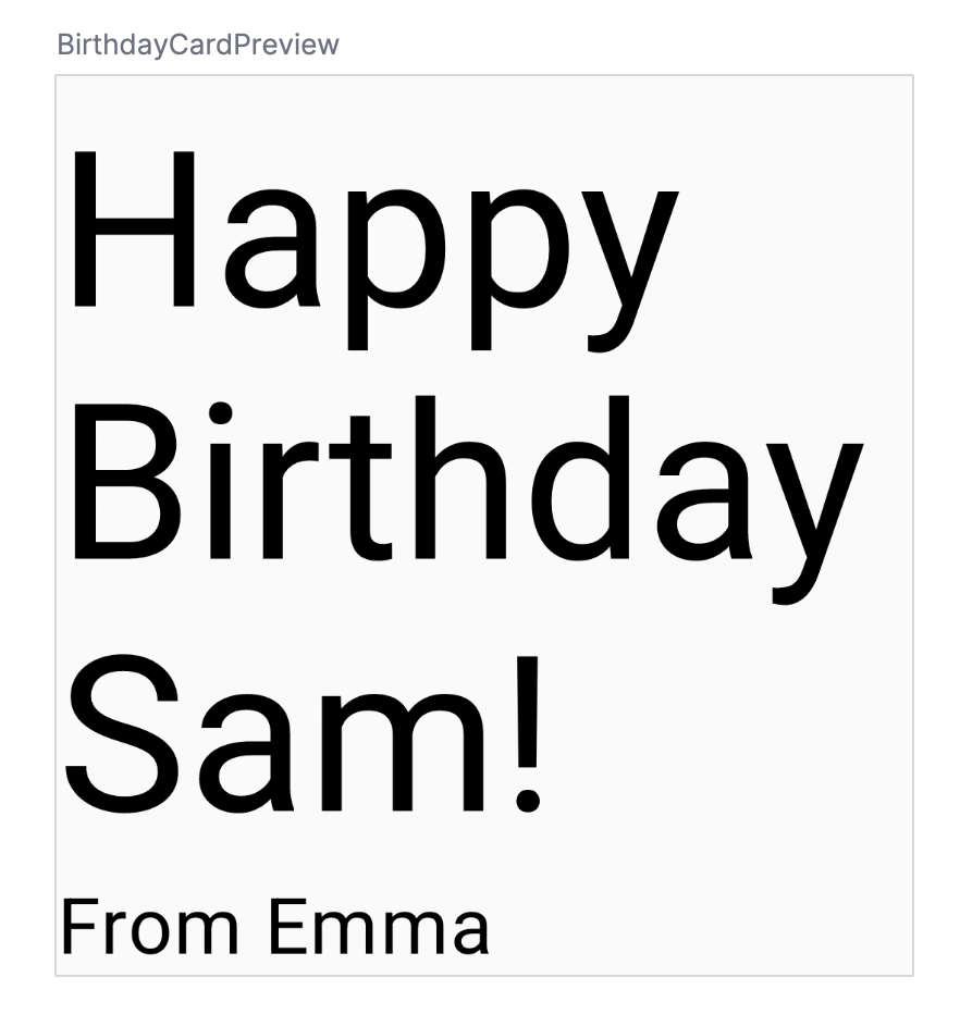
GreetingPreview()with your name. The preview should update automatically. If it doesn’t, rebuild the app manually: Design view ➜ ✓ Up-to-date ➜ Build & Refresh@Preview(showBackground = true) @Composable fun GreetingPreview() { GreetingCardTheme { Greeting("Yue Niang") } }
To set a different background color for your introduction, you’ll need to surround your text with a
Surface. ASurfaceis a container that represents a section of UI where you can alter the appearance, such as the background color or border. Do this:@Composable fun Greeting(name: String, modifier: Modifier = Modifier) { Surface(color = Color.Magenta) { Text( text = "Hi, my name is $name!", modifier = modifier ) } }
At this point, the code for
SurfaceandColormay be red, so we need to import these references. To solve this, scroll to the top of the file where it says import and press the three dots.
Add these statements to the bottom of the list of imports.
import androidx.compose.ui.graphics.Color
import androidx.compose.material3.Surface
The full list of imports will look similar to this.
import android.os.Bundle
import androidx.activity.ComponentActivity
import androidx.activity.compose.setContent
import androidx.activity.enableEdgeToEdge
import androidx.compose.foundation.layout.Box
import androidx.compose.foundation.layout.fillMaxSize
import androidx.compose.foundation.layout.padding
import androidx.compose.material3.Scaffold
import androidx.compose.material3.Text
import androidx.compose.runtime.Composable
import androidx.compose.ui.Modifier
import androidx.compose.ui.tooling.preview.Preview
import com.example.greetingcard.ui.theme.GreetingCardTheme
import androidx.compose.ui.graphics.Color
import androidx.compose.material3.Surface
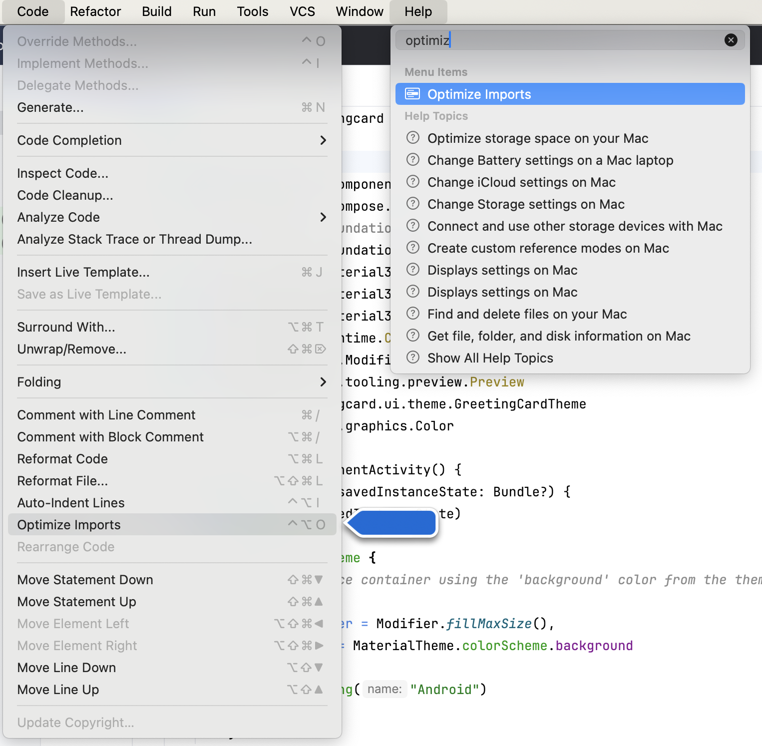
To keep the imports listed alphabetically, and remove unused imports: click Help on the top toolbar, select Find Action…, type optimize imports, and click on Optimize Imports.
Next, you will add some space (padding) around the text.
A
Modifieris used to augment or decorate a composable. One modifier you can use is thepaddingmodifier, which adds space around an element. This is accomplished by using theModifier.padding()function.Every composable should have an optional parameter of the type
Modifier. This should be the first optional parameter.Add a padding to the
modifierwith a size of24.dp. More about density-independent pixels (dp) later.@Composable fun Greeting(name: String, modifier: Modifier = Modifier) { Surface(color = Color.Magenta) { Text( text = "Hi, my name is $name!", modifier = modifier.padding(24.dp) ) } }
imports
import androidx.compose.ui.unit.dp
import androidx.compose.foundation.layout.padding
The preview should update to show the new padding.
Run your first app on the Android Emulator
In this task, you’ll use the Device Manager to create an Android Virtual Device (AVD). An AVD is a software version of a mobile device that runs on your computer and mimics the configuration of a particular type of Android device. This could be any phone, tablet, TV, watch, or Android Auto device. You’ll use an AVD to run the Greeting Card app.
The Android Emulator is an independent app used to set up virtual devices. Depending on the context, sometimes emulator refers to the Android Emulator, sometimes it refers to an Android Virtual Device.
The Android Emulator has its own system requirements. Virtual devices can use a lot of disk space. If you run into any issues, see Run apps on the Android Emulator.
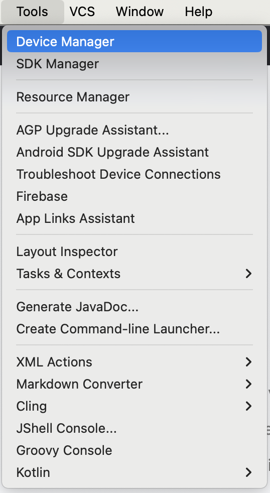
In Android Studio, select Tools ➜ Device Manager.
The Device Manager dialog opens. If you created a virtual device previously, it’s listed in this dialog.
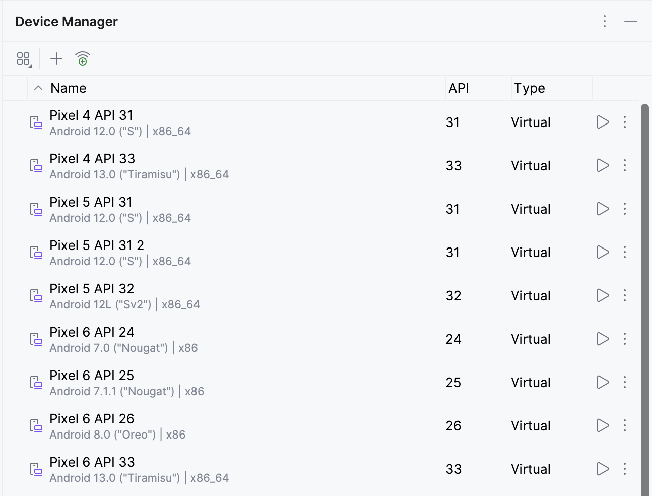
Click + (Create Virtual Device). The Virtual Device Configuration dialog appears.
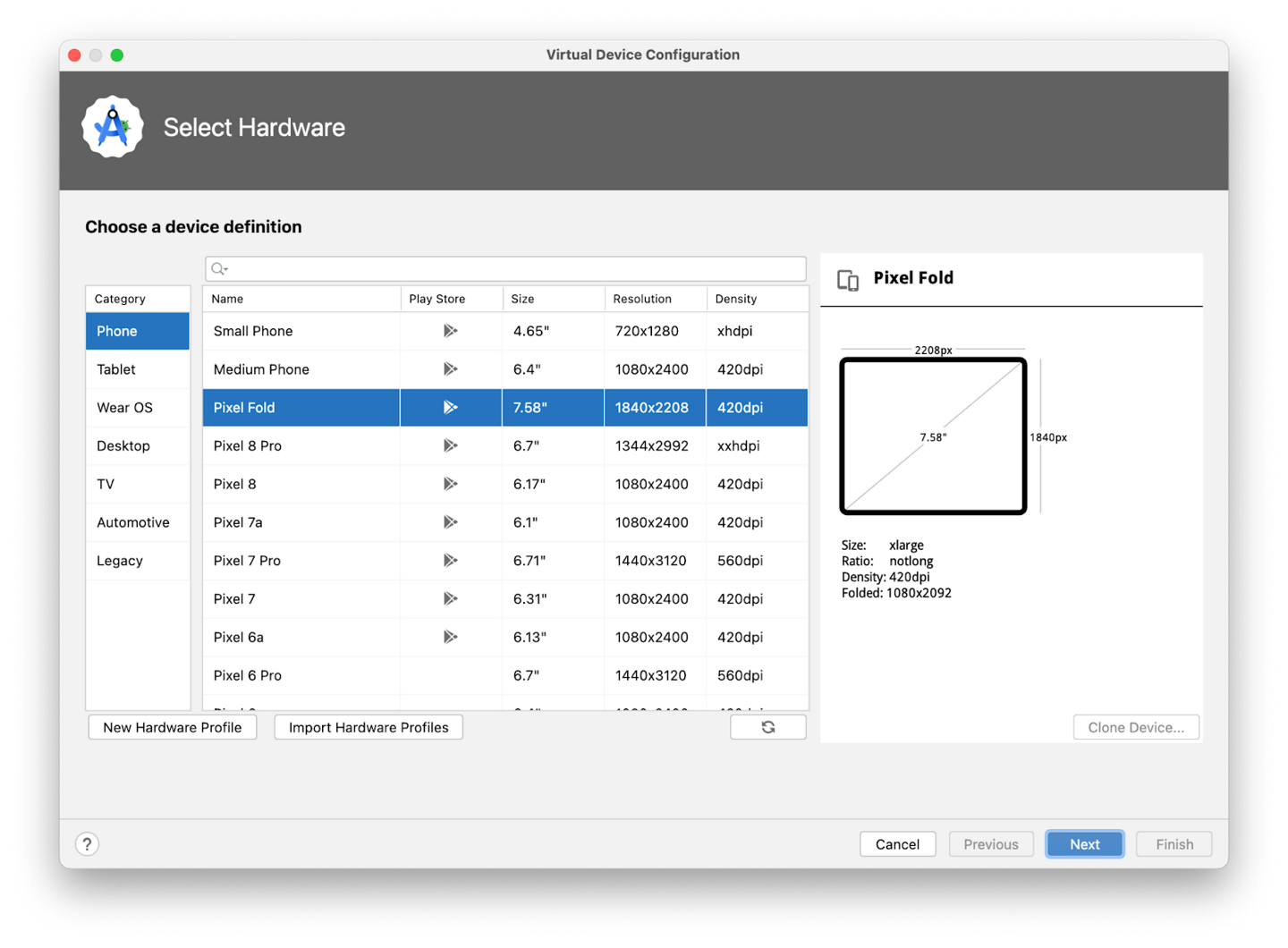
Select Phone ➜ Pixel 6 ➜ Next. This step opens another screen where you can choose the version of Android to run on your virtual device. This lets you test your app on different versions of Android.
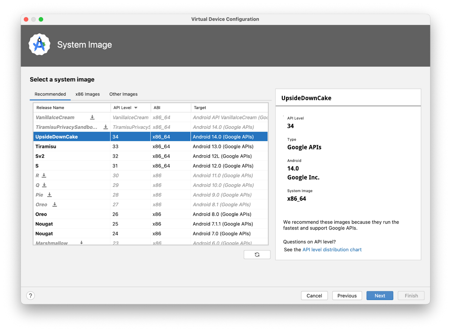
If there’s a download link next to UpsideDownCake, click Download ➜ Accept ➜ Next ➜ Finish. The download will take a while to complete.


In the Recommended tab, choose UpsideDownCake as the version of Android to run on the virtual device, and then click Next.
Important
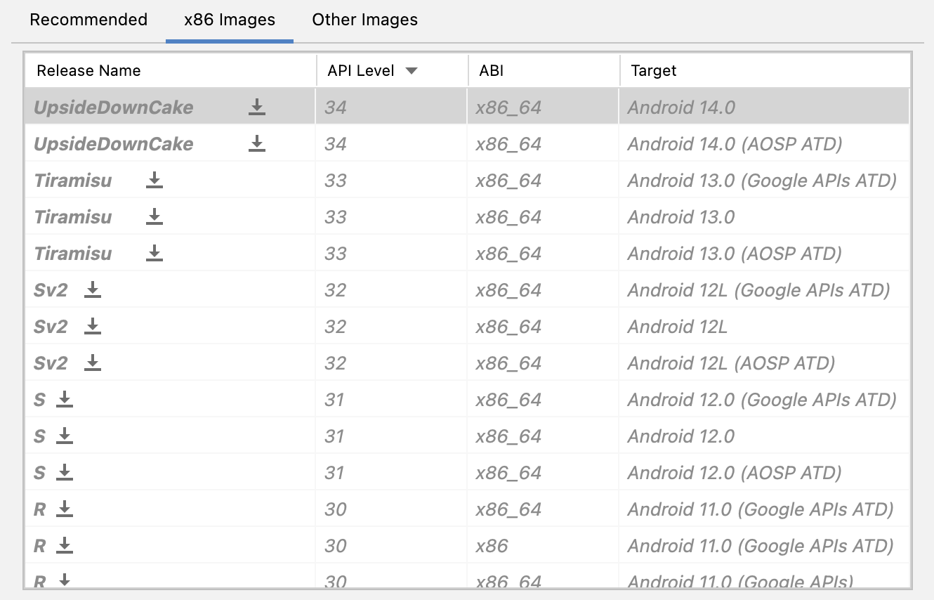
These Android system images use a lot of disk space, so only a few are part of your original installation. Many more versions of the Android system are available than are shown in the Recommended tab. To see them, look under the x86 Images and Other Images tabs in the Virtual Device Configuration dialog.
This action opens another screen, where you can choose additional configuration details for your device. Leave the fields unchanged.
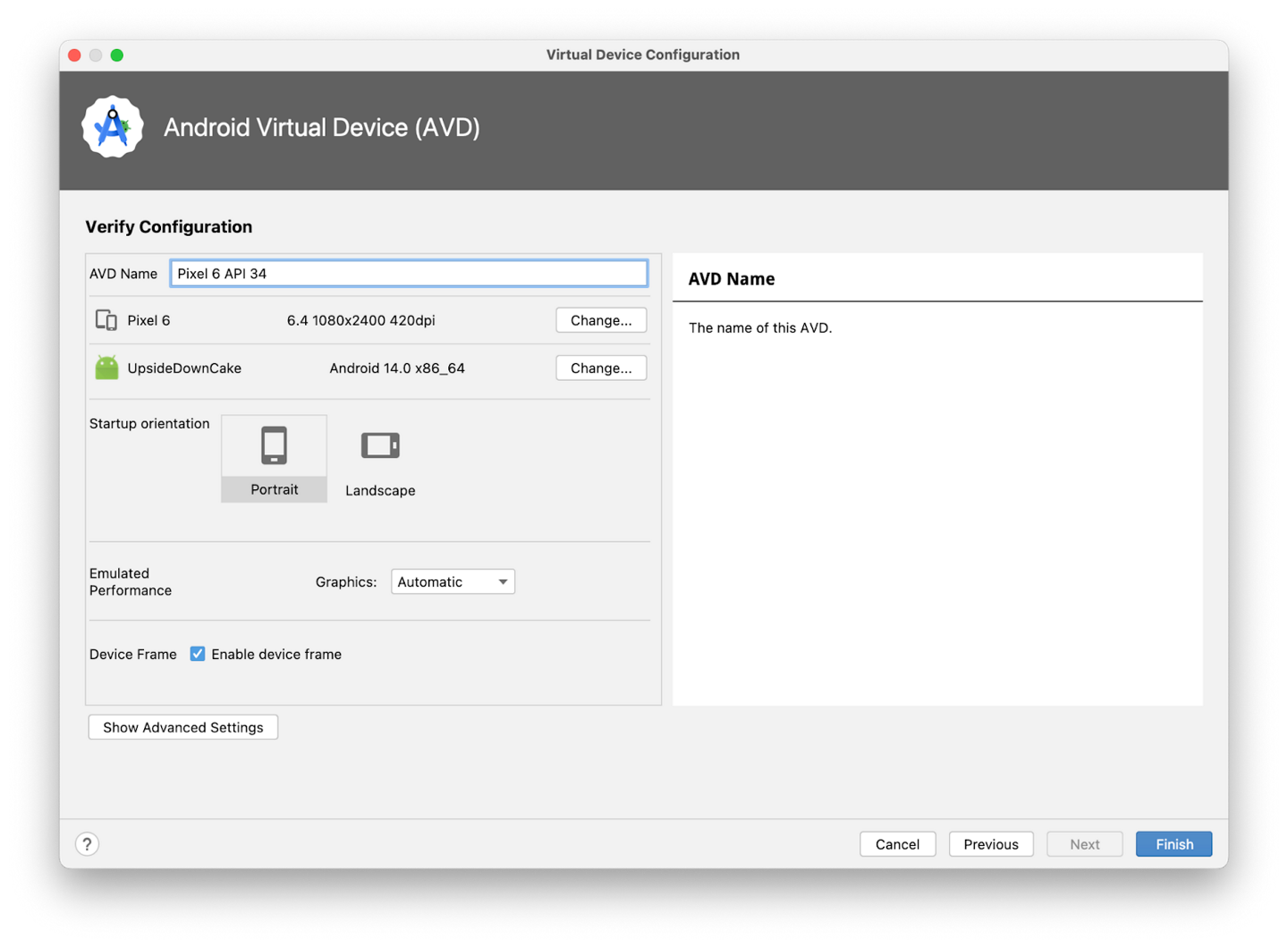
Note
If you see a red warning about using a system image with Google APIs, you can disregard it for now.
Click Finish. This action returns to the Device Manager pane.
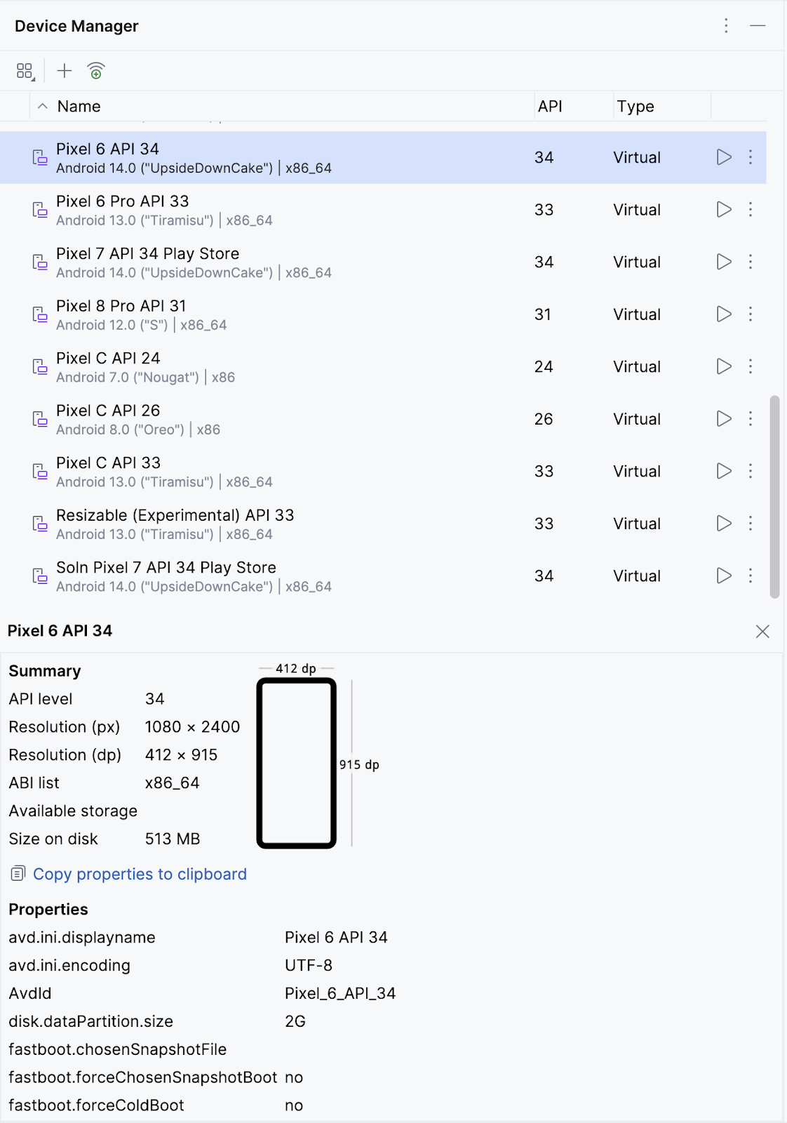
Hide the Device Manager dialog.
Select the virtual device that you created from the dropdown menu at the top of the Android Studio window.
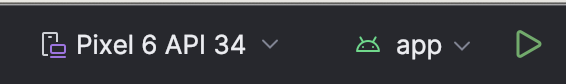
Click ▶️
The virtual device turns on, just like a physical device. Expect this to take a while when it starts for the first time. The virtual device should open beside the code editor.
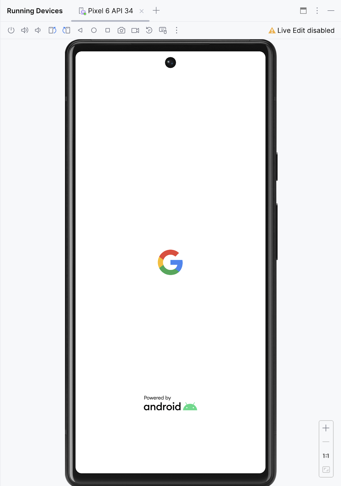
When your app is ready, it opens on the virtual device.
How to connect your Android device (optional)
Teacher Say
This is optional. Since some of us don’t have Android devices, we’ll just stick to the emulator so that people won’t feel left out.
Enable USB debugging
To let Android Studio communicate with your Android device, you must enable USB debugging in the Developer options settings of the device.
To show developer options and enable USB debugging:
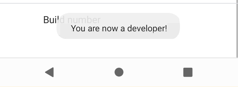
On your Android device, tap Settings > About phone.
Tap Build number seven times.
If prompted, enter your device password or pin. You know you succeeded when you see the You are now a developer! message.
Return to Settings and then tap System > Developer options.
If you don’t see Developer options, tap Advanced options.
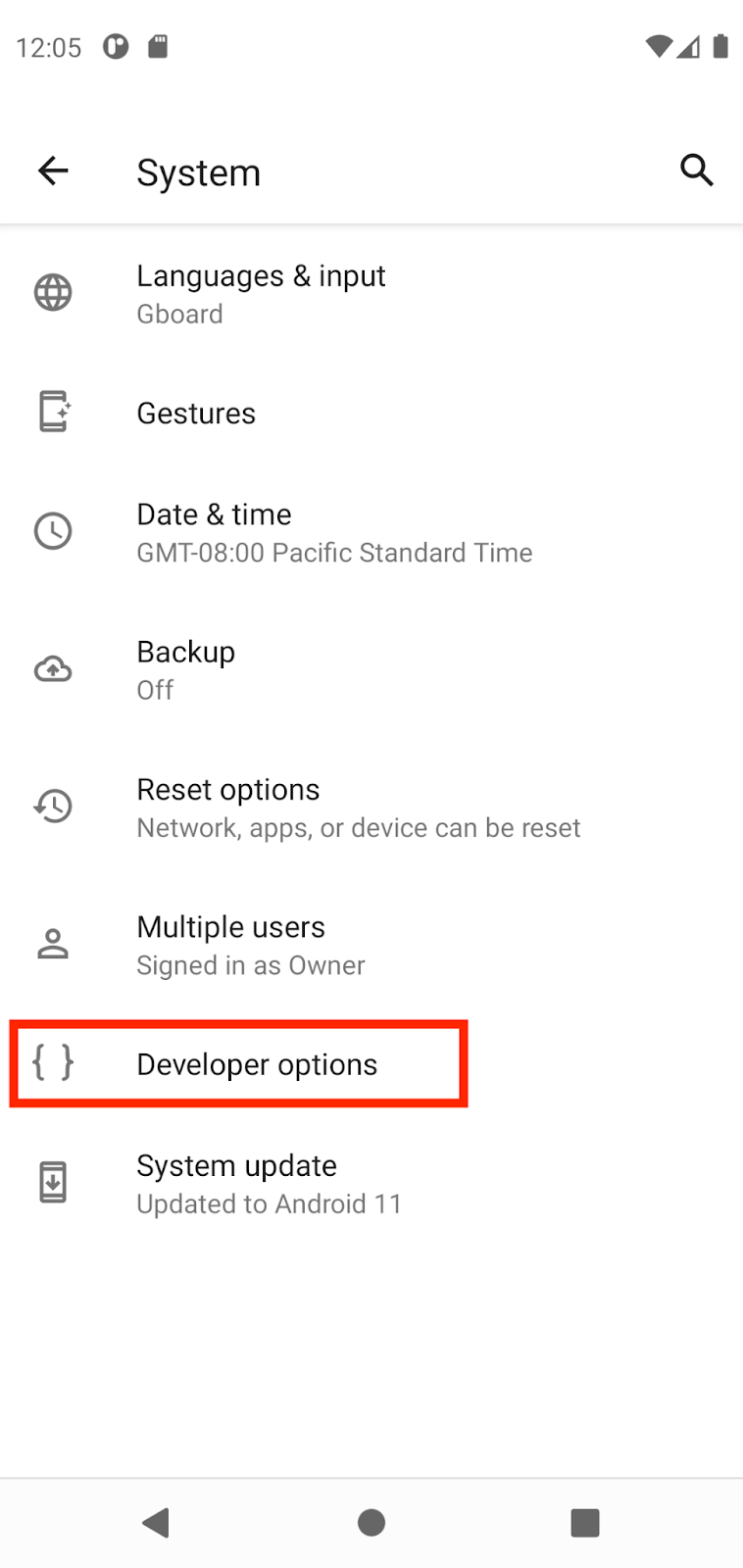
Tap Developer options and then tap the USB debugging toggle to turn it on.
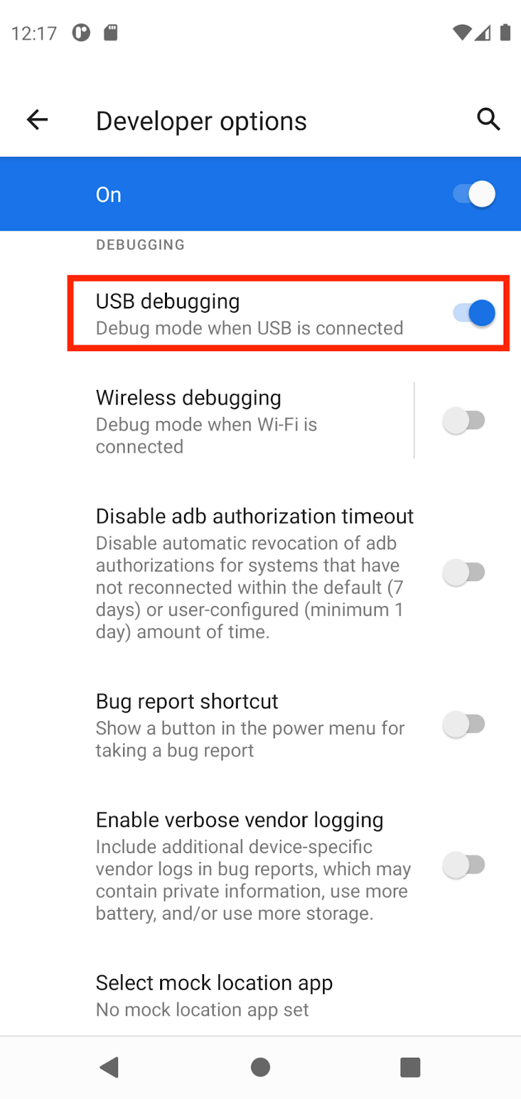
Install the Google USB Driver (Windows only)
If you installed Android Studio on Windows, you must install a USB device driver before you can run your app on a physical device.
Note
For Ubuntu Linux, follow the instructions in Run Apps on a Hardware Device.
In Android Studio, click Tools > SDK Manager. The Preferences > Appearance & Behavior > System Settings > Android SDK dialog opens.
Click the SDK Tools tab.
Select Google USB Driver and then click OK.
When done, the driver files are downloaded into the
android_sdk\extras\google\usb_driverdirectory. Now you can connect and run your app from Android Studio.
Run your app on the Android device with a cable
There are two ways to connect your device to Android Studio, through a cable or through Wi-Fi. You can choose whichever you like more.
Connect your Android device to your computer with a USB cable. A dialog should appear on your device, which asks you to allow USB debugging.
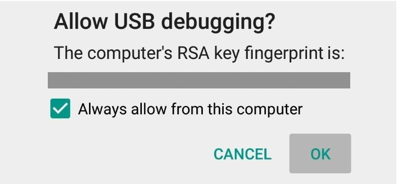
Select Always allow from this computer and then tap OK.
In Android Studio on your computer, make sure your device is selected in the dropdown. Click ▶️.

Select your device and then click OK. Android Studio installs the app on your device and runs it.
Note
For Android Studio 3.6 and higher, the physical device is automatically selected when the device is connected with debugging turned on.
If your device runs an Android platform that isn’t installed in Android Studio and you see a message that asks whether you want to install the needed platform, click Install > Continue > Finish. Android Studio installs the app on your device and runs it.
Run your app on the Android device with Wi-Fi
If you don’t have a cable, you can also connect and run your app on your device with Wi-Fi.
Ensure that your computer and device are connected to the same wireless network.
Ensure that your device runs Android 11 or higher. For more information, see Check & update your Android version.
Ensure that your computer has the latest version of Android Studio.
Ensure that your computer has the latest version of the SDK Platform Tools.
In Android Studio, select Pair Devices Using Wi-Fi from the run configurations drop-down menu.
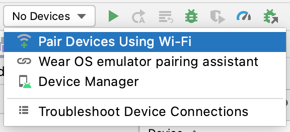
The Pair devices over Wi-Fi dialog opens.
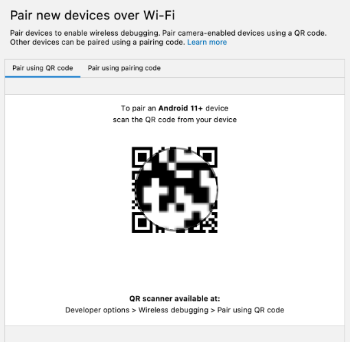
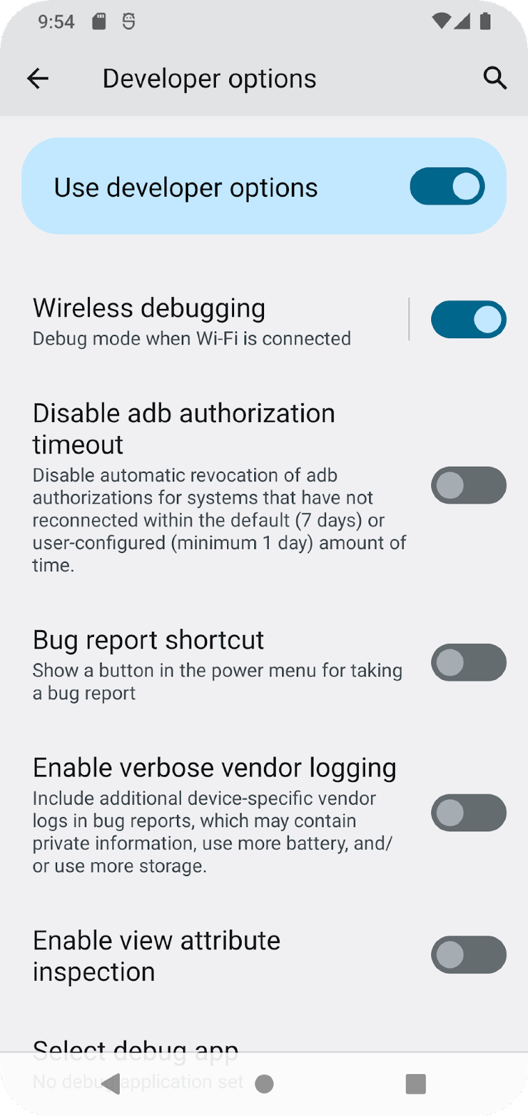
Go to Developer options, scroll down to the Debugging section and turn on Wireless debugging.
On the Allow wireless debugging on this network? popup, select Allow.

If you want to pair your device with a QR code, select Pair device with QR code and then scan the QR code on your computer. Alternatively, if you want to pair your device with a pairing code, select Pair device with pairing code and then enter the 6-digit code.
Click run and you can deploy your app to your device.
Note
If you want to pair a different device or forget this device on your computer, navigate to Wireless debugging on your device, tap on your workstation name under Paired devices, and select Forget.
Troubleshooting
If your computer runs Linux or Windows, and you can’t run your app on a physical Android device, see Run apps on a hardware device for additional steps.
If your computer runs Windows and the emulator installation doesn’t work, see Install OEM USB Drivers for the appropriate USB driver for your device.
If Android Studio doesn’t recognize your device: try unplugging the USB cable and plug it back in or restarting Android Studio.
If your computer still doesn’t find the device or declares it unauthorized: disconnect the USB cable. On the device, tap Settings > Developer options > Revoke USB debugging authorizations. Reconnect the device to your computer. When prompted, grant authorizations.
Build a basic layout
Jetpack Compose is a modern toolkit for building Android User Interfaces (UIs). With Compose, you can build your UI by defining composable functions, that take in data and describe UI elements.
What is a user interface (UI)?
The user interface (UI) of an app is what you see on the screen: text, images, buttons, and many other types of elements, and how it’s laid out on the screen. It’s how the app shows things to the user and how the user interacts with the app.
Almost everything you see on the screen of your app is a UI element (also known as a UI component). They can be interactive, like a clickable button or an editable input field, or they can be decorative images.
Each of these elements is called a UI component.
A clickable button:
A text message inside a Card:
A text input field:
Annotations
Annotations are means of attaching extra information to code. This information helps other developers, and tools like the Jetpack Compose compiler, understand the app’s code. Different code elements, including properties, and functions, can be annotated.
Examples:
@Json
val imgSrcUrl: String

@Volatile
private var INSTANCE: AppDatabase? = null
Example:
@Previewannotation without parameters.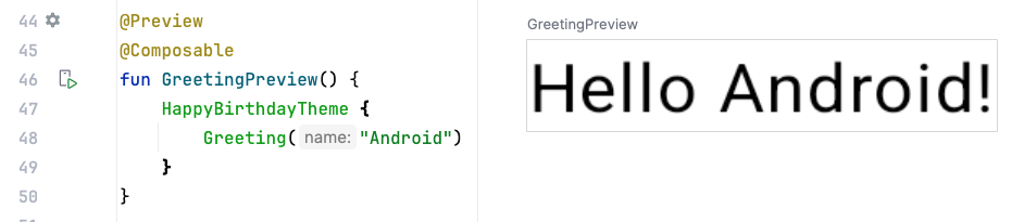
Example:
@Previewannotation with a background.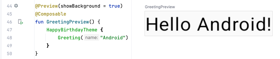
Example:
@Previewannotation with a preview name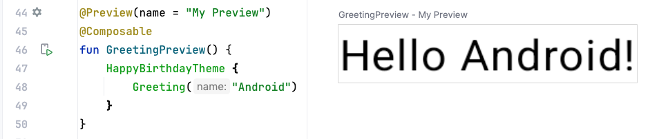
Example:
@Previewannotation with multiple arguments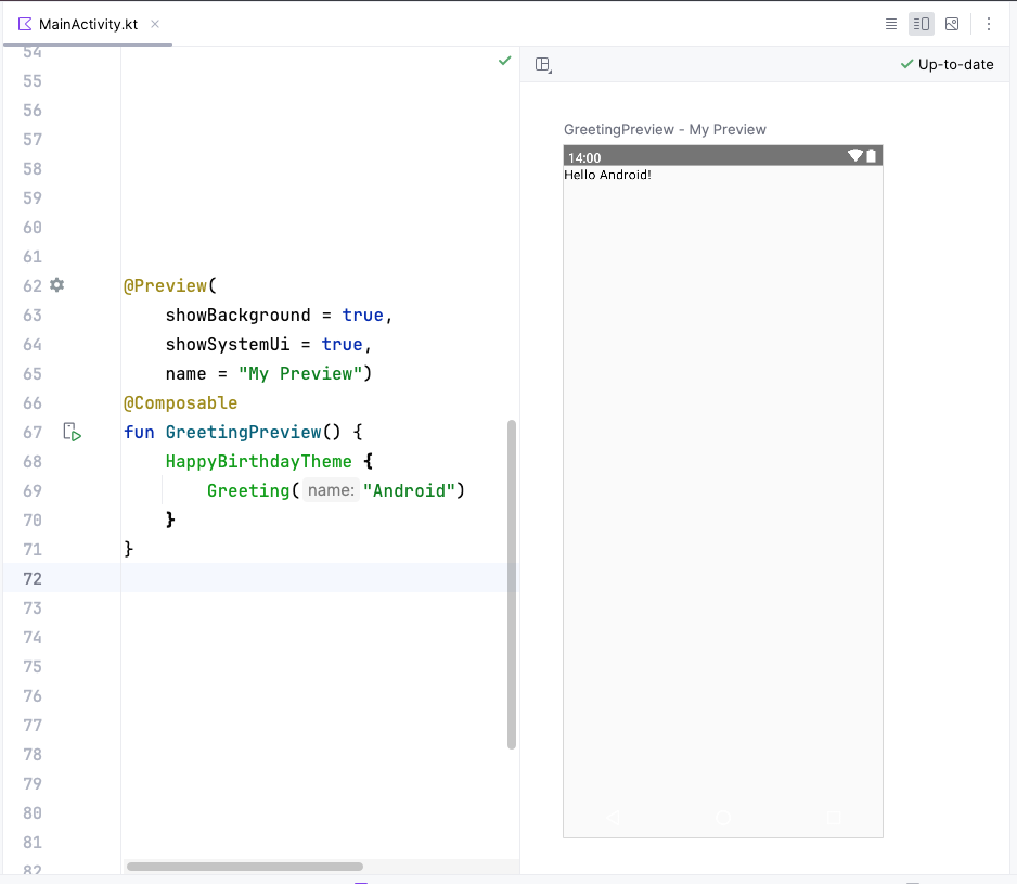
Composable functions
Composable functions are the basic building block of a UI in Compose. A composable function:
Describes some part of your UI.
Doesn’t return anything.
Takes some input, processes it, and displays something on the screen.
Composable functions differ from normal functions:
There’s a
@Composableannotation before the function.@Composablefunction names start with a capital letter.@Composablefunctions can’t return anything.
A composable function is annotated with the
@Composableannotation. These functions let you define your app’s UI programmatically by describing how it should look, rather than focusing on the process of the UI’s construction.Example of a composable function that is passed some data (
name), and uses it to render a text element on the screen.@Composable fun Greeting(name: String) { Text(text = "Hello $name!") }
A composable function MUST be named using Pascal case. Pascal case refers to a naming convention in which the first letter of each word in a compound word is capitalized.
A Composable function:
MUST be a noun:
DoneButton()MAY be prefixed by descriptive adjectives:
RoundIcon()is NOT a verb or verb phrase:
DrawTextField()is NOT a nouned preposition:
TextFieldWithLink()is NOT an adjective:
Bright()is NOT an adverb:
Outside()
For more, see Naming Composable functions.
Examples:
// Do: This function is a descriptive PascalCased noun. It is a visual UI element
@Composable
fun FancyButton(text: String) {}


// Do: This function is a descriptive PascalCased noun. It is a non-visual element (it handles a button tap, but doesn't display anything)
@Composable
fun BackButtonHandler() {}


// Don't: This function is a noun but is not PascalCased!
@Composable
fun fancyButton(text: String) {}


// Don't: This function is PascalCased but is not a noun!
@Composable
fun RenderFancyButton(text: String) {}


// Don't: This function is neither PascalCased nor a noun!
@Composable
fun drawProfileImage(image: ImageAsset) {}
Birthday Card app
The Birthday Card app displays an image with a message:
Get the code from https://github.com/simplyslay/cs461-sample-apps
Clone:
$ git clone https://github.com/simplyslay/cs461-sample-apps
$ cd cs461-sample-apps/basic-android-kotlin-compose-birthday-card-app
The code for MainActivity.kt:
/*
 * Copyright (C) 2023 The Android Open Source Project
 *
 * Licensed under the Apache License, Version 2.0 (the "License");
 * you may not use this file except in compliance with the License.
 * You may obtain a copy of the License at
 *
 *     https://www.apache.org/licenses/LICENSE-2.0
 *
 * Unless required by applicable law or agreed to in writing, software
 * distributed under the License is distributed on an "AS IS" BASIS,
 * WITHOUT WARRANTIES OR CONDITIONS OF ANY KIND, either express or implied.
 * See the License for the specific language governing permissions and
 * limitations under the License.
 */
package com.example.happybirthday

import android.os.Bundle
import androidx.activity.ComponentActivity
import androidx.activity.compose.setContent
import androidx.compose.foundation.Image
import androidx.compose.foundation.layout.Arrangement
import androidx.compose.foundation.layout.Box
import androidx.compose.foundation.layout.Column
import androidx.compose.foundation.layout.fillMaxSize
import androidx.compose.foundation.layout.padding
import androidx.compose.material3.MaterialTheme
import androidx.compose.material3.Surface
import androidx.compose.material3.Text
import androidx.compose.runtime.Composable
import androidx.compose.ui.Alignment
import androidx.compose.ui.Modifier
import androidx.compose.ui.layout.ContentScale
import androidx.compose.ui.res.painterResource
import androidx.compose.ui.res.stringResource
import androidx.compose.ui.text.style.TextAlign
import androidx.compose.ui.tooling.preview.Preview
import androidx.compose.ui.unit.dp
import androidx.compose.ui.unit.sp
import com.example.happybirthday.ui.theme.HappyBirthdayTheme

class MainActivity : ComponentActivity() {
    override fun onCreate(savedInstanceState: Bundle?) {
        super.onCreate(savedInstanceState)
        setContent {
            // Apply the app's theme
            HappyBirthdayTheme {
                // Display a Surface composable
                Surface(
                    modifier = Modifier.fillMaxSize(), // Fill the available space
                    color = MaterialTheme.colorScheme.background // Use the theme's background color
                ) {
                    // Display a GreetingImage composable
                    GreetingImage(
                        stringResource(R.string.happy_birthday_text), // Load the string resource for the birthday message
                        stringResource(R.string.signature_text) // Load the string resource for the signature
                    )
                }
            }
        }
    }
}

@Composable
fun GreetingText(message: String, from: String, modifier: Modifier = Modifier) {
    // Display a Column composable
    // It will contain 2 Text composables
    Column(
        verticalArrangement = Arrangement.Center, // Center the content vertically
        modifier = modifier // Since column is the first element, pass it the modifier argument
    ) {
        // Display a Text composable
        Text(
            text = message, // The text to display
            fontSize = 100.sp, // Set the font size
            lineHeight = 116.sp, // Set the height of each line. Must be large enough so that lines don't overlap
            textAlign = TextAlign.Center, // Alignment of the text inside the Text composable
            modifier = Modifier.padding(top = 16.dp) // Add padding around the Text composable
        )
        // Display another Text composable
        Text(
            text = from,
            fontSize = 36.sp,
            modifier = Modifier
                .padding(top = 16.dp) // Add padding around the Text composable
                .padding(end = 16.dp) // Add padding around the Text composable
                .align(alignment = Alignment.End) // Alignment of the Text composable inside the parent Column composable
        )
    }
}

@Composable
fun GreetingImage(message: String, from: String, modifier: Modifier = Modifier) {
    // Display a box that contains an Image composable, and a GreetingText composable
    // Since the Box is the first element, pass it the modifier argument
    Box(modifier) {
        // Display an Image composable
        Image(
            painter = painterResource(id = R.drawable.androidparty), // Load the image from resources
            contentDescription = null, // A description of the image for accessibility, none needed in this case since the image doesn't contain any useful information
            contentScale = ContentScale.Crop, // Scale the image to fill the bounds of the Image composable
            alpha = 0.5F
        )
        // Display a GreetingText composable
        GreetingText(
            message = message,
            from = from,
            modifier = Modifier
                .fillMaxSize() // Fill the available space of the Box
                .padding(8.dp) // Add padding around the GreetingText
        )
    }
}


@Preview(showBackground = false)
@Composable
private fun BirthdayCardPreview() {
    HappyBirthdayTheme {
        GreetingImage(
            stringResource(R.string.happy_birthday_text),
            stringResource(R.string.signature_text)
        )
    }
}
Briefly read through the comments to get an idea of how the code works. Subsequently, we’ll focus on various parts of this code to learn more about Jetpack Compose.
Preview functions
A preview function calls another composable function, and provides arguments. In the below example,
BirthdayCardPreview()is a preview function. It calls theGreeting()composable, and provides an argument.@Preview(showBackground = true) @Composable fun BirthdayCardPreview() { HappyBirthdayTheme { Greeting("Sabrina") } }
The Design pane shows previews within the IDE, without having to install the app to an Android device or emulator.
Click Split to view both code and previews.
The code added to preview functions with the
@Previewannotation is only for previewing in the Design pane in Android Studio. These changes aren’t reflected in the actual app.
The Text composable
The
Textcomposable is used to display text in the UI. It takes a string as an argument and displays it on the screen. It takes many parameters, includingfontSizeandlineHeightUI elements use two different units of measurement: density-independent pixels (DP), and scalable pixels (SP). By default, the SP unit is the same size as the DP unit. If the user sets a preferred text size under their phone settings, then the SP unit resizes based on the user’s preferred text size.
Example of setting the font size of a text element to 100 SP:
Text(
    text = message,
    fontSize = 100.sp,
    lineHeight = 116.sp,
)
imports
import androidx.compose.ui.unit.sp
In
100.sp,100is anInt, andspis an extension property forInt. More on extension properties later.The AndroidX (Android Extension) library helps accelerate app development by providing core functionality. It is accessed using the
androidxpackage.The line height refers to the vertical space between consecutive lines of text. It can be set like this:
Text(
    text = message,
    fontSize = 100.sp,
    lineHeight = 116.sp,
)
User Interface Hierarchy
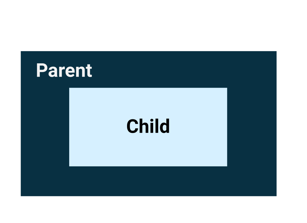
The UI hierarchy is based on containment, meaning a component, called the parent, can contain one or more components, called children.
The three basic layout elements in Compose are the
Column,Row, andBoxcomposables.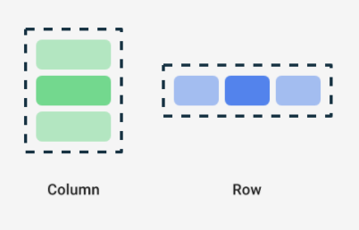
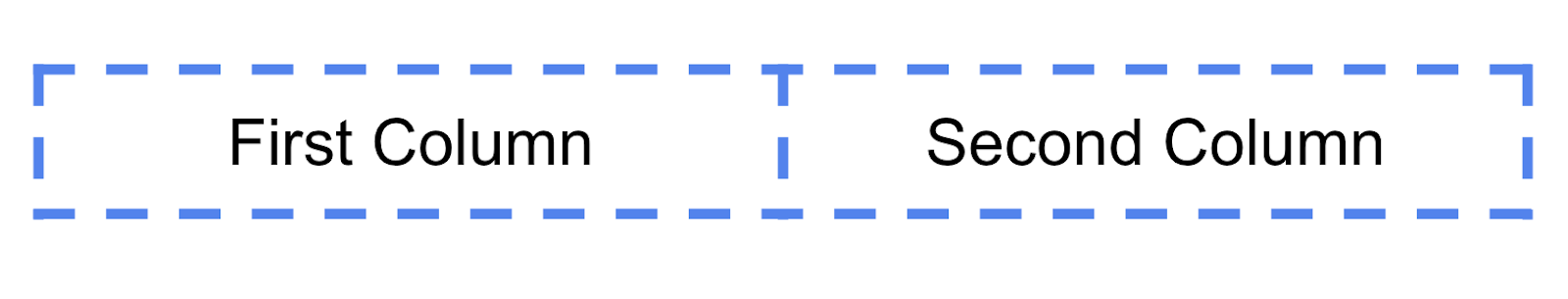
Example: each child element inside a
Rowcomposable is placed horizontally next to each other in a row. The blue borders are only for demonstration purposes and don’t display.Row { Text("First Column") Text("Second Column") }
Trailing lambda syntax
Notice in the previous code snippet that curly braces are used instead of parentheses in the Row composable function. This is called Trailing Lambda Syntax. It is confusing because it looks like a function definition, but it’s not. It’s a function call. Kotlin uses this special syntax when the last parameter to a function is a function:
When you pass a function as the last parameter, you can use trailing lambda syntax. Instead of putting the function inside the parentheses, you can place it outside the parentheses in curly braces. This is a recommended and common practice in Compose, so you need to be familiar with how the code looks.
For example, the last parameter in the
Row()composable function is thecontentparameter, a function that describes the child UI elements. Suppose you wanted to create a row that contains three text elements. This code would work, but it’s cumbersome:Row( content = { Text("Some text") Text("Some more text") Text("Last text") } )
Because the
contentparameter is the last one in the function signature, you can remove thecontentparameter and the parentheses as follows:Row { Text("Some text") Text("Some more text") Text("Last text") }
The Row composable
The
Rowcomposable arranges multiple UI elements in a row. Example:@Composable fun GreetingText(message: String, from: String, modifier: Modifier = Modifier) { Row { Text( text = message, fontSize = 30.sp, lineHeight = 116.sp, ) Text( text = from, fontSize = 36.sp ) } }
imports
import androidx.compose.foundation.layout.Row
What it looks like:
The Column composable
The
Columncomposable arranges multiple UI elements in a column. Example:@Composable fun GreetingText(message: String, from: String, modifier: Modifier = Modifier) { Column { Text( text = message, fontSize = 100.sp, lineHeight = 116.sp, ) Text( text = from, fontSize = 36.sp ) } }
imports
import androidx.compose.foundation.layout.Column
What it looks like:
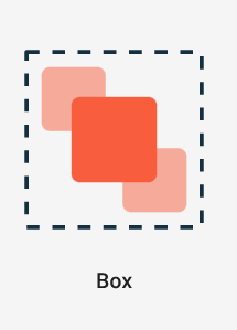
The Box composable
Boxis one of the standard layout elements in Compose. UseBoxto stack elements on top of one another. Imagine your phone lying flat on a table.Boxstacks elements “upwards”, from the “bottom” of your phone screen. Like a burger.
For example, in this code, the
Boxcontains aGreetingText, which is stacked on top of anImage@Composable fun GreetingImage(message: String, from: String, modifier: Modifier = Modifier) { // Display a box that contains an Image composable, and a GreetingText composable // Since the Box is the first element, pass it the modifier argument Box(modifier) { // Display an Image composable Image( painter = painterResource(id = R.drawable.androidparty), // Load the image from resources contentDescription = null, // A description of the image for accessibility, none needed in this case since the image doesn't contain any useful information contentScale = ContentScale.Crop, // Scale the image to fill the bounds of the Image composable alpha = 0.5F ) // Display a GreetingText composable GreetingText( message = message, from = from, modifier = Modifier .fillMaxSize() // Fill the available space of the Box .padding(8.dp) // Add padding around the GreetingText ) } }
imports
import androidx.compose.foundation.layout.Box
What it looks like:
Layout Modifiers
Modifiers are used to decorate or add behavior to Jetpack Compose UI elements. For example, you can add backgrounds, padding or behavior to rows, text, or buttons. To set them, a composable or a layout needs to accept a modifier as a parameter.
The default modifier object is simply
Modifier. To create a layout modifer, start with theModifierobject, and chain on additional modifier functions:modifier = Modifier .background(color = Color.Green) .padding(16.dp) .fillMaxWidth()
Most composables have a parameter called
modifierthat can be used to specify layout modifiers. For example, thisTextcomposable has amodifierparameter.Text( text = "Hello, World!", modifier = Modifier.background(color = Color.Green) )
Padding
A UI element wraps itself around its content. To prevent it from wrapping too tightly, you can specify the amount of padding on each side.

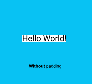

Example:
Modifier.padding(
    start = 16.dp,
    top = 16.dp,
    end = 16.dp,
    bottom = 16.dp
)
Row and Column layout parameters
The
RowandColumncomposables have amodifierparameter. In addition, they each have 2 layout-related parameters used to set their children’s positions.A
RowhasverticalAlignmentandhorizontalArrangementparametersA
ColumnhashorizontalAlignmentandverticalArrangementparameters.
The alignment property is used to align the child elements at the start, center, or end of the layout.
The arrangement property is used to arrange the child elements when the size of the layout is larger than the sum of its children.
When the size of a
Columnis larger than the sum of its children sizes, averticalArrangementcan define the positioning of the children inside theColumn.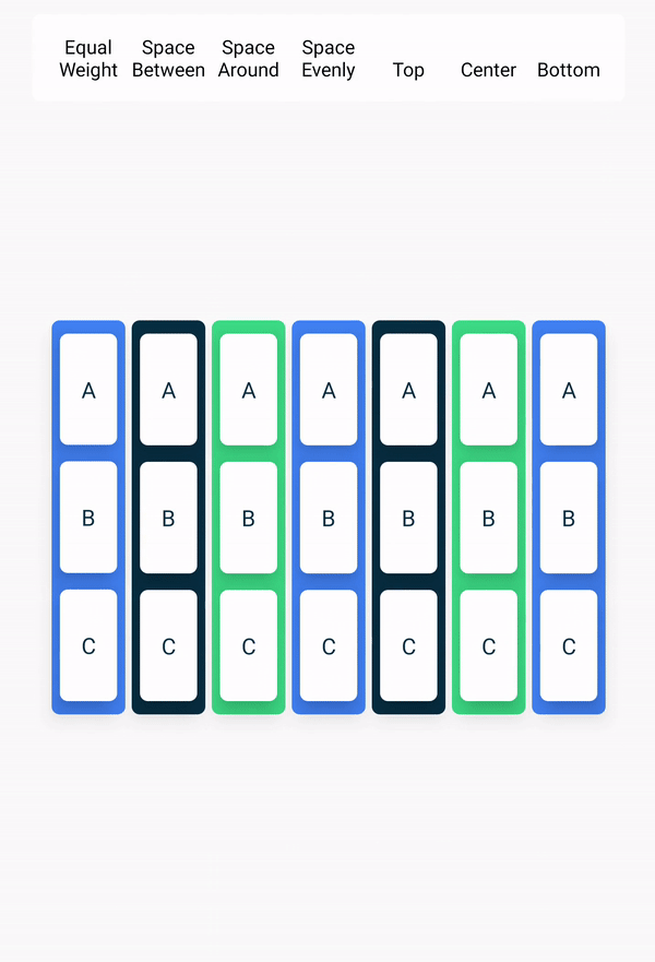
When the size of a
Rowis larger than the sum of its children sizes, ahorizontalArrangementcan define the positioning of the children inside theRow.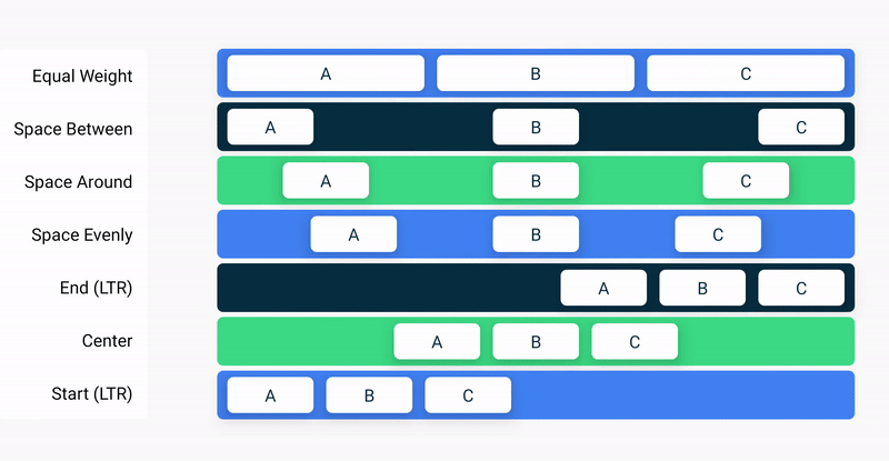
In
GreetingText(), the highlighted lines show layout modifiers being used. If unclear, adjust these lines to see what they actually do.@Composable fun GreetingText(message: String, from: String, modifier: Modifier = Modifier) { // Display a Column composable // It will contain 2 Text composables Column( verticalArrangement = Arrangement.Center, // Center the content vertically modifier = modifier // Since column is the first element, pass it the modifier argument ) { // Display a Text composable Text( text = message, // The text to display fontSize = 100.sp, // Set the font size lineHeight = 116.sp, // Set the height of each line. Must be large enough so that lines don't overlap textAlign = TextAlign.Center, // Alignment of the text inside the Text composable modifier = Modifier.padding(top = 16.dp) // Add padding around the Text composable ) // Display another Text composable Text( text = from, fontSize = 36.sp, modifier = Modifier .padding(top = 16.dp) // Add padding around the Text composable .padding(end = 16.dp) // Add padding around the Text composable .align(alignment = Alignment.End) // Alignment of the Text composable inside the parent Column composable ) } }
As a best practice, pass the
modifierargument from the parent composable to the first child. In this case,GreetingText()is the parent, its first child isColumn(), that’s why the linemodifier = modifieris added.
Resources in Jetpack Compose
Resources are files and static content that your code uses, such as images, user-interface strings, animation instructions, and more. You should always separate resources from your code, so that you can maintain them independently. At runtime, Android uses the appropriate resource based on the current configuration. For example, you might want to provide a different UI layout based on the screen size, or different strings based on the language setting.
Grouping resources
You should always place each type of resource in a specific subfolder of your project’s
res/folder. For example, here’s the file hierarchy for a simple project:MyProject/ src/ MyActivity.kt res/ drawable/ graphic.png mipmap/ icon.png values/ strings.xml
As you can see in this example, the
res/folder contains all the resources in subdirectories, which includesa
drawable/folder for image resourcesa
mipmap/folder for launcher iconsa
values/folder for string resources
Accessing resources
Resources can be accessed with resource IDs that are generated in your project’s
Rclass. TheRclass is an automatically generated class that contains the IDs of all resources in the project. In most cases, the resource ID is the same as the filename.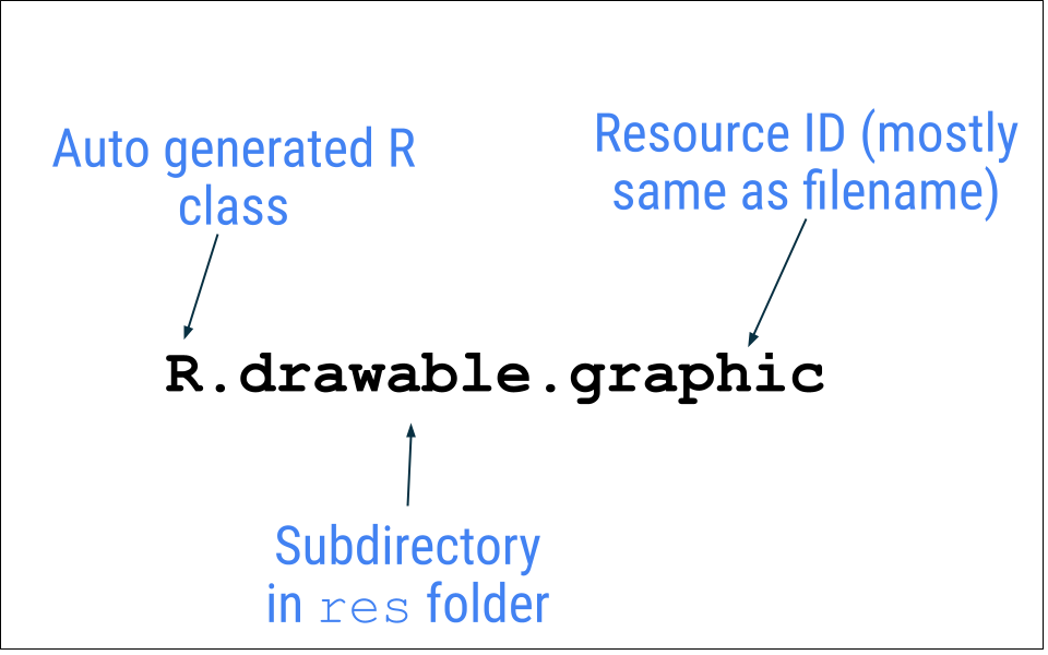
For example, the image in the previous file hierarchy can be accessed with this code:
R.drawable.graphic
Example code that uses an
Image()composable and a resource calledandroidparty.png:Image( painter = painterResource(id = R.drawable.androidparty), // Load the image from resources contentDescription = null, // A description of the image for accessibility, none needed in this case since the image doesn't contain any useful information contentScale = ContentScale.Crop, // Scale the image to fill the bounds of the Image composable alpha = 0.5F )
Add an image resource
This section shows how to add an image to the project. The image being added here is already in the project, so you don’t have to actually follow these steps. If you’d like to practice, you can still repeat these steps, and overwrite the existing image. Otherwise, just refer to them later when you actually need to add an image.
Download androidparty.png
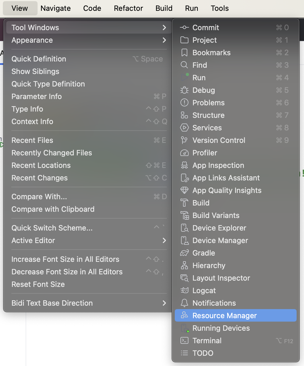
Resource Manager is a tool window that lets you import, create, manage, and use resources in your app. To access it, either click View ➜ Tool Windows ➜ Resource Manager, or click the Resource Manager tab next to the Project window.

Click + (Add resources to the module) ➜ Import Drawables.
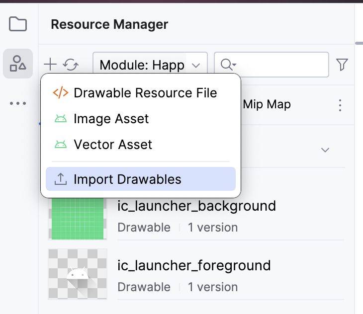
Select the
androidparty.pngfile, and click Open. This action opens the Import drawables dialog.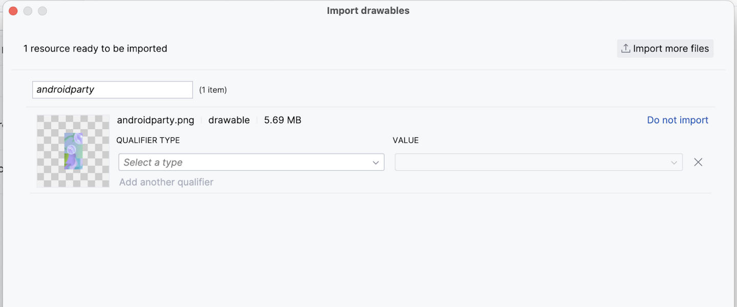
An image preview appers. From the QUALIFIER TYPE drop-down list, select Density.
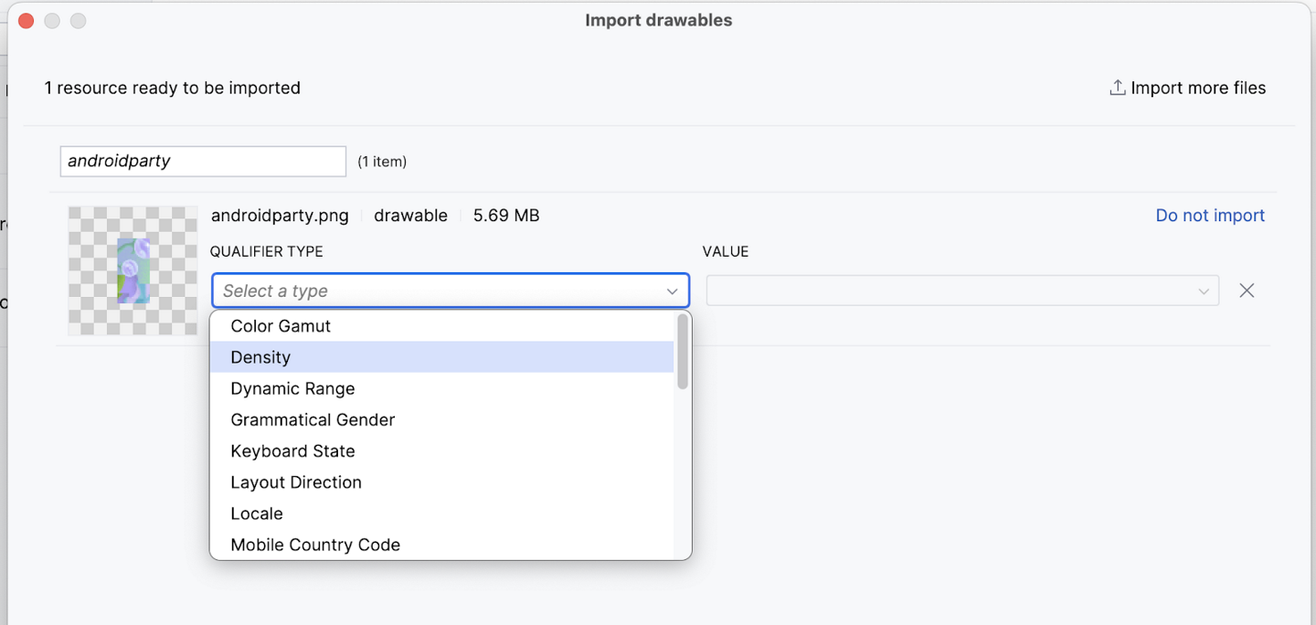
Select No Density from the VALUE list.

Android devices come in different screen sizes (phones, tablets, TVs, etc), and their screens also have different pixel sizes. That is, while one device has 160 pixels per square inch, another device fits 480 pixels in the same space. If you don’t consider these variations in pixel density, the system might resize your images, which could result in blurry images, or large images that consume too much memory, or images that are sized improperly. For more information about pixel densities, see Support different pixel densities.
For photographs and background images, like
androidparty.png, doing the above stops the resizing behavior. Such images are placed in a folder calleddrawable-nodpi.Click Next. Android Studio shows you the folder structure in which your image will be placed. Notice the
drawable-nodpifolder.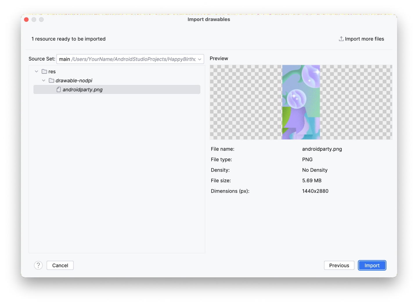
Click Import. Android Studio creates a
drawable-nodpifolder and places your image in it. In the Android Studio project view, the resource name is displayed asandroidparty.png (nodpi). In the computer file system, Android Studio would have created a folder calleddrawable-nodpi.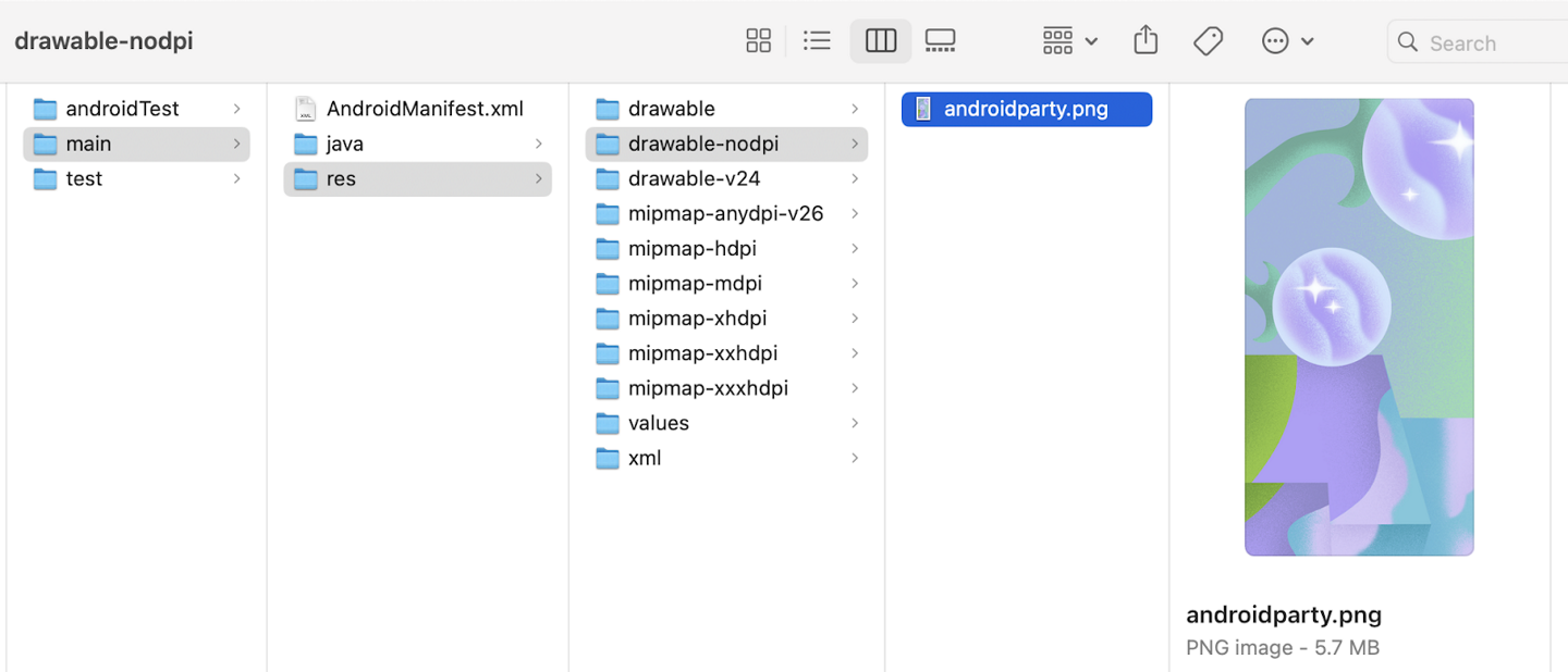
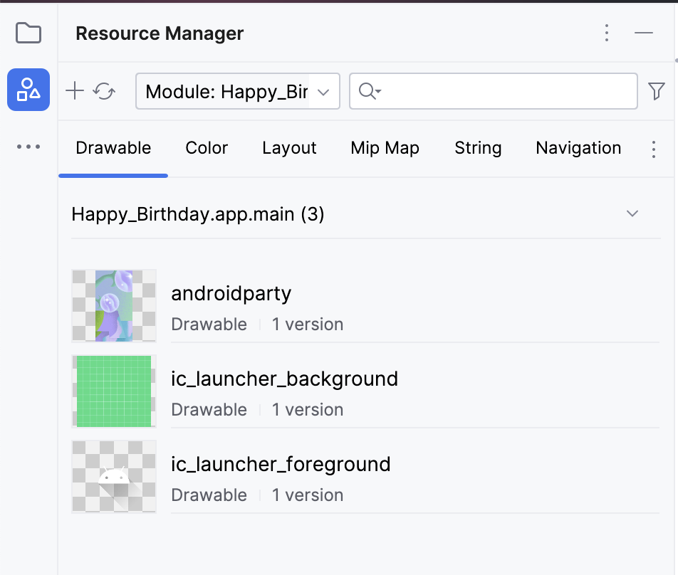
If the image is imported successfully, Android Studio adds the image to the list under the Drawable tab. This list includes all your images and icons for the app. You can now use this image in your app.
Switch back to the project view: click View ➜ Tool Windows ➜ Project or click the Project tab on the far left.
Click app ➜ res ➜ drawable to confirm that the image is in the
drawablefolder.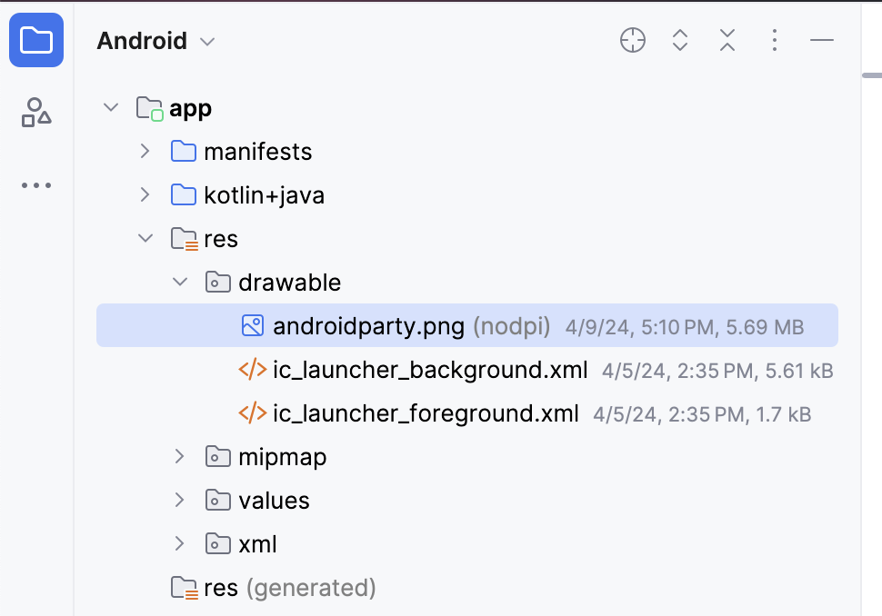
Add a string resource
When you write apps, they may be translated into another language at some point. A hardcoded string is one that’s written directly in the code of your app. Hardcoded strings make it more difficult to translate your app into other languages and harder to reuse strings in different places in your app. You can extract strings into a resource file to resolve these issues. Instead of hardcoding strings in your code, you put the strings into a file, name the string resources, and use the names whenever you want to use the strings. The name stays the same, even if you change the string or translate it to a different language.
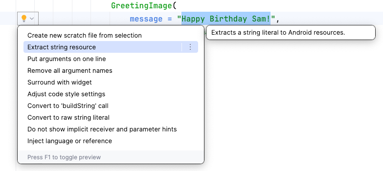
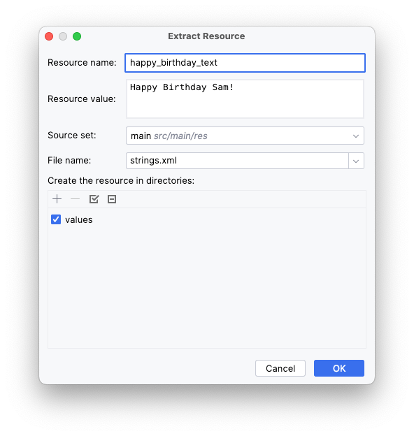
To extract a string resource, select any string, then click the bulb on the left side of the screen, and select Extract string resource. Example:
The Extract Resource dialog opens. In this dialog, you can customize what your string resource is called and some details on how to store it. The Resource name field is where you enter what the string is going to be called. The Resource value field is where you enter the actual string itself.
String resources should have lowercase names and multiple words should be separated with an underscore. Example:
After extracting a string, the hardcoded string is now replaced with a call to the
getString()function:GreetingImage( message = getString(R.string.happy_birthday_text), from = "From Emma", modifier = Modifier.padding(8.dp) )
String resources are stored in app ➜ res ➜ values ➜ strings.xml. The
strings.xmlfile has a list of strings that the user sees in your app. The name of your app is also a string resource. By putting the strings all in one place, you can more easily translate all the text in your app and more easily reuse a string in different parts of your app.An example of
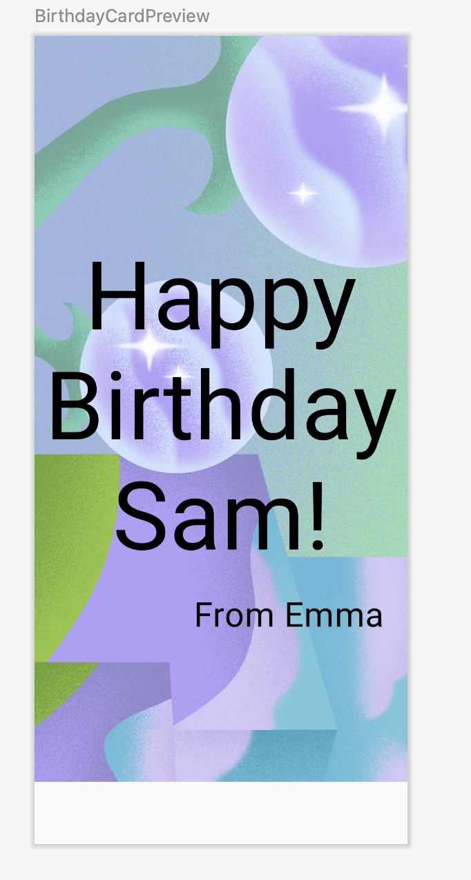
strings.xml:<resources> <string name="app_name">Happy Birthday</string> <string name="happy_birthday_text">Happy Birthday Sam!</string> <string name="signature_text">From Emma</string> </resources>
An example of how they are used:
@Preview(showBackground = false)
@Composable
private fun BirthdayCardPreview() {
    HappyBirthdayTheme {
        GreetingImage(
            stringResource(R.string.happy_birthday_text),
            stringResource(R.string.signature_text)
        )
    }
}
imports
import androidx.compose.ui.res.stringResource
The Image composable
Use an
Imagecomposable to display an image. Example:Image( painter = painterResource(id = R.drawable.androidparty), // Load the image from resources contentDescription = null, // A description of the image for accessibility, none needed in this case since the image doesn't contain any useful information contentScale = ContentScale.Crop, // Scale the image to fill the bounds of the Image composable alpha = 0.5F )
To let all users, including those with disabilities, have an awesome experience, follow the Android accessibility guidelines. For example, a content description defines the purpose of a UI element, which makes your app more usable with tools such as TalkBack.
Since the image in this app is only included for decorative purposes, the addition of a content description for the image would make it harder to use with TalkBack in this particular case. That’s why the image’s
contentDescriptionargument is set tonull.ContentScale.Cropscales the image uniformly to maintain the aspect ratio, so that the width and height of the image are equal to, or larger than, the corresponding dimension of the screen.The
alphaparameter affects the image’s opacity. Higher values mean the image is more opaque, while lower values make it more transparent.
Week 1 in-lesson exercises: Compose Basics
To be done during the lesson.
It’s ok if you can’t complete everything during the lesson. Continue working on them after the lesson.
These exercises focus on how to build apps with the UI composables that you learned. The exercises are inspired by real-world use cases, some of which you probably encountered before.
These exercises provide you with resources that you need for implementation, such as images and strings. The string resources contain the text that’s displayed in the UI. You add these strings to the
strings.xmlfile and use them in your code.Additionally, the exercises provide you with a set of specifications, such as font size, to use for the text content or padding around the UI components. These specifications help you build consistent UIs and often guide developers to visualize and build the screens. You might encounter similar specifications when you work with a team for an organization.
Some exercises might require you to use a
Modifier. In such cases, see the References section available for each problem, where you can find links to documentation related to the modifiers or properties. You can read the documentation and determine how to incorporate the concepts in the app. The ability to comprehend documentation is one of the important skills that you should develop to grow your knowledge.The solution code is available at the end, but try to solve the exercises before you check the answers. Consider the solutions as one way to implement the app. The solution code uses the basic composables and concepts that you learned so far. There’s a lot of room for improvement, so feel free to experiment and try different things.
Lastly, you should use Android Studio to create separate projects for these exercises.
Compose Article
The Learn Together app displays a list of articles about several Jetpack libraries. Users can choose the topic of their choice and learn about its latest developments.
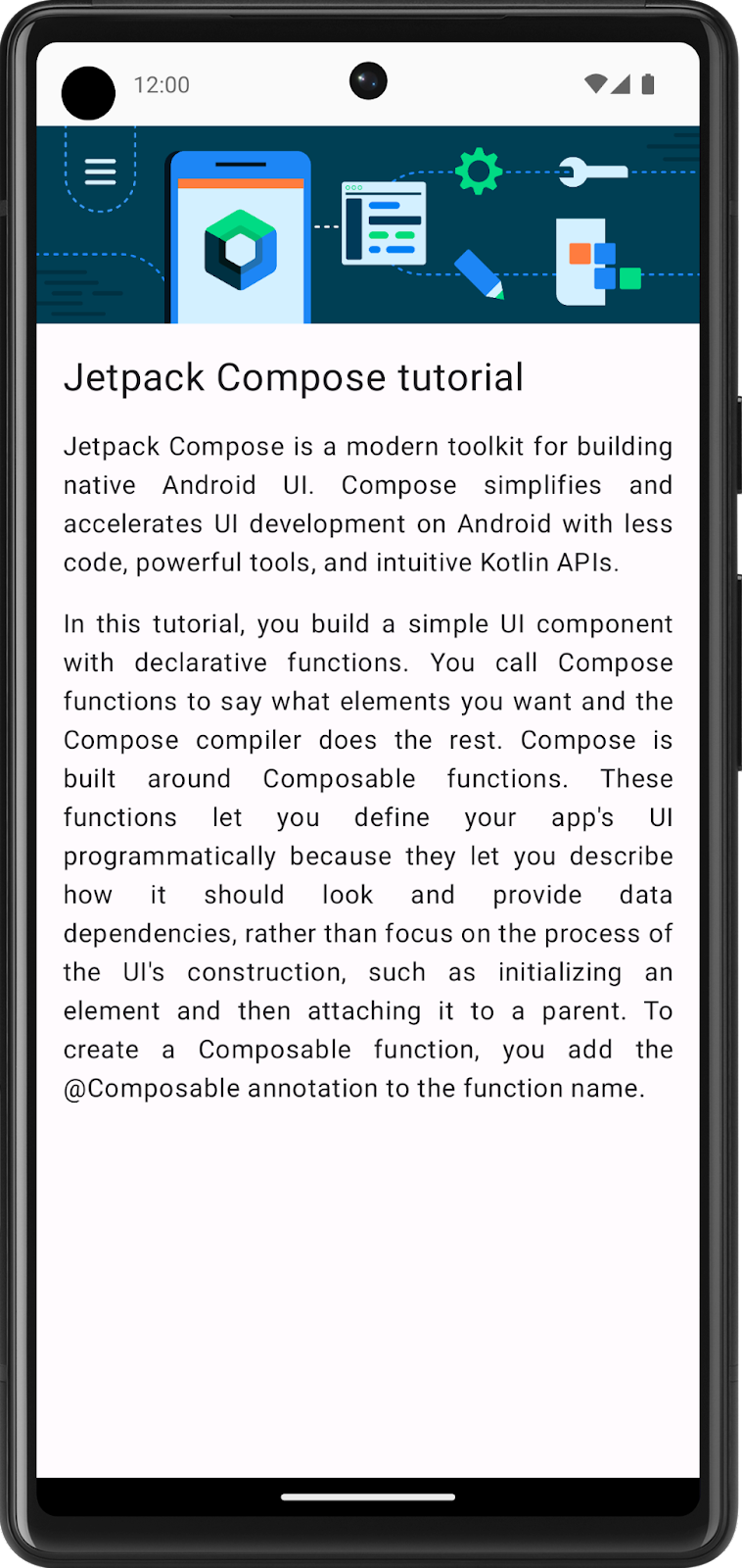
In this exercise, you build a screen for the app, which displays a tutorial for Jetpack Compose. You use the image and string resources provided in the Resources section for this problem.
Compose Article: final screenshot
After you finish the implementation, your design should match this screenshot:
Compose Article: UI specification
Follow this UI specification:
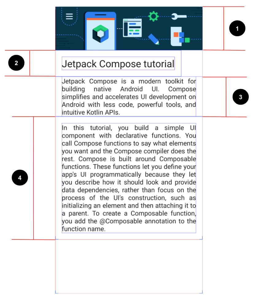
Set the image to fill the entire screen’s width.
Set the first
Textcomposable to a24spfont size and16dppadding (start, end, bottom, and top).Set the second
Textcomposable to a default font size,16dppadding(start and end), andJustifytext align.Set the third
Textcomposable to a default font size,16dppadding (start, end, bottom, and top), andJustifytext align.
Compose Article: resources
Import bg_compose_background.png into your project
Use these strings:
Jetpack Compose tutorialJetpack Compose is a modern toolkit for building native Android UI. Compose simplifies and accelerates UI development on Android with less code, powerful tools, and intuitive Kotlin APIs.In this tutorial, you build a simple UI component with declarative functions. You call Compose functions to say what elements you want and the Compose compiler does the rest. Compose is built around Composable functions. These functions let you define your app\'s UI programmatically because they let you describe how it should look and provide data dependencies, rather than focus on the process of the UI\'s construction, such as initializing an element and then attaching it to a parent. To create a Composable function, you add the @Composable annotation to the function name.
Might be useful:
TextAlign.Justify property
Compose Article: solution code
Task manager
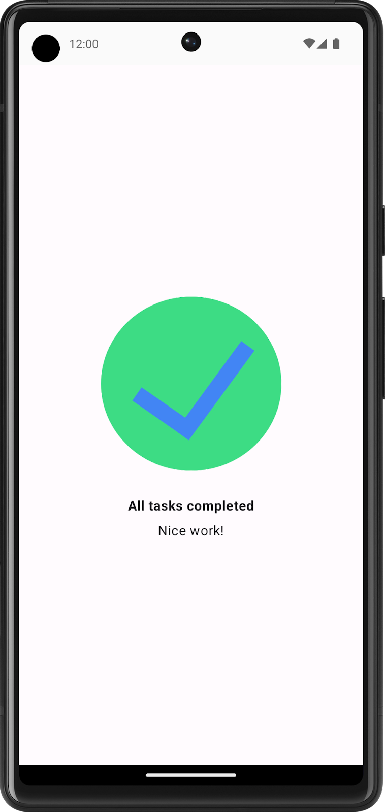
The Task Manager app lets users manage their day-to-day tasks and check the tasks that they need to complete.
In this exercise, you build a screen that users see when they complete all the tasks for a given day.
Task manager: final screenshot
After you finish the implementation, your design should match this screenshot:
Task manager: UI specification
Follow these UI specifications:
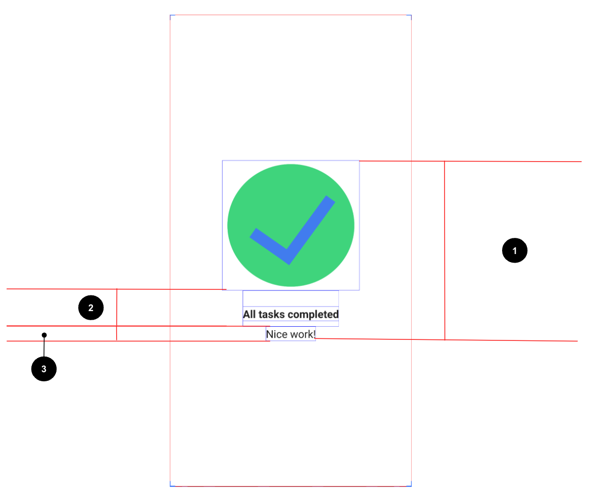
Center align all of the content vertically and horizontally on the screen.
Set the first
Textcomposable to aBoldfont weight,24dppadding top, and8dppadding bottom.Set the second
Textcomposable to a16spfont size.
Task manager: resources
These strings:
All tasks completedNice work!
Task manager: solution code
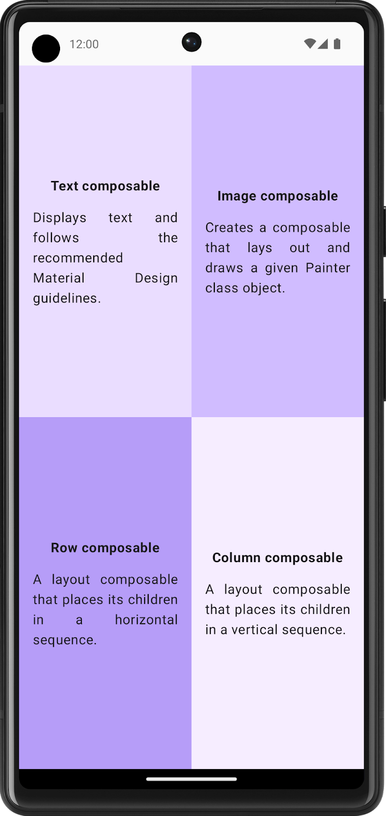
Compose Quadrant
In this exercise, you need to apply most of the concepts that you learned so far and then go a step further to explore new
Modifierand properties. You can check the References section, where you can find the links to theseModifierclasses and properties, and use them for implementation.You need to build an app that displays the information about the
Composablefunctions that you learned.The screen is divided into four quadrants. Each quadrant provides the name of a
Composablefunction and describes it in one sentence.
Compose Quadrant: final screenshot
After you finish the implementation, your design should match this screenshot:
Compose Quadrant: UI specifications
Divide the entire screen into four equal parts, each of which contains a Compose card and displays information about a
Composablefunction.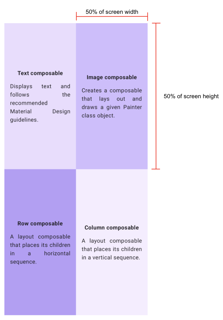
Follow these specifications for each quadrant:
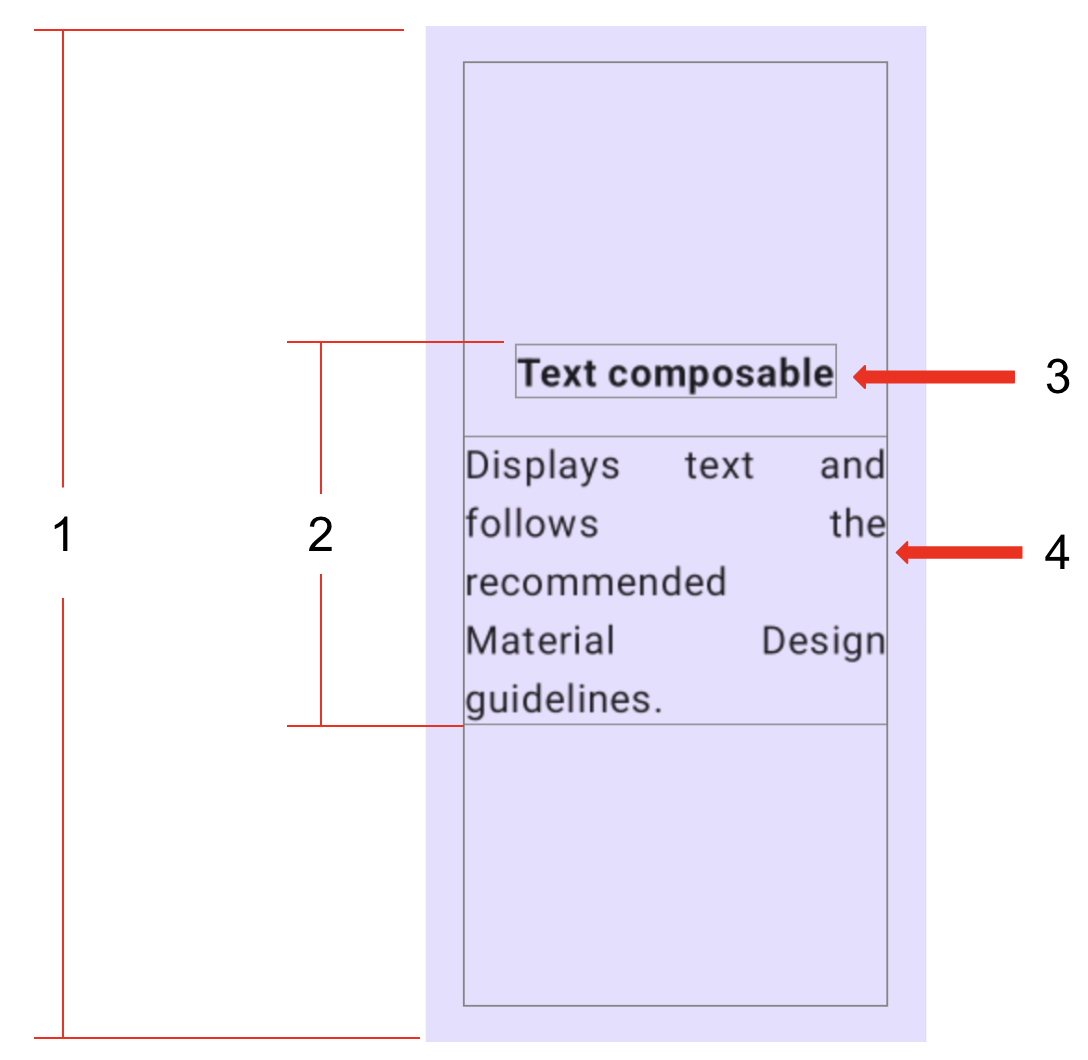
Set the entire quadrant (start, end, top, and bottom) to a
16dppadding.Center align all of the content vertically and horizontally in each quadrant.
Format the first
Textcomposable in bold and set it to a16dppadding bottom.Set the second
Textcomposable to a Default font size.
Compose Quadrant: resources
Colors:
Color(0xFFEADDFF)Color(0xFFD0BCFF)Color(0xFFB69DF8)Color(0xFFF6EDFF)
Strings:
Text composableDisplays text and follows the recommended Material Design guidelines.Image composableCreates a composable that lays out and draws a given Painter class object.Row composableA layout composable that places its children in a horizontal sequence.Column composableA layout composable that places its children in a vertical sequence.
Other:
Weight modifier function
FontWeight.Bold property
TextAlign.Justify property
Compose Quadrant: solution code
Week 1 Homework: Business Card app
To be done after the lesson.
You apply what you learned in this unit to create your own business card app. There are much less step-by-step instructions to follow here. You’re only provided with guidelines and suggestions about what you can build. You’re encouraged to use your creativity to build the app.
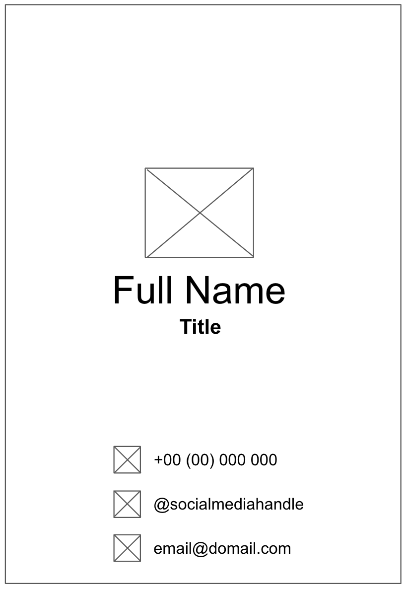
A sample of how your app might look like:

Build UI with composables
Create a low-fidelity prototype
When you begin a project, it’s useful to visualize how UI elements need to fit together on the screen. In professional development work, oftentimes there are designers or design teams that provide developers with UI mockups, or designs, that contain exact specifications. However, if you don’t work with a designer, you can create a low-fidelity, or low-fi, prototype on your own. Low-fi prototype refers to a simple model, or drawing, that provides a basic idea of what the app looks like.
Surprisingly, it’s common to work without a designer, which makes the ability to sketch simple UI mockups a handy skill for a developer. Don’t worry, you don’t need to be a professional designer or even know how to use design tools. You can simply use a pen and paper, Slides, or Drawings to help you build it. Figma is an option too.
To create a low-fidelity prototype:
On your preferred medium, add elements that make up your app. Some elements to consider include the Android logo, your name, title, and contact information, icons that indicate contact information. For example, a telephone icon indicates a phone number.
Add these elements in different positions and then evaluate them visually. Don’t worry about getting it perfect the first time. You can always settle on one design now and iteratively improve it later.
Note
There are principles that help make design better for users, which is outside the scope of this project. To learn more, see Understanding layout.
You may come up with a low-fi design that looks like this image:
Convert design into code
To use your prototype to help translate your design into code, identify different logical sections of the apps and draw boundaries around them. This step helps you divide your screen into small composables and think about the hierarchy of the composables.
In this example, you can divide the screen into two sections:
Logo, name, and title
Contact information
Each section can be converted into one composable. This way you are able to build your UI with small composable building blocks. You can arrange each of these sections with layout composables, such as a
RoworColumncomposable.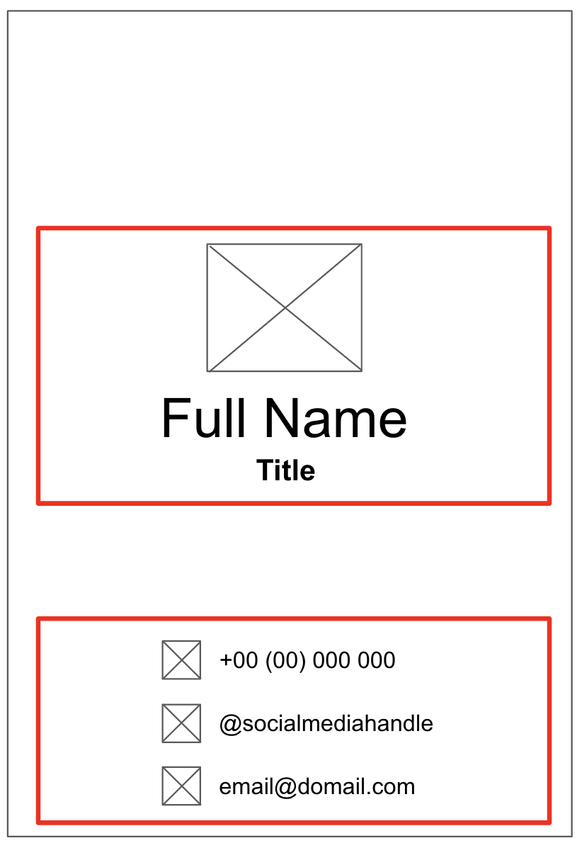
For each section of the app that contains multiple UI elements, draw boundaries around them. These boundaries help you see how one element relates to another in the section.
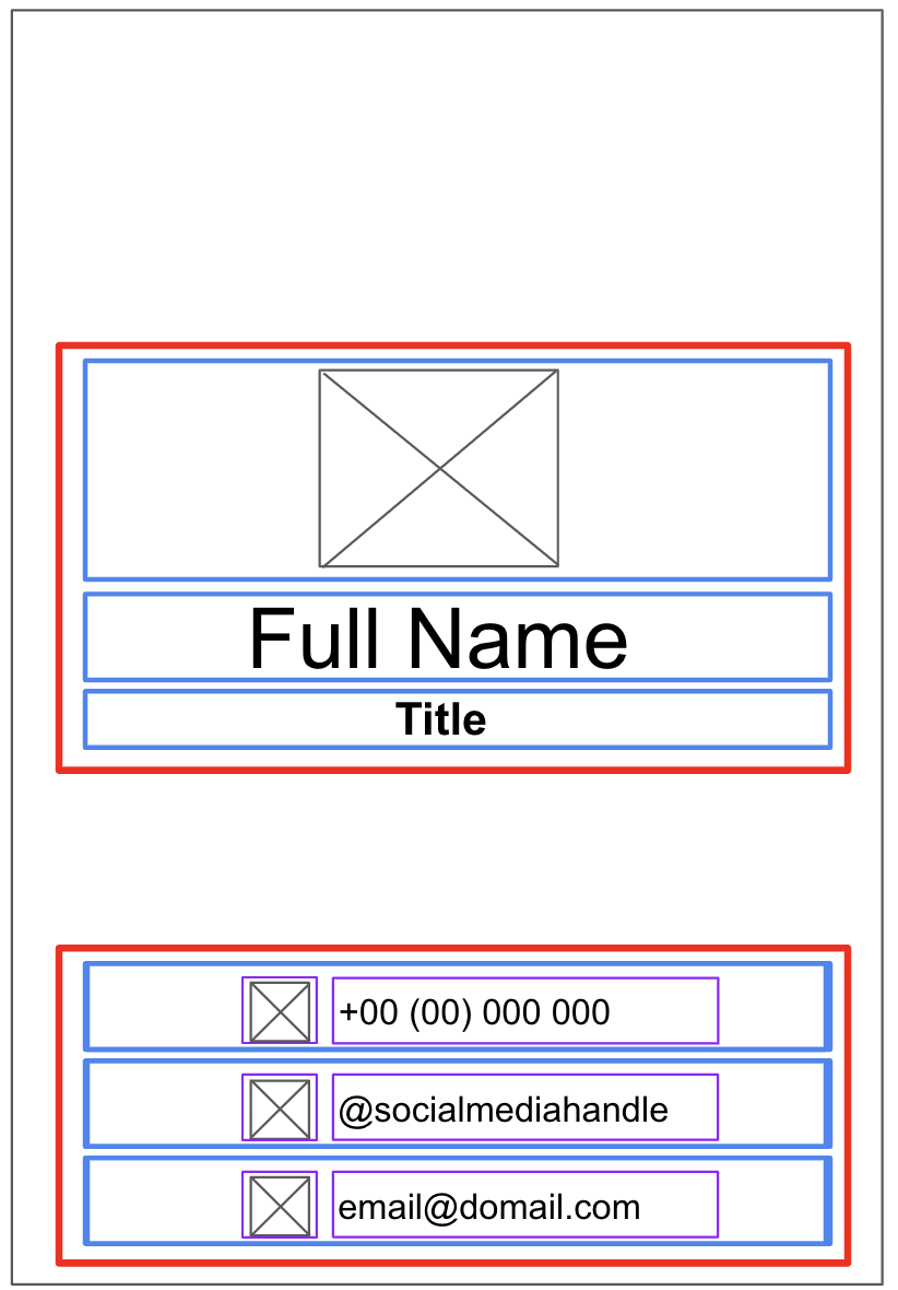
Now it’s easier to see how you can arrange Text, Image, Icon, and other composables with layout composables.
Some notes on various composables that you may use:
RoworColumncomposablesExperiment with various
horizontalArrangementandverticalAlignmentparameters inRowandColumncomposables to match the design that you have.
ImagecomposablesDon’t forget to fill in the
contentDescriptionparameter. As mentioned in the previous codelab, TalkBack uses thecontentDescriptionparameter to help with the accessibility of the app. If theImagecomposable is only used for decorative purposes or there’s a Text element that describes theImagecomposable, you can set thecontentDescriptionparameter tonull. You can also customize the size of the image by specifying theheightandwidthmodifiers in themodifierparameter.
IconcomposablesYou can use the Icon composable to add icons from Material Design. You can change the Tint parameter to adjust the icon color to fit the style of your business card. Similar to the
Imagecomposable, don’t forget to fill in thecontentDescriptionparameter.
TextcomposablesYou can experiment with various values of
fontSize,textAlign,color, andfontWeightparameters to style your text.
Spacing and alignment
You can use
Modifierarguments, such aspaddingandweightmodifiers, to help with the arrangement of composables.You can also use a Spacer composable to make spacing more explicit.
Color customization
You can use custom color with the Color class and the color hex code (a hexadecimal way to represent a color in RGB format). For example, the green color of Android has a hex code of #3DDC84. You can make your text the same green color with this code:
Text("Example", color = Color(0xFF3ddc84))
Run the app in an emulator or on your Android device.
Week 1 Blended Learning Questions
What are the differences between previewing an app in the Design view, and running the app on an Android Virtual Device?
#solulu
Previewing the app on Design View
Running the app on an Android Virtual Device
No Android device, whether real or emulated, is involved.
An Android Virtual Device is used, which emulates real Android hardware and software. Your laptop “pretends” to be an Android device, so that the app thinks it’s running on an Android device.
Uses only the app code that is annotated with
@Preview.All app code is used.
Doesn’t install the app anywhere. It “runs” within Android Studio.
App is installed and runs on the Android Virtual Device.
Build process is faster. Can see changes to the composables sooner.
Build process is slower. Need to compile the entire app, install it onto the AVD, and run it on the AVD.
Mainly for viewing the layout, styling, and UI elements. Interactivity (e.g., button clicks, navigation, network calls) is limited.
Full functionality: the entire app works as it would on a real device.
Lower resource usage (resource: your laptop’s CPU, RAM)
Higher resource usage
What’s the difference between compile-time and run-time?
#solulu
Compile-time is when the source code is converted to a form that the machine understands (machine code). Run-time is when the machine code is executed on a mobile device.
What are the pros and cons of using named arguments as compared to positional arguments?
#solulu
Pros
Cons
Makes function calls more descriptive and easier to understand. Clearly identifies the purpose of each argument. Code becomes more self-explanatory.
Changes to parameter order don’t affect all callers of that function.
Allows passing arguments in any order, less risk of messing up the order, prevents mistakes caused by passing arguments in wrong order.
For simple functions with just 1 parameter, could make the code longer and more cluttered.
Changes to parameter names requires updates to callers of that function using that parameter.
Slightly extra typing.
In the code below, what might be some reasons for not including
Surface()inTaskCompletedPreview()?class MainActivity : ComponentActivity() { override fun onCreate(savedInstanceState: Bundle?) { super.onCreate(savedInstanceState) setContent { TaskCompletedTheme { // A surface container using the 'background' color from the theme Surface( modifier = Modifier.fillMaxSize(), color = MaterialTheme.colorScheme.background ) { TaskCompletedScreen() } } } } } @Composable fun TaskCompletedScreen() { Column( modifier = Modifier .fillMaxWidth() .fillMaxHeight(), verticalArrangement = Arrangement.Center, horizontalAlignment = Alignment.CenterHorizontally ) { val image = painterResource(R.drawable.ic_task_completed) Image(painter = image, contentDescription = null) Text( text = stringResource(R.string.all_task_completed), modifier = Modifier.padding(top = 24.dp, bottom = 8.dp), fontWeight = FontWeight.Bold ) Text( text = stringResource(R.string.nice_work), fontSize = 16.sp ) } } @Preview(showBackground = true) @Composable fun TaskCompletedPreview() { TaskCompletedTheme { TaskCompletedScreen() } }
#solulu
Simplifies the
TaskCompletedPreview()code.In
Surface(),fillmodifier = Modifier.fillMaxSize()makes its contents fill the entire screen (of an Android device).TaskCompletedPreview()doesn’t need this, because the preview is a small window within Android Studio, not the screen of an Android device.In
Surface(),color = MaterialTheme.colorScheme.backgroundapplies a background color to the surface. This is done forTaskCompletedPreview()by using@Preview(showBackground = true), which does not have as many color options asSurface(), but is sufficient in this case.
What are the similarities and differences between Kotlin, Python, and C? Individually, compare Kotlin with only Python, or C. In a team, combine your answers to compare all 3.
#solulu
C
Kotlin
Python
Statically typed. Variables must have a type declared, and cannot change their type.
Statically typed.
Dynamically typed. Variables don’t need a type declared, and can change types.
Variable types must be declared explicity.
Variable types can be inferred.
Variable types can be specified in some cases, but are optional.
Not object-oriented. No classes.
Object-oriented. Has classes.
Object-oriented. Has classes.
Function definitions start with a return type.
Function definitions start with the keyword
fun.Function definitions start with the keyword
def.Can assign a function to a variable.
Can assign a function to a variable.
Can assign a function to a variable.
Parameters are mutable (can be changed within the function body).
Parameters are immutable (cannot be changed within the function body).
Parameters are mutable (can be changed within the function body).
Semicolons must be used to end statements.
Semicolons are optional.
Semicolons are optional.
Uses attributes to add metadata to functions. (Some compilers only)
Uses annotations to add metadata to functions.
Uses decorators to add metadata to functions.
No named arguments.
Supports named arguments.
Supports named arguments.
Comments
Single-line comments:
Longer comments:
Example: