Week 3: State
At its core, state in an app is any value that can change over time. This definition is very broad and includes everything from a database cell to a variable in your app.
All Android apps display state to the user. A few examples of state in Android apps include:
Whether Wi-Fi is connected or not connected.
Forms, such as registration forms. The state can be filled and submitted.
Tappable controls, such as buttons. The state could be: not tapped, being tapped (display animation), or tapped (an
onClickaction).
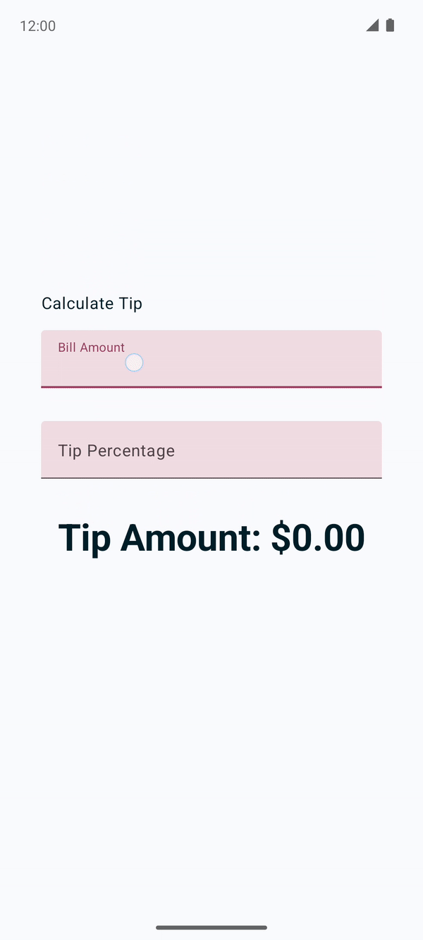
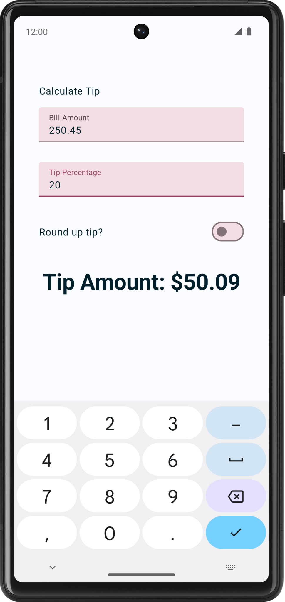
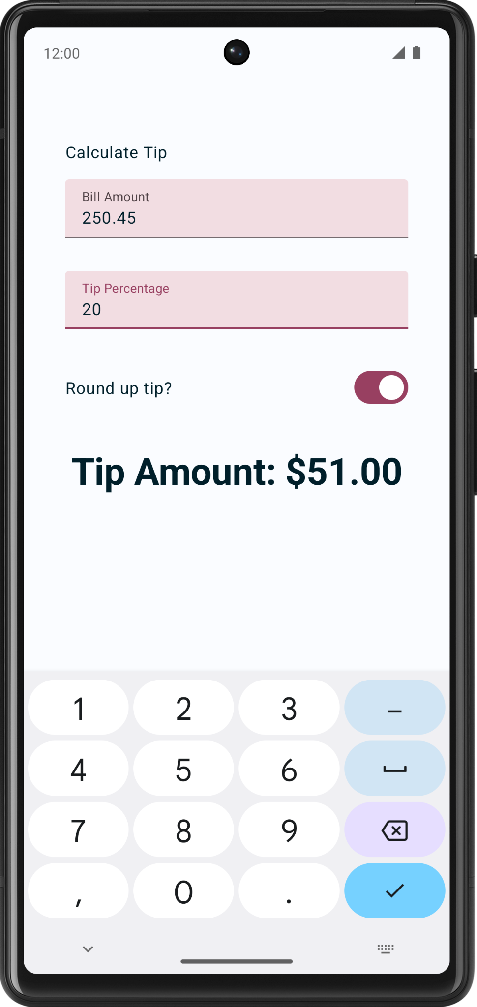
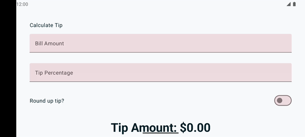
Tip calculator app
We’ll use the tip calculator app to learn about state.
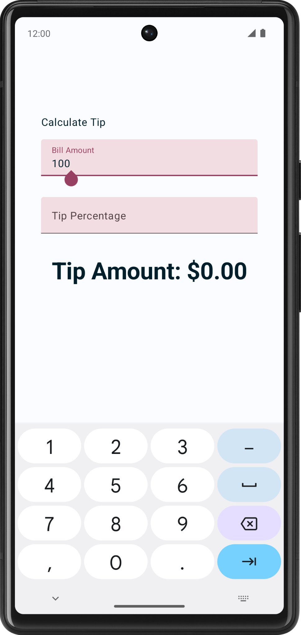
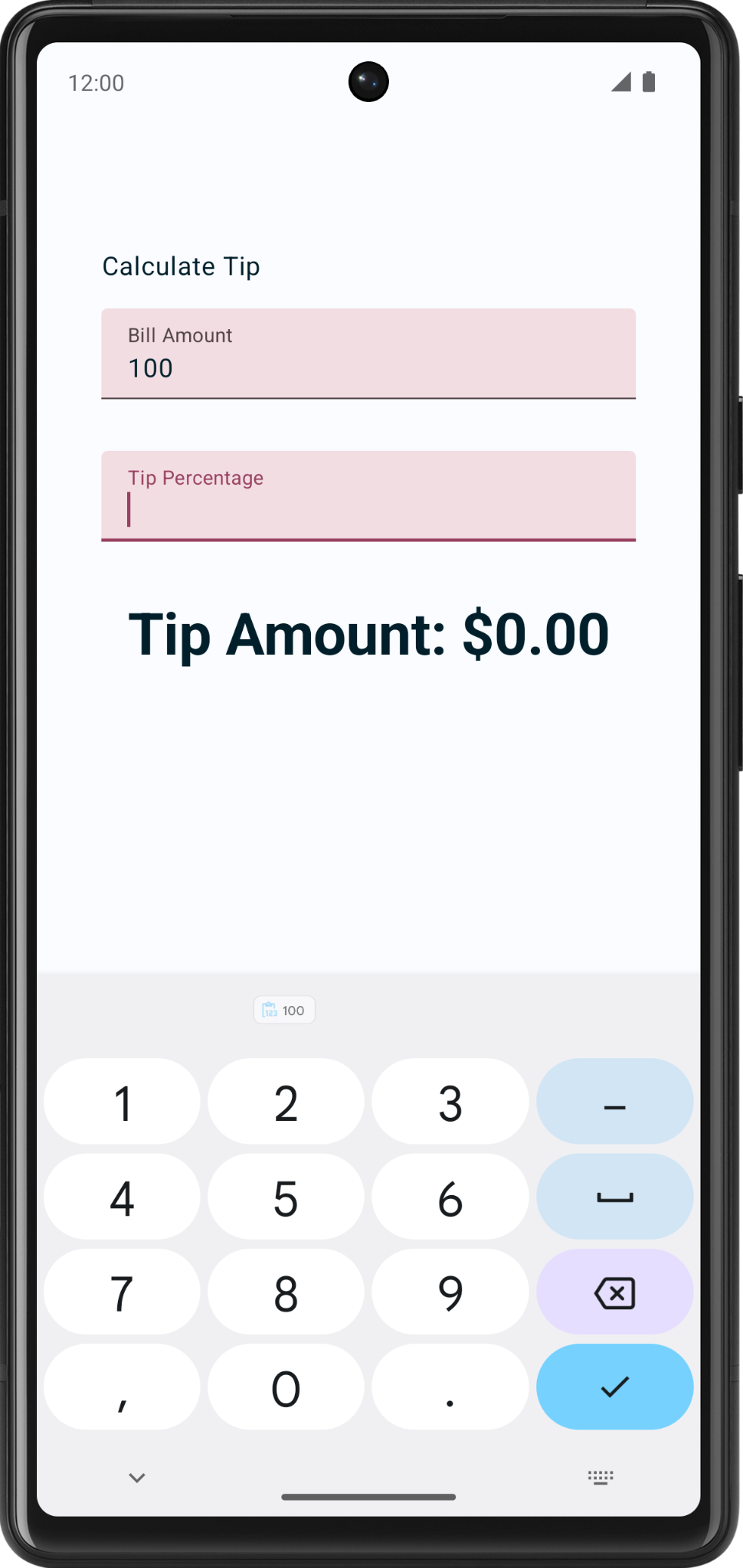
The tip calculator app has these built-in Compose UI elements:
A
TextFieldcomposable to enter and edit text.A
Textcomposable to display text.A
Spacercomposable to display empty space between UI elements.
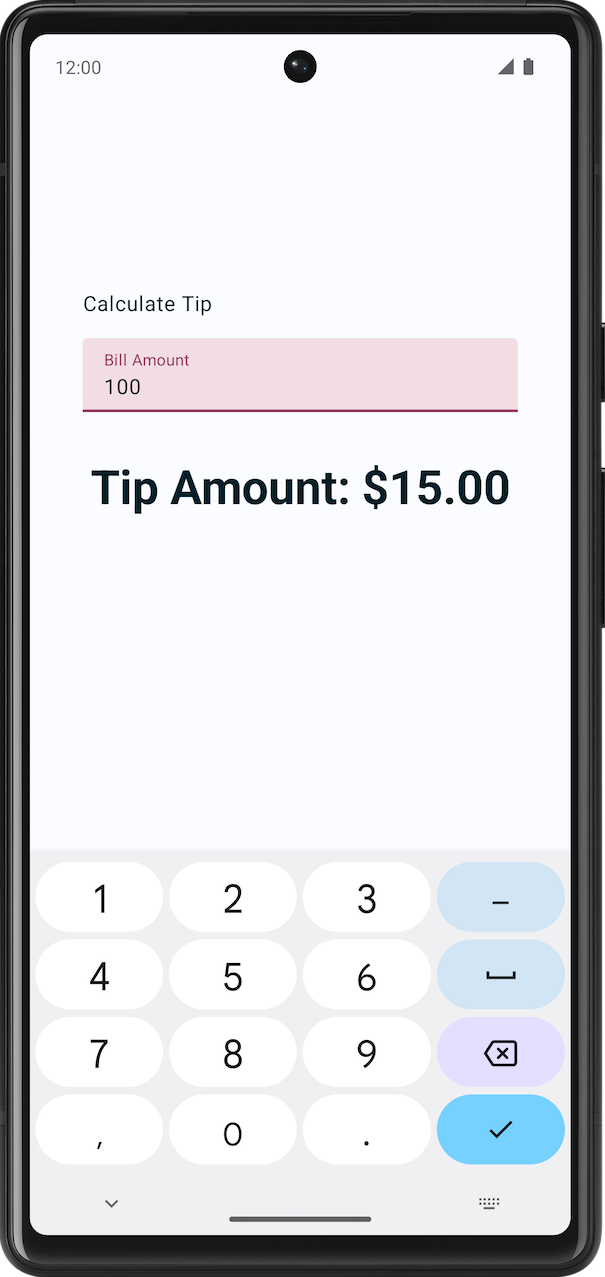
The tip calculator app automatically calculates the tip amount when you enter the service amount:
Solution code
Branch: main
Clone:
$ git clone https://github.com/google-developer-training/basic-android-kotlin-compose-training-tip-calculator.git
$ cd basic-android-kotlin-compose-training-tip-calculator
$ git checkout main
Solution code walkthrough
res/values/strings.xmlcontains the strings used in the app.<resources> <string name="app_name">Tip Time</string> <string name="calculate_tip">Calculate Tip</string> <string name="bill_amount">Bill Amount</string> <string name="how_was_the_service">Tip Percentage</string> <string name="round_up_tip">Round up tip?</string> <string name="tip_amount">Tip Amount: %s</string> </resources>
The
TipTimeLayout()composable contains the state, and the UI elements: text composables, number fields, etc.@Composable fun TipTimeLayout() { var amountInput by remember { mutableStateOf("") } var tipInput by remember { mutableStateOf("") } var roundUp by remember { mutableStateOf(false) } val amount = amountInput.toDoubleOrNull() ?: 0.0 val tipPercent = tipInput.toDoubleOrNull() ?: 0.0 val tip = calculateTip(amount, tipPercent, roundUp) Column( modifier = Modifier .statusBarsPadding() .padding(horizontal = 40.dp) .verticalScroll(rememberScrollState()) .safeDrawingPadding(), horizontalAlignment = Alignment.CenterHorizontally, verticalArrangement = Arrangement.Center ) { Text( text = stringResource(R.string.calculate_tip), modifier = Modifier .padding(bottom = 16.dp, top = 40.dp) .align(alignment = Alignment.Start) ) EditNumberField( label = R.string.bill_amount, leadingIcon = R.drawable.money, keyboardOptions = KeyboardOptions.Default.copy( keyboardType = KeyboardType.Number, imeAction = ImeAction.Next ), value = amountInput, onValueChanged = { amountInput = it }, modifier = Modifier.padding(bottom = 32.dp).fillMaxWidth(), ) EditNumberField( label = R.string.how_was_the_service, leadingIcon = R.drawable.percent, keyboardOptions = KeyboardOptions.Default.copy( keyboardType = KeyboardType.Number, imeAction = ImeAction.Done ), value = tipInput, onValueChanged = { tipInput = it }, modifier = Modifier.padding(bottom = 32.dp).fillMaxWidth(), ) RoundTheTipRow( roundUp = roundUp, onRoundUpChanged = { roundUp = it }, modifier = Modifier.padding(bottom = 32.dp) ) Text( text = stringResource(R.string.tip_amount, tip), style = MaterialTheme.typography.displaySmall ) Spacer(modifier = Modifier.height(150.dp)) } }
The
calculateTip()function takes as input the bill amount, the tip percentage, and whether to round up the tip. It outputs the tip amount.private fun calculateTip(amount: Double, tipPercent: Double = 15.0, roundUp: Boolean): String { var tip = tipPercent / 100 * amount if (roundUp) { tip = kotlin.math.ceil(tip) } return NumberFormat.getCurrencyInstance().format(tip) }
The TextField composable
The
TextFieldcomposable lets the user enter text in an app.The
EditNumberFieldcomposable contains aTextFieldcomposable. The parameterssingleLineandleadingIconare hard-coded, but the rest are up to the caller who callsEditNumberFieldto pass in. For this specific use case, it reduces code duplication: withoutEditNumberField, callers that useTextFieldwould have to repeat the samesingleLineandleadingIconparameters every time they calledTextField.@Composable fun EditNumberField( @StringRes label: Int, @DrawableRes leadingIcon: Int, keyboardOptions: KeyboardOptions, value: String, onValueChanged: (String) -> Unit, modifier: Modifier = Modifier ) { TextField( value = value, singleLine = true, leadingIcon = { Icon(painter = painterResource(id = leadingIcon), null) }, modifier = modifier, onValueChange = onValueChanged, label = { Text(stringResource(label)) }, keyboardOptions = keyboardOptions ) }
imports
import androidx.compose.material3.TextField
The
valueparameter is a text box that displays a string.singleLine = truecondenses the text box to a single, horizontally scrollable line from multiple lines.The
onValueChangeparameter is the lambda callback that’s triggered when the user enters text in the text box.keyboardOptionscan be used to configure the keyboard displayed on the screen to enter digits, email addresses, URLs, and passwords, etc.
About the EditNumberField parameters:
@StringResindicates that the integer to be passed is a string resource from thevalues/strings.xmlfile. These annotations are useful to developers who work on your code and for code-inspection tools like lint in Android Studio. TheDrawableResplays a similar role.In the Design pane, you should see something similar to:
Use state in Compose
State in an app is any value that can change over time. In this app, the state is the bill amount, tip amount, and whether to round up the tip. These are found in
TipTimeLayout():@Composable fun TipTimeLayout() { var amountInput by remember { mutableStateOf("") } var tipInput by remember { mutableStateOf("") } var roundUp by remember { mutableStateOf(false) } // ... }
The Composition
Compose is a declarative UI framework, meaning that you declare how the UI should look in your code. If you wanted your text box to show a 100 value initially, you’d set the initial value in the code for the composables to a 100 value.
What happens if you want your UI to change while the app is running or as the user interacts with the app? For example, what if you wanted to update the
amountInputvariable with the value entered by the user and display it in the text box? That’s when you rely on a process called recomposition to update the Composition of the app.The Composition is a description of the UI built by Compose when it executes composables. Compose apps call composable functions to transform data into UI. If a state change happens, Compose re-executes the affected composable functions with the new state, which creates an updated UI. This is called recomposition. Compose schedules a recomposition for you. “Schedules” means that Compose will put the changes on its “to-do” list and decide an appropriate time to update the UI.
When Compose runs your composables for the first time during initial composition, it keeps track of the composables that you call to describe your UI in a Composition. Recomposition is when Compose re-executes the composables that may have changed in response to data changes and then updates the Composition to reflect any changes.
The Composition can only be produced by an initial composition and updated by recomposition. The only way to modify the Composition is through recomposition. To do this, Compose needs to know what state to track so that it can schedule the recomposition when it receives an update. For example, wheneter the
amountInputvariable changes, Compose schedules a recomposition.The
StateandMutableStatetypes make state in the app observable. TheStatetype is immutable, while theMutableStatetype is mutable. ThemutableStateOf()function creates an observableMutableState. It receives an initial value as a parameter that is wrapped in aStateobject, which then makes its value observable.The value returned by the
mutableStateOf()function:Holds state, such as the bill amount.
Is mutable, so the value can be changed.
Is observable, so Compose observes any changes to the value and triggers a recomposition to update the UI.
Example: in
TipTimeLayout(), these are the state variables.var amountInput by remember { mutableStateOf("") } var tipInput by remember { mutableStateOf("") } var roundUp by remember { mutableStateOf(false) }
imports
import androidx.compose.runtime.MutableState
import androidx.compose.runtime.mutableStateOf
Compose keeps track of each composable that contains such state properties, and triggers a recomposition when their value changes.
Use remember to save state
Composable functions can be called many times because of recomposition. The composable resets its state during recomposition if it’s not saved.
Composable functions can store an object across recompositions with
remember. A value computed by therememberfunction is stored in the Composition during initial composition and the stored value is returned during recomposition. UsuallyrememberandmutableStateOffunctions are used together in composable functions to have the state and its updates be reflected properly in the UI.Example: in
TipTimeLayout(), these are the state variables; notice how remember is used here.var amountInput by remember { mutableStateOf("") } var tipInput by remember { mutableStateOf("") } var roundUp by remember { mutableStateOf(false) }
imports
import androidx.compose.runtime.remember
import androidx.compose.runtime.getValue
import androidx.compose.runtime.setValue
State hoisting
In a composable function, you can define variables that hold state to display in the UI. Composables should be stateless as far as possible. Notice that the
EditNumberFieldcomposable doesn’t contain any state at all; it relies on its caller to remember the state. TheEditNumberFieldcomposable is stateless because it doesn’t define or modify any state. It only displays the state passed to it as parameters.A stateless composable is a composable that doesn’t have a state, meaning it doesn’t hold, define, or modify a new state. On the other hand, a stateful composable is a composable that owns a piece of state that can change over time.
State hoisting is a pattern of moving state to its caller to make a component stateless. Example: this is how
EditNumberFieldmight look like if it were stateful:@Composable fun EditNumberField(modifier: Modifier = Modifier) { var amountInput by remember { mutableStateOf("") } val amount = amountInput.toDoubleOrNull() ?: 0.0 val tip = calculateTip(amount) TextField( value = amountInput, onValueChange = { amountInput = it }, label = { Text(stringResource(R.string.bill_amount)) }, modifier = Modifier.fillMaxWidth(), singleLine = true, keyboardOptions = KeyboardOptions(keyboardType = KeyboardType.Number) ) }
Hoisting the state would mean moving the
amountInputstate variable to the caller of theEditNumberField()composable. In this case, the caller is theTipTimeLayout()composable. This way, theEditNumberField()composable becomes stateless, and it relies on its caller to provide the state.In real apps, having a 100% stateless composable can be difficult to achieve depending on the composable’s responsibilities. You should design your composables in a way that they will own as little state as possible and allow the state to be hoisted when it makes sense, by exposing it in the composable’s API.
When applied to composables, hoisting state often means introducing two parameters to the composable:
A
value: Tparameter, which is the current value to display.An
onValueChange: (T) -> Unitcallback lambda, which is triggered when the value changes so that the state can be updated elsewhere, such as when a user enters some text in the text box.
Positional formatting
Positional formatting is used to display dynamic content in strings. This is similar to
printf()inC, andString.format()inJava.For example, in the
strings.xmlfile, the tip amount string resource has a placeholder argument%s:<string name="tip_amount">Tip Amount: %s</string>
In
TipTimeLayout(), theTextcomposable callsstringResource(R.string.tip_amount, tip)to format the string resource with thetipvariable. The%sis replaced by whatever the value oftipis.Text( text = stringResource(R.string.tip_amount, tip), style = MaterialTheme.typography.displaySmall )
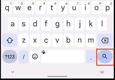
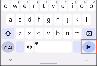
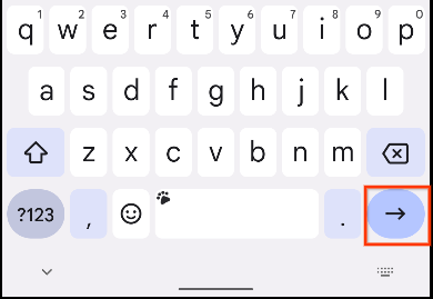
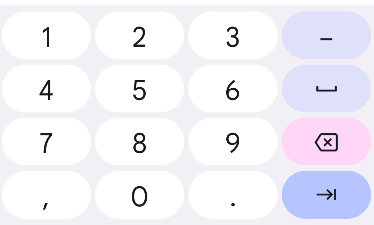
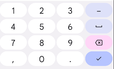
Set a keyboard action button
A keyboard action button is a button at the end of the keyboard. You can see some examples here:
In the app, there are two different action buttons for the text boxes:
A Next action button for the Bill Amount text box
A Done action button for the Tip Percentage text box
Examples of keyboards with these action buttons:
Example:
EditNumberField(
    label = R.string.bill_amount,
    leadingIcon = R.drawable.money,
    keyboardOptions = KeyboardOptions.Default.copy(
        keyboardType = KeyboardType.Number,
        imeAction = ImeAction.Next
    ),
    value = amountInput,
    onValueChanged = { amountInput = it },
    modifier = Modifier.padding(bottom = 32.dp).fillMaxWidth(),
)
EditNumberField(
    label = R.string.how_was_the_service,
    leadingIcon = R.drawable.percent,
    keyboardOptions = KeyboardOptions.Default.copy(
        keyboardType = KeyboardType.Number,
        imeAction = ImeAction.Done
    ),
    value = tipInput,
    onValueChanged = { tipInput = it },
    modifier = Modifier.padding(bottom = 32.dp).fillMaxWidth(),
)
What it looks like on the app:
The user flow:
Add a switch
A switch toggles the state of a single item on or off.
There are two states in a toggle switch that let the user select between two options. A toggle switch consists of a track, thumb and an optional icon as you can see in these images:
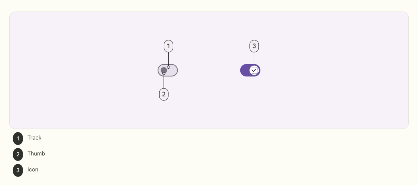
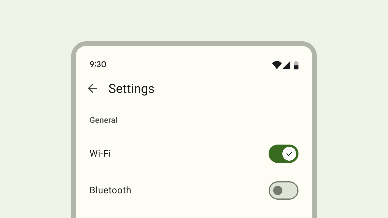
A switch is a selection control that can be used to enter decisions or declare preferences, such as settings as you can see in this image:
The user may drag the switch back and forth to choose the selected option, or simply tap the switch to toggle. You can see another example of a toggle here:
In the app, the
Switchcomposable is used so that the user can choose whether to round up the tip to the nearest whole number: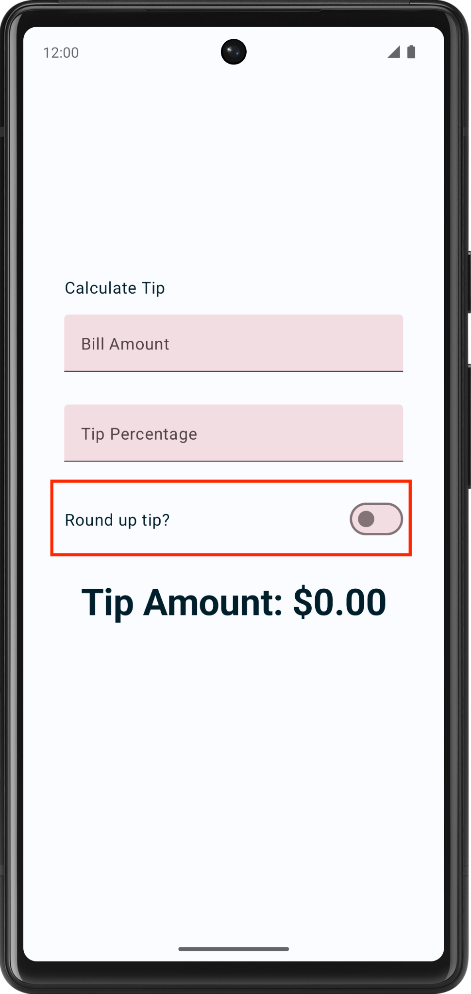
Example:
Row(
    modifier = modifier.fillMaxWidth(),
    verticalAlignment = Alignment.CenterVertically
) {
    Text(text = stringResource(R.string.round_up_tip))
    Switch(
        modifier = Modifier
            .fillMaxWidth()
            .wrapContentWidth(Alignment.End),
        checked = roundUp,
        onCheckedChange = onRoundUpChanged
    )
}
imports
import androidx.compose.material3.Switch
checked: whether the switch is checked. This is the state of the Switch composable.onCheckedChange: the callback to be called when the switch is clicked.
What it looks like:
Add vertical scrolling
The
verticalScroll()modifier helps the app to scroll vertically when the content is larger than the screen. This is useful for small screens, and it also helps when the phone is rotated to landscape mode.Example:
.verticalScroll(rememberScrollState())enables the column to scroll vertically. TherememberScrollState()creates and automatically remembers the scroll state.@Composable fun TipTimeLayout() { // ... Column( modifier = Modifier .padding(40.dp) .verticalScroll(rememberScrollState()), horizontalAlignment = Alignment.CenterHorizontally, verticalArrangement = Arrangement.Center ) { //... } }
imports
import androidx.compose.foundation.rememberScrollState
import androidx.compose.foundation.verticalScroll
It looks like this:
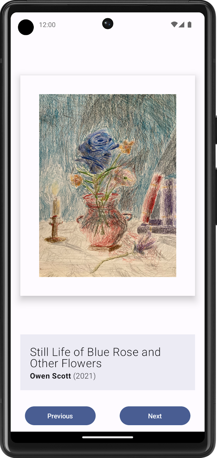
In-lesson practice: Art Space app
This is done during the lesson.
You’ll create your own digital art space — an app that displays an array of artwork that you can showcase.
Sample:

Here is an example of what the code might look like: https://github.com/dev-xero/art-space/blob/main/app/src/main/java/dev/codeninja/artspace/MainActivity.kt . If you’re not sure how to get started, you can have a look at this code first, understand how it works, and try writing your own code using this as a reference.
Build static UI with composables
Create a low-fidelity prototype
Low-fidelity (low-fi) prototype refers to a simple model, or drawing, that provides a basic idea of what the app looks like.
Think about what you want to display in your Art Space app and who the target audience is.
On your preferred medium, add elements that make up your app. Some elements to consider include:
Artwork image
Information about the artwork, such as its title, artist, and year of publication
Any other elements, such as buttons that make the app interactive and dynamic.
Put these elements in different positions and then evaluate them visually. Don’t worry about getting it perfect the first time. You can always settle on one design now and iteratively improve later.
Note
There are principles that help make design better for users, which is outside the scope of this project. To learn more, see Understanding layout.
You may come up with a low-fi design that looks like this image:
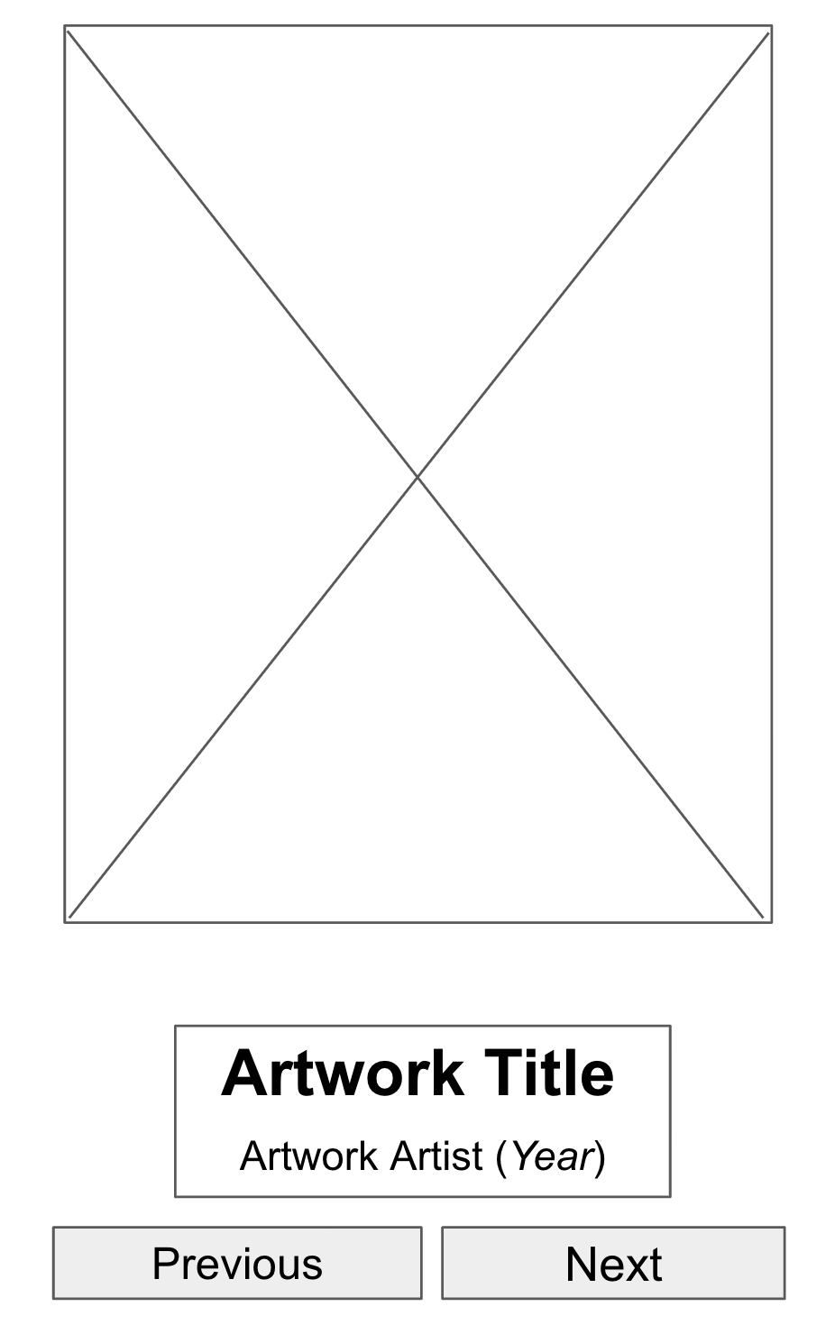
Placeholder elements in UI mockups help to visualize the end product.
Convert design into code
Use your prototype to help translate your design into code.
Identify UI elements needed to build your app.
For example, from the design example that you made, you need to have one
Imagecomposable, twoTextcomposables, and twoButtoncomposables in your code.Identify different logical sections of the apps and draw boundaries around them.
This step helps you divide your screen into small composables and think about the hierarchy of the composables.
In this example, you can divide the screen into three sections:
Artwork wall
Artwork descriptor
Display controller
You can arrange each of these sections with layout composables, such as a
RoworColumncomposable.
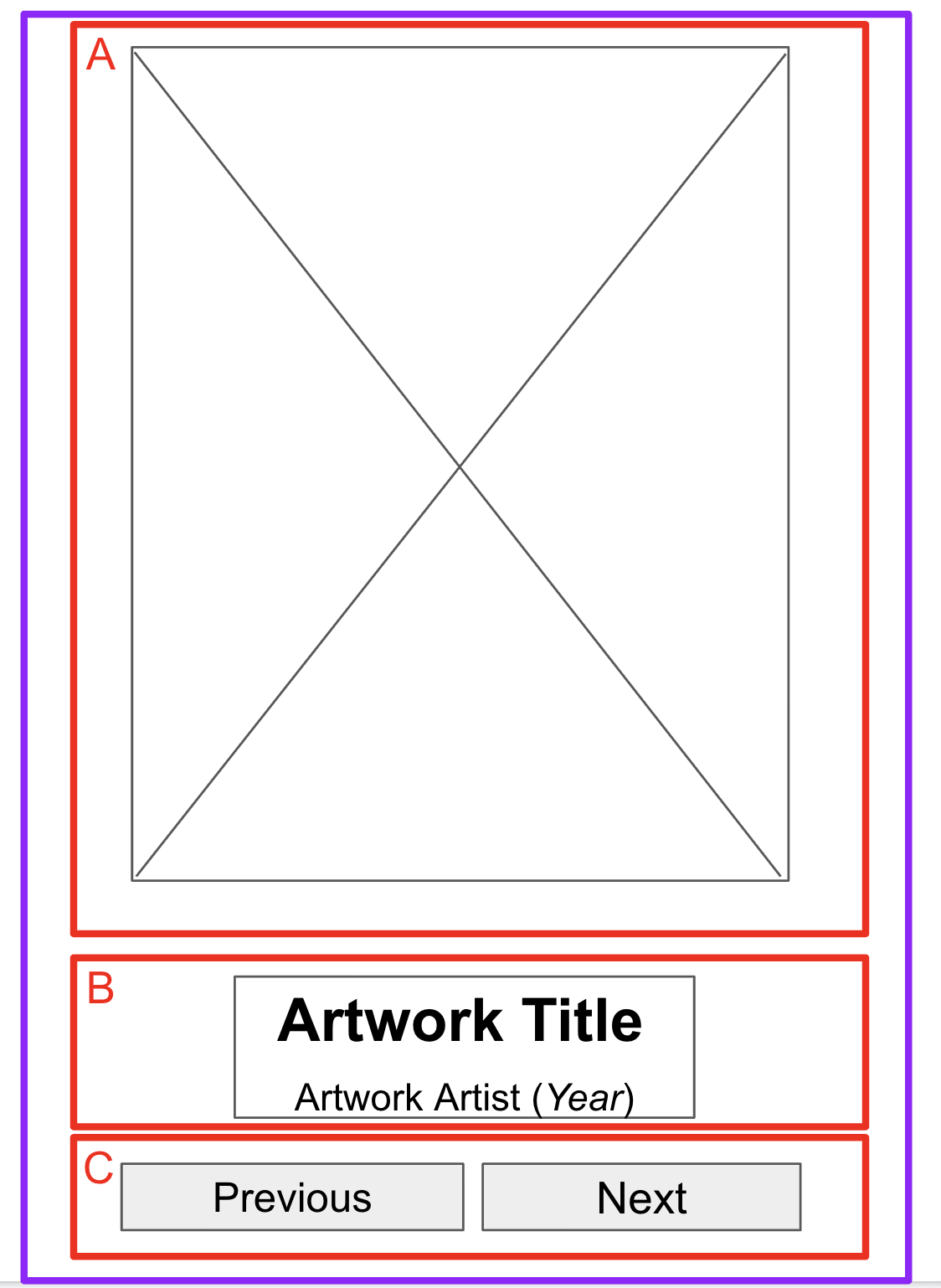
Boundaries around sections help developers conceptualize composables.
For each section of the app that contains multiple UI elements, draw boundaries around them. These boundaries help you see how one element relates to another in the section.
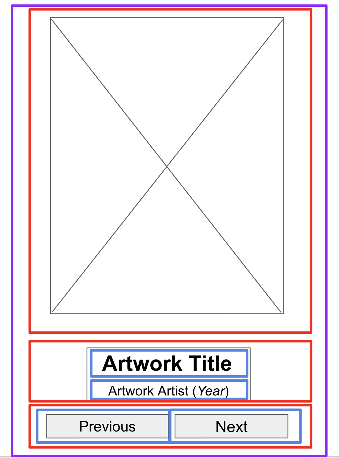
More boundaries around the text and buttons help developers arrange composables.
Now it’s easier to see how you can arrange composables, such as
TextandButtoncomposables, with layout composables.Some notes on various composables that you may use:
RoworColumncomposables: experiment with varioushorizontalArrangementandverticalAlignmentparameters inRowandColumncomposables to match the design that you have.Imagecomposables. Don’t forget to fill in thecontentDescriptionparameter. As mentioned in the previous codelab, TalkBack uses thecontentDescriptionparameter to help with the accessibility of the app. If theImagecomposable is only used for decorative purposes or there’s aTextelement that describes theImagecomposable, you can set thecontentDescriptionparameter to null.Textcomposables. You can experiment with various values offontSize,textAlign, andfontWeightto style your text. You may also use abuildAnnotatedStringfunction to apply multiple styles for a singleTextcomposable.Surfacecomposables. You can experiment with various values ofElevation,Color, andBorderStrokeforModifier.borderto create different UIs withinSurfacecomposables.Spacing and alignment. You can use
Modifierarguments, such aspaddingandweight, to help with the composables arrangement.
Note
For a simple app, you can style each UI element on its own. However, this approach creates overhead as you add more screens. Compose helps maintain design consistency through its implementation of Material Design. To learn more about Material Design and Material Theming, see Material Theming in Compose.
Run the app in an emulator or your Android device.
This app shows static content, but users can’t interact with it yet.
Make the app interactive
Create states for dynamic elements
Work on the part of the UI that shows the next or previous artwork upon a button tap.
First, identify the UI elements that need to change upon user interaction. In this case, the UI elements are the artwork image, artwork title, artist and year.
If necessary, create a state for each of the dynamic UI elements with the
MutableStateobject.Remember to replace hardcoded values with
statesdefined.Note
While you currently use one state for each dynamic UI element, this approach may not be the most efficient for code readability and performance of the app. You can potentially group related elements together as one entity and declare it as a single state, which you learn how to do with the
CollectionandDataclasses in future units. After you complete those concepts, you can return to this project and refactor your code with the concepts that you learned.
Write conditional logic for interaction
Think about the behavior you need when a user taps the buttons, beginning with the Next button.
When users tap the Next button, they should expect to see the next artwork in the sequence. For now it might be difficult to determine what’s the next artwork to be displayed.
Add identifiers, or IDs, in the form of sequential numbers that begin with 1 for each artwork. It’s now clear that the next artwork refers to the artwork that has the next ID in the sequence.
Because you don’t have an infinite number of artwork pieces, you may also want to determine the behavior of the Next button when you display the last artwork piece in your series. A common behavior is to go back to display the first artwork piece after the last artwork piece.
If there are three artwork pieces to show, the pseudocode for the logic for the Next button may look something like this code snippet:
if (current artwork is the first artwork) {
    // Update states to show the second artwork.
} else if (current artwork is the second artwork) {
    // Update states to show the third artwork.
} else if (current artwork is the last artwork) {
  // Update state to show the first artwork.
}
You may use the
whenstatement to build the conditional logic instead ofif elsestatements to make your code more readable when it manages a large number of artwork cases.For this logic to be executed upon a button tap, put it inside the
ButtoncomposablesonClick()argument.Repeat the same steps to construct the logic for the Previous button.
Run your app and then tap the buttons to confirm that they change the display to the previous or next artwork.
Week 3 Blended Learning Questions
What to do?
Individual work: place your responses to the questions in your Personal RefleXions doc (no need to share with teacher).
Team work: share responses, resolve differences, produce one set of responses as a team, place them in the Team RefleXions doc (share with teacher).
What are the strengths and weaknesses of using state hoisting?
#solulu
Strengths
Separation of concerns: composables mainly responsible for displaying UI elements, other code is responsible for the app logic.
Better code overview: easier to see all state variables at a glance, since they are in a central location. Example:
@Composable
fun ParentComponent() {
    // State is hoisted to the parent component, all state variables visible at a glance.
    var count by remember { mutableStateOf(0) }
    var isEnabled by remember { mutableStateOf(true) }
    var userName by remember { mutableStateOf("") }

    Column {
        ChildComponent(
            count = count,
            isEnabled = isEnabled,
            userName = userName,
            onCountChange = { count++ },
            onEnableChange = { isEnabled = !isEnabled },
            onUserNameChange = { userName = it }
        )
    }
}

@Composable
fun ChildComponent(
    count: Int,
    isEnabled: Boolean,
    userName: String,
    onCountChange: () -> Unit,
    onEnableChange: () -> Unit,
    onUserNameChange: (String) -> Unit
) {
    Column {
        Button(onClick = onCountChange, enabled = isEnabled) {
            Text("Increment Count")
        }
        Button(onClick = onEnableChange) {
            Text(if (isEnabled) "Disable" else "Enable")
        }
        Button(onClick = { onUserNameChange("New User") }) {
            Text("Change User")
        }
    }
}
Weaknesses:
May lead to parameters being passed down multiple levels of the hierarchy, even if some levels don’t use them. In React, this is called “prop drilling”. Example:
@Composable
fun ParentComponent(data: String) {
    ChildComponentA(data)
}

@Composable
fun ChildComponentA(data: String) {
    // Doesn't use data, passes it down to ChildComponentB
    ChildComponentB(data)
}

@Composable
fun ChildComponentB(data: String) {
    // Doesn't use data, passes it down to ChildComponentC
    ChildComponentC(data)
}

@Composable
fun ChildComponentC(data: String) {
    Text(text = data)
}
What are some scenarios when it may be better for a composable to be stateful, not stateless?
#solulu
When state is localized to that composable only, not shared with other composables.
For small components (like toggle buttons) - may make them simpler and more self-contained. Example:
@Composable
fun ToggleButton() {
    var isOn by remember { mutableStateOf(false) }
    Button(onClick = { isOn = !isOn }) {
        Text(if (isOn) "ON" else "OFF")
    }
}