Build a simple app with text composables
Before you begin
In this codelab, you use Jetpack Compose to build a simple Android app that displays a birthday message on the screen.
Prerequisites
How to create an app in Android Studio.
How to run an app on an emulator or your Android device.
What you’ll learn
How to write composable functions, such as Text, Column and Row composable functions.
How to display text in your app in a layout.
How to format the text, such as changing text size.
What you’ll build
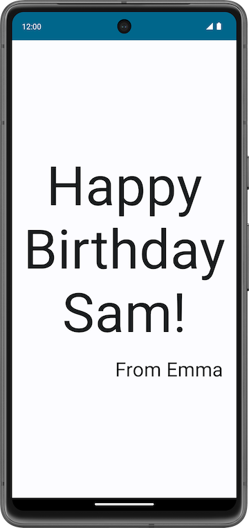
An Android app that displays a birthday greeting in text format, which looks like this screenshot when done:
What you’ll need
A computer with Android Studio installed
Set up a Happy Birthday app
In this task, you set up a project in Android Studio with the Empty Activity template and change the text message to a personalized birthday greeting.
Create an Empty Activity project
In the Welcome to Android Studio dialog, select New Project.
In the New Project dialog, select Empty Activity and then click Next.
In the Name field enter
Happy Birthdayand then select a minimum API level of 24 (Nougat) in the Minimum SDK field and click Finish.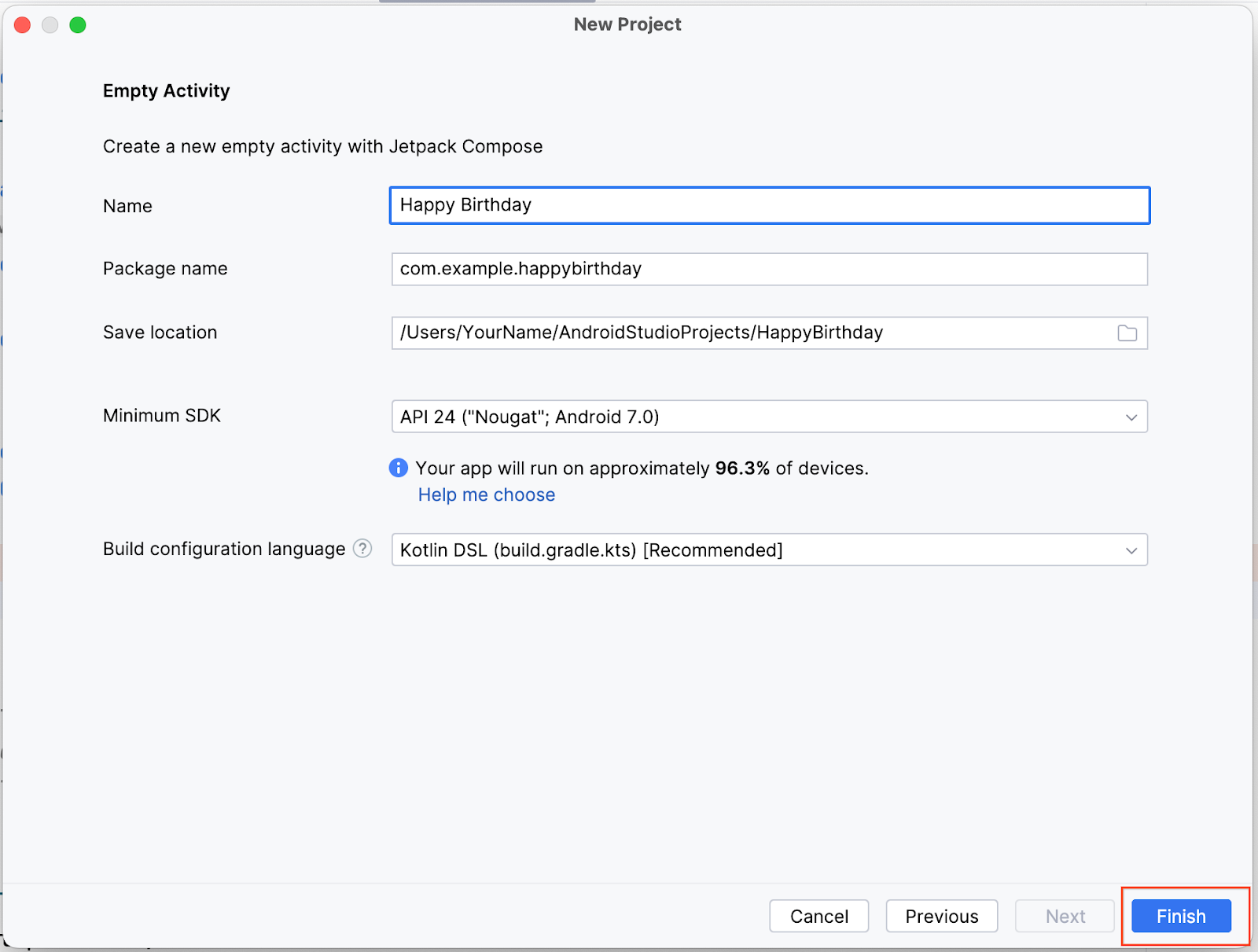
Wait for Android Studio to create the project files and build the project.
Click Run ‘app’. The app should look like this screenshot:
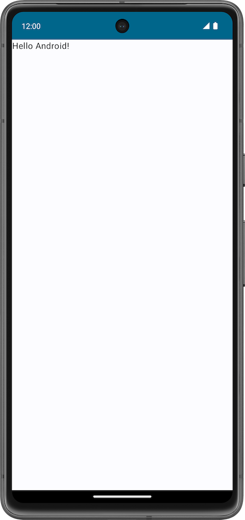
When you created this Happy Birthday app with the Empty Activity template, Android Studio set up resources for a basic Android app, including a Hello Android! message on the screen. In this codelab, you learn how that message gets there, how to change its text to a birthday greeting, and how to add and format additional messages.
What is a user interface (UI)?
The user interface (UI) of an app is what you see on the screen: text, images, buttons, and many other types of elements, and how it’s laid out on the screen. It’s how the app shows things to the user and how the user interacts with the app.
Almost everything you see on the screen of your app is a UI element (also known as a UI component). They can be interactive, like a clickable button or an editable input field, or they can be decorative images.
Each of these elements is called a UI component.
A clickable button:
A text message inside a Card:
A text input field:
In this codelab, you work with a UI element that displays text, called a
Textelement.
What is Jetpack Compose?
Jetpack Compose is a modern toolkit for building Android UIs. Compose simplifies and accelerates UI development on Android with less code, powerful tools, and intuitive Kotlin capabilities. With Compose, you can build your UI by defining a set of functions, called composable functions, that take in data and describe UI elements.
Composable functions
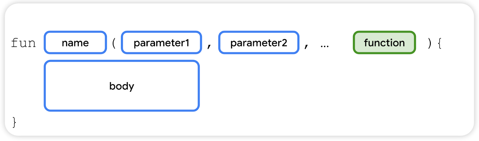
Composable functions are the basic building block of a UI in Compose. A composable function:
Describes some part of your UI.
Doesn’t return anything.
Takes some input, processes it, and displays something on the screen.
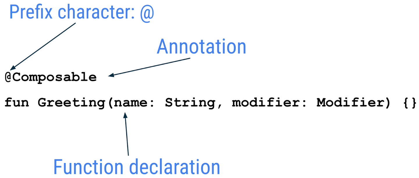
Annotations
Annotations are means of attaching extra information to code. This information helps other developers, and tools like the Jetpack Compose compiler, understand the app’s code.
An annotation is applied by prefixing its name (the annotation) with the
@character at the beginning of the declaration you are annotating. Different code elements, including properties, and functions, can be annotated.Example of an annotated function:
The following code snippet has examples of annotated properties. You will be using these in the coming codelabs.
// Example code, do not copy it over

@Json
val imgSrcUrl: String

@Volatile
private var INSTANCE: AppDatabase? = null
Annotations with parameters
Annotations can take parameters. Parameters provide extra information to the tools processing them.
Example:
@Previewannotation without parameters.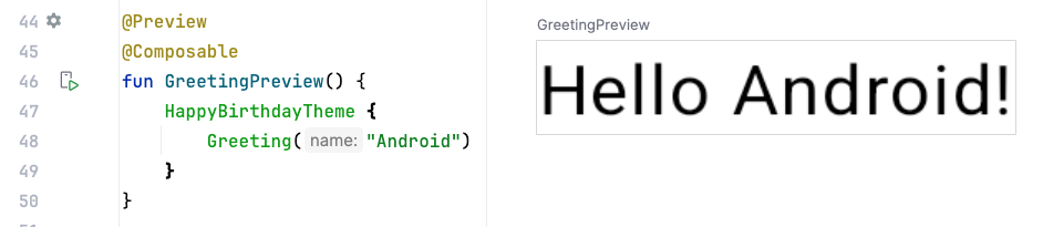
@Preview
@Composable
fun GreetingPreview() {
    HappyBirthdayTheme {
        Greeting("Sabrina")
    }
}
Example:
@Previewannotation with a background.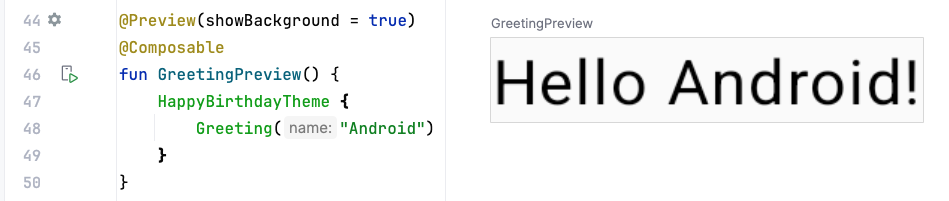
@Preview(showBackground = true)
@Composable
fun GreetingPreview() {
    HappyBirthdayTheme {
        Greeting("Sabrina")
    }
}
Example:
@Previewannotation with a preview title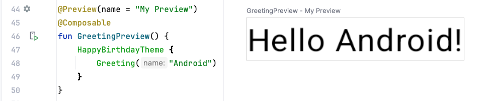
@Preview(name = "Feather")
@Composable
fun GreetingPreview() {
    HappyBirthdayTheme {
        Greeting("Sabrina")
    }
}
Example:
@Previewannotation with multiple arguments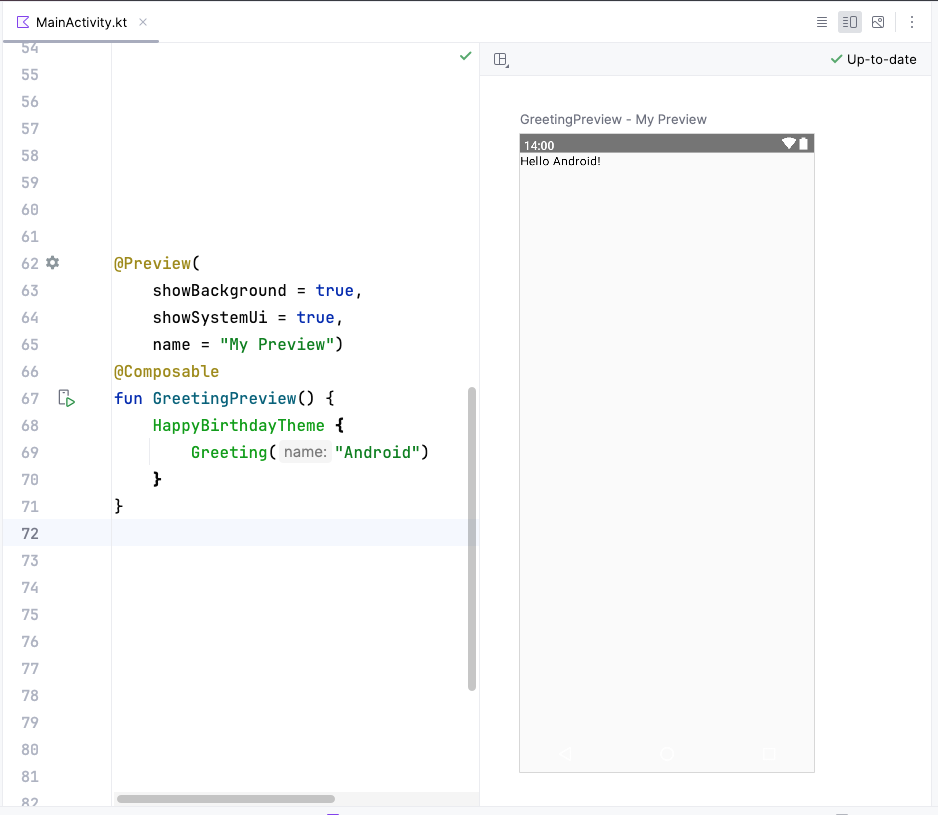
@Preview(showBackground = true, name = "Feather")
@Composable
fun GreetingPreview() {
    HappyBirthdayTheme {
        Greeting("Sabrina")
    }
}
Jetpack Compose includes a wide range of built-in annotations. You have already seen
@Composableand@Previewannotations so far.
Example of a composable function
A composable function is annotated with the
@Composableannotation. All composable functions must have this annotation. This annotation informs the Compose compiler that this function is intended to convert some data into UI elements. As a reminder, a compiler is a special program that takes the code you wrote, and translates it into something the computer can understand (machine language).This code snippet is an example of a simple composable function that is passed data (the
namefunction parameter) and uses it to render a text element on the screen.@Composable fun Greeting(name: String) { Text(text = "Hello $name!") }
Jetpack Compose is built around composable functions. These functions let you define your app’s UI programmatically by describing how it should look, rather than focusing on the process of the UI’s construction. To create a composable function, just add the
@Composableannotation to the function name.Composable functions can accept arguments, which let the app logic describe or modify the UI. In this case, your UI element accepts a
Stringso that it can greet the user by name.
Notice the composable functions in code
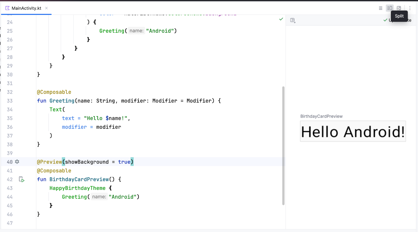
Scroll to the
GreetingPreview()function. This composable function helps preview theGreeting()function. As a good practice, functions should always be named describe their functionality. Change the name of this function toBirthdayCardPreview().@Preview(showBackground = true) @Composable fun BirthdayCardPreview() { HappyBirthdayTheme { Greeting("Sabrina") } }
Composable functions can call other composable functions. In this code snippet, the preview function is calling the
Greeting()composable function.Notice the function also has another annotation, a
@Previewannotation, which has ashowBackgroundparameter. More on that later.
Composable function names
A composable function MUST be named using Pascal case. Pascal case refers to a naming convention in which the first letter of each word in a compound word is capitalized. The difference between Pascal case and camel case is that all words in Pascal case are capitalized. In camel case, the first word can be in either case.
A Composable function:
MUST be a noun:
DoneButton()MAY be prefixed by descriptive adjectives:
RoundIcon()is NOT a verb or verb phrase:
DrawTextField()is NOT a nouned preposition:
TextFieldWithLink()is NOT an adjective:
Bright()is NOT an adverb:
Outside()
For more, see Naming Composable functions.
Example code:
// Do: This function is a descriptive PascalCased noun. It is a visual UI element
@Composable
fun FancyButton(text: String) {}


// Do: This function is a descriptive PascalCased noun. It is a non-visual element (it handles a button tap, but doesn't display anything)
@Composable
fun BackButtonHandler() {}


// Don't: This function is a noun but is not PascalCased!
@Composable
fun fancyButton(text: String) {}


// Don't: This function is PascalCased but is not a noun!
@Composable
fun RenderFancyButton(text: String) {}


// Don't: This function is neither PascalCased nor a noun!
@Composable
fun drawProfileImage(image: ImageAsset) {}
Design pane in Android Studio
Android Studio lets you preview your composable functions within the IDE, instead of installing the app to an Android device or emulator. You can preview them in the Design pane in Android Studio.
To preview a composable function, default values for parameters must be provided. For this reason, it is recommended not to preview the
Greeting()function directly. Instead, you need to add another function, theBirthdayCardPreview()function in this case, that calls theGreeting()function with an appropriate parameter.@Preview(showBackground = true) @Composable fun BirthdayCardPreview() { HappyBirthdayTheme { Greeting("Sabrina") } }
Note
Click Split to view both your code and design preview.
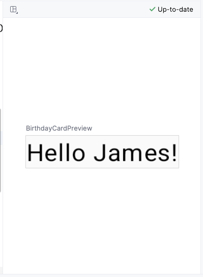
In
BirthdayCardPreview(), change the argument of theGreeting()function to your name.The preview should automatically update.
Important
The code you added to the
BirthdayCardPreview()function with the@Previewannotation is only for previewing in the Design pane in Android Studio. These changes aren’t reflected in the app. You learn how to make changes to the app later in this codelab.
Add a new text element
In this task, you’ll remove the
Hello $name!greeting and add a birthday greeting.
Add a new composable function
In
MainActivity.kt, delete theGreeting()function definition. You will add your own function to display the greeting in the codelab later. Remove the following code:@Composable fun Greeting(name: String, modifier: Modifier = Modifier) { Text( text = "Hello $name!", modifier = modifier ) }
Inside
onCreate()(look forsuper.onCreate(savedInstanceState)), notice that theGreeting()function call is now colored red, indicating an error. Hover over the cursor over this function call and Android Studio will display information regarding the error.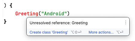
Delete the
Greeting()function call along with its arguments from theonCreate()andBirthdayCardPreview()functions. YourMainActivity.ktfile will look similar to this.Note
If your code uses
Scaffoldinstead ofSurface, just copy-paste the code below to replace theScaffoldwithSurface.You may also need to hover over
Surfaceand click Import to import the necessary classes. Same forMaterialTheme`.class MainActivity : ComponentActivity() { override fun onCreate(savedInstanceState: Bundle?) { super.onCreate(savedInstanceState) setContent { HappyBirthdayTheme { Surface( modifier = Modifier.fillMaxSize(), color = MaterialTheme.colorScheme.background ) { } } } } } @Preview(showBackground = true) @Composable fun BirthdayCardPreview() { HappyBirthdayTheme { } }
Before
BirthdayCardPreview(), add a new composable function calledGreetingText(). This composable function describes aTextcomposable.@Composable fun GreetingText() { }
It’s best practice to have your Composable accept a
Modifierparameter, and pass thatmodifierto its first child. You will learn more aboutModifierand child elements later. For now, add aModifierparameter to theGreetingText()function.@Composable fun GreetingText(modifier: Modifier = Modifier) { }
In
GreetingText(), add amessageparameter of typeString.@Composable fun GreetingText(message: String, modifier: Modifier = Modifier) { }
In
GreetingText(), add aTextcomposable, passing in a text message as a named argument.@Composable fun GreetingText(message: String, modifier: Modifier = Modifier) { Text( text = message ) }
The purpose of
GreetingText()is to display text in the UI. It does so by calling theText()composable function.
Preview the function
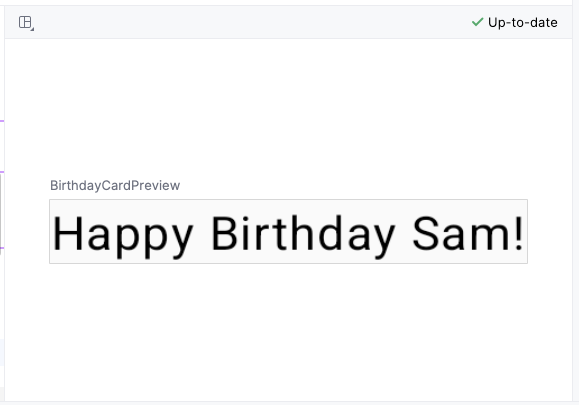
In this task you will preview the
GreetingText()function in the Design pane.Call the
GreetingText()function inside theBirthdayCardPreview()function.Pass a
Stringargument to theGreetingText()function, a birthday greeting to your friend. You can customize it with their name if you like, such as"Happy Birthday Sabrina!".@Preview(showBackground = true) @Composable fun BirthdayCardPreview() { HappyBirthdayTheme { GreetingText(message = "Happy Birthday Sam!") } }
The Design pane is updated automatically. Preview your changes.
Change font size
You added text to your user interface, but it doesn’t look like the final app yet. In this task, you learn how to change the size, text color, and other attributes that affect the appearance of the text element. You can also experiment with different font sizes and colors.
Scalable pixels (SP) is a unit of measure for the font size. UI elements in Android apps use two different units of measurement: density-independent pixels (DP), which you use later for the layout, and scalable pixels (SP). By default, the SP unit is the same size as the DP unit, but it resizes based on the user’s preferred text size under phone settings.
In
MainActivity.kt, scroll to theText()composable in theGreetingText()function.Pass the
Text()function afontSizeargument as a second named argument and set it to a value of100.sp.Text( text = message, fontSize = 100.sp )
Android Studio highlights the
.spcode because you need to import some classes or properties to compile your app. Hover over (or click).sp, then click Import in the popup to import theandroidx.compose.ui.unit.spto use the.spextension property (more on extension properties later).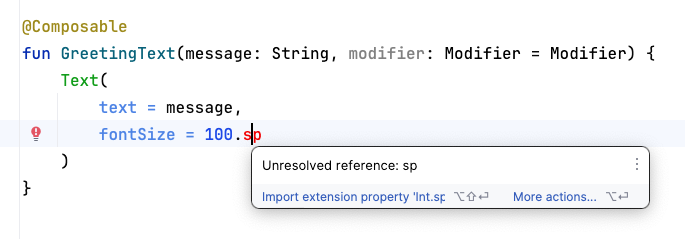
Note
The AndroidX (Android Extension) library contains a set of libraries and classes that help accelerate your app development, by providing you the core functionality. You can access the classes, properties, and other artifacts using the
androidxpackage.Scroll to the top of the file and notice the
importstatements, where you should see animport androidx.compose.ui.unit.spstatement, which means that Android Studio adds the package to your file.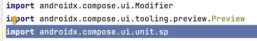
Note
If you encounter any problems with importing using Android Studio, you can manually add the imports at the top of the file.
Notice the updated preview of the font size. The text is overlapped. To fix it, set the line height.
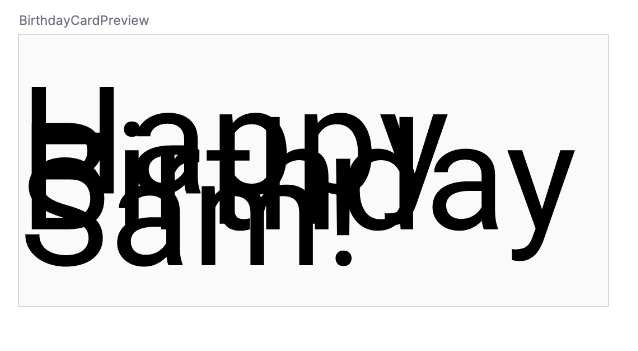
Note
The
spis an extension property forInt, which creates anspunit. Similarly, you can use the.spextension property in other data types, likeFloatandDouble.Update the
Textcomposable to include the line height.@Composable fun GreetingText(message: String, modifier: Modifier = Modifier) { Text( text = message, fontSize = 100.sp, lineHeight = 116.sp, ) }
Add another text element
In your previous tasks, you added a birthday-greeting message to your friend. In this task, you sign your card with your name.
Scroll to the
GreetingText()function.Pass the function a
fromparameter of typeStringfor your signature.fun GreetingText(message: String, from: String, modifier: Modifier = Modifier)
After the birthday message
Textcomposable, add anotherTextcomposable that accepts atextargument set to thefromvalue.@Composable fun GreetingText(message: String, from: String, modifier: Modifier = Modifier) { Text( text = message, fontSize = 100.sp, lineHeight = 116.sp, ) Text( text = from ) }
Add a
fontSizenamed argument set to a value of36.sp.Text( text = from, fontSize = 36.sp )
Scroll to the
BirthdayCardPreview()function. Add anotherStringargument to sign your card, such as"From Labubu".GreetingText(message = "Happy Birthday Sabrina!", from = "From Labubu")
A composable function might describe several UI elements. However, if you don’t provide guidance on how to arrange them, Compose might arrange the elements in a way that you don’t like. For example, the previous code generates two text elements that overlap each other because there’s no guidance on how to arrange the two composables.
In your next task, you will learn how to arrange the composables in a row and in a column.
Arrange the text elements in a row and column
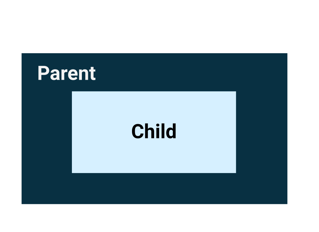
User Interface Hierarchy
The UI hierarchy is based on containment, meaning one component can contain one or more components, and the terms parent and child are sometimes used. The context here is that the parent UI elements contain children UI elements, which in turn can contain children UI elements. In this section, you will learn about Column, Row, and Box composables, which can act as parent UI elements.
The three basic, standard layout elements in Compose are
Column,Row, andBoxcomposables. You learn more about theBoxcomposable in the next codelab.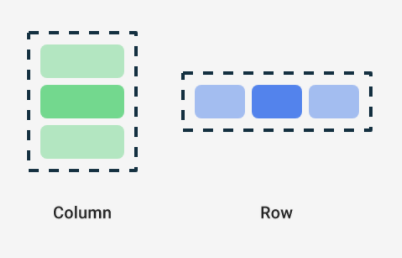
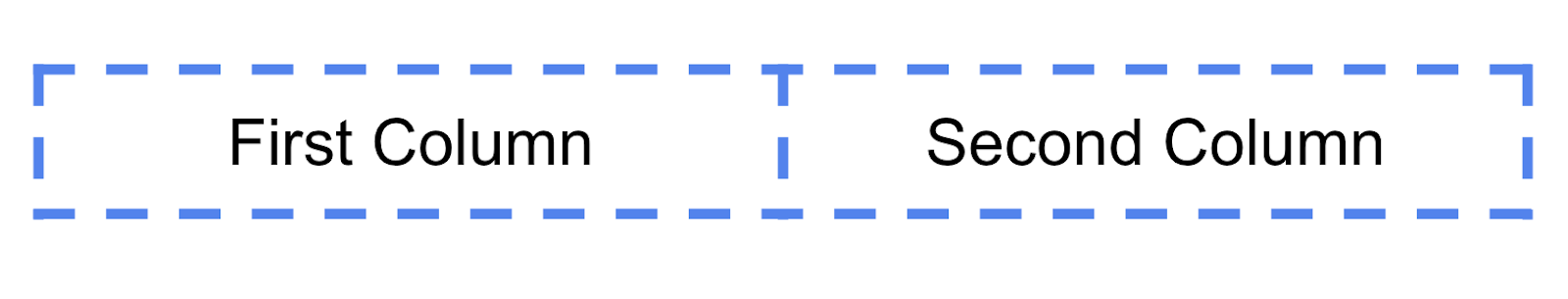
Column,Row, andBoxare composable functions that take composable content as arguments, so you can place items inside these layout elements. For example, each child element inside aRowcomposable is placed horizontally next to each other in a row.// Don't copy. Row { Text("First Column") Text("Second Column") }
These text elements display next to each other on the screen as seen in this image. The blue borders are only for demonstration purposes and don’t display.
Trailing lambda syntax
Notice in the previous code snippet that curly braces are used instead of parentheses in the Row composable function. This is called Trailing Lambda Syntax. You learn about lambdas and trailing lambda syntax in detail later in the course. For now, get familiar with this commonly used Compose syntax.
Kotlin offers a special syntax for passing functions as parameters to functions, when the last parameter is a function.
When you pass a function as that parameter, you can use trailing lambda syntax. Instead of putting the function inside the parentheses, you can place it outside the parentheses in curly braces. This is a recommended and common practice in Compose, so you need to be familiar with how the code looks.
For example, the last parameter in the
Row()composable function is thecontentparameter, a function that describes the child UI elements. Suppose you wanted to create a row that contains three text elements. This code would work, but it’s very cumbersome to use named parameters for the trailing lambda:Row( content = { Text("Some text") Text("Some more text") Text("Last text") } )
Because the
contentparameter is the last one in the function signature and you pass its value as a lambda expression (for now, it’s okay if you don’t know what a lambda is, just familiarize yourself with the syntax), you can remove thecontentparameter and the parentheses as follows:Row { Text("Some text") Text("Some more text") Text("Last text") }
Arrange the text elements in a row
In this task, you arrange the text elements in your app in a row to avoid overlap.
Scroll to the
GreetingText()function.Add the
Rowcomposable around the text elements so that it shows a row with two text elements. Select the twoTextcomposables, click on the light bulb. Select Surround with widget > Surround with Row.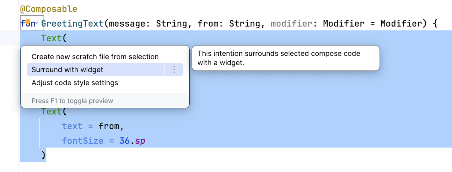
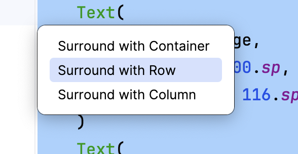
Now the function should look like this code snippet:
@Composable
fun GreetingText(message: String, from: String, modifier: Modifier = Modifier) {
    Row {
        Text(
            text = message,
            fontSize = 100.sp,
            lineHeight = 116.sp,
        )
        Text(
            text = from,
            fontSize = 36.sp
        )
    }
}
Android Studio auto imports the
Row()function for you. Scroll to the top and notice the import section, there should be a lineimport androidx.compose.foundation.layout.Row
Temporarily change the font size for the birthday message from
100.spto30.sp. Observe the updated preview in the Design pane.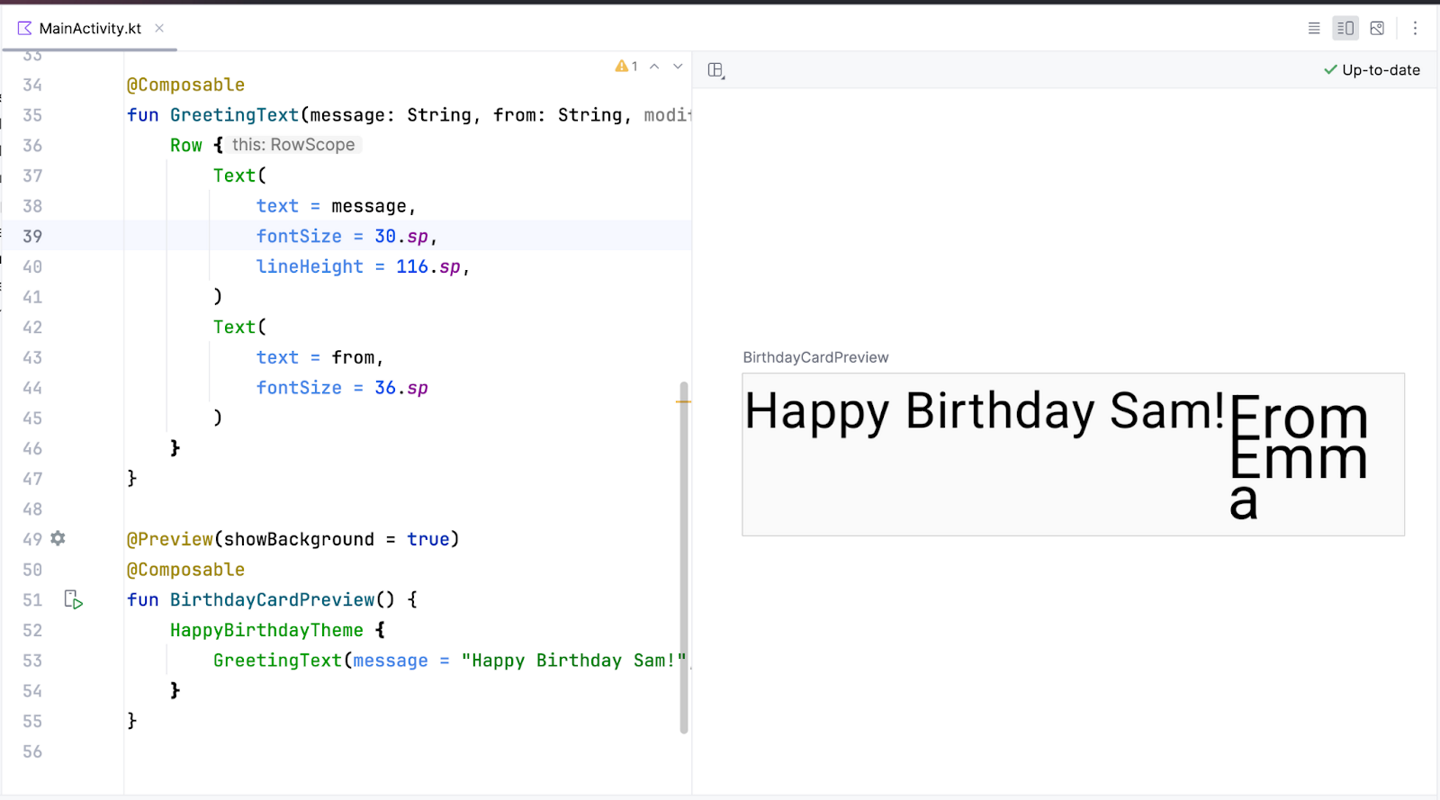
There’s no overlap now. However, this isn’t what you want because there’s not enough room for your signature. In your next task, you arrange the text elements in a column to resolve this issue.
Change the font size for the birthday message back to
100.sp.
Arrange the text elements in a column
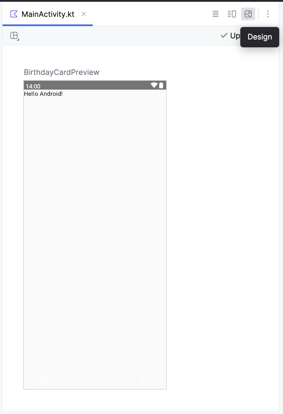
Now try this on your own: change the
GreetingText()function to arrange the text elements in a column. The preview should look like this screenshot: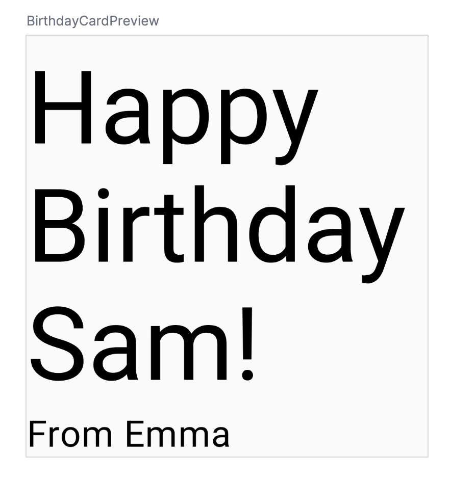
Here’s a sample solution code snippet:
@Composable
fun GreetingText(message: String, from: String, modifier: Modifier = Modifier) {
    Column {
        Text(
            text = message,
            fontSize = 100.sp,
            lineHeight = 116.sp,
        )
        Text(
            text = from,
            fontSize = 36.sp
        )
    }
}
You need to pass the
modifierparameter to the child element in the composables. In this case, the child element is theColumncomposable.@Composable fun GreetingText(message: String, from: String, modifier: Modifier = Modifier) { Column(modifier = modifier) { Text( text = message, fontSize = 100.sp, lineHeight = 116.sp, ) Text( text = from, fontSize = 36.sp ) } }
Add greeting to the app
It’s time to add the composable to your app on the emulator.
In
MainActivity.kt, scroll toonCreate().Call
GreetingText()from theScaffoldblock.Pass your birthday greeting and signature to
GreetingText().
The completed
onCreate()function should look like this code snippet:class MainActivity : ComponentActivity() { override fun onCreate(savedInstanceState: Bundle?) { super.onCreate(savedInstanceState) setContent { HappyBirthdayTheme { // A surface container using the 'background' color from the theme Surface( modifier = Modifier.fillMaxSize(), color = MaterialTheme.colorScheme.background ) { GreetingText(message = "Happy Birthday Sabrina!", from = "From Labubu") } } } } }
Build and run your app on the emulator.
Align greeting to the center
The steps here may require adding
importstatements. Whenever you see the text turn to red, hover over the code and click Import.To align the greeting in the center of the screen add a parameter called
verticalArrangement, set it toArrangement.Center. You will learn more aboutverticalArrangementlater.@Composable fun GreetingText(message: String, from: String, modifier: Modifier = Modifier) { Column( verticalArrangement = Arrangement.Center, modifier = modifier ) { // ... } }
Add
8.dppadding around the column. It is a good practice to use padding values in increments of4.dp.@Composable fun GreetingText(message: String, from: String, modifier: Modifier = Modifier) { Column( verticalArrangement = Arrangement.Center, modifier = modifier.padding(8.dp) ) { // ... } }
To further beautify your app, align the greeting text to the center using
textAlign.Text( text = message, fontSize = 100.sp, lineHeight = 116.sp, textAlign = TextAlign.Center )
Add padding to the signature and align it to the right. For
Alignment, import it fromandroidx.compose.ui.Text( text = from, fontSize = 36.sp, modifier = Modifier .padding(16.dp) .align(alignment = Alignment.End) )
Adopt good practice
It is a good practice to pass the modifier attributes along with the modifier from the parent composable. Update the modifier parameter in the
GreetingText().In
onCreate()Surface( //... ) { GreetingText( message = "Happy Birthday Sabrina!", from = "From Labubu", modifier = Modifier.padding(8.dp) ) }
In
GreetingText()@Composable fun GreetingText(message: String, from: String, modifier: Modifier = Modifier) { Column( verticalArrangement = Arrangement.Center, modifier = modifier ) { // ... } }
Build and run your app on the emulator to see the final result.
Get the solution code
The completed
MainActivity.kt:package com.example.happybirthday import android.os.Bundle import androidx.activity.ComponentActivity import androidx.activity.compose.setContent import androidx.compose.foundation.layout.Arrangement import androidx.compose.foundation.layout.Column import androidx.compose.foundation.layout.fillMaxSize import androidx.compose.foundation.layout.padding import androidx.compose.material3.MaterialTheme import androidx.compose.material3.Surface import androidx.compose.material3.Text import androidx.compose.runtime.Composable import androidx.compose.ui.Alignment import androidx.compose.ui.Modifier import androidx.compose.ui.text.style.TextAlign import androidx.compose.ui.tooling.preview.Preview import androidx.compose.ui.unit.dp import androidx.compose.ui.unit.sp import com.example.happybirthday.ui.theme.HappyBirthdayTheme class MainActivity : ComponentActivity() { override fun onCreate(savedInstanceState: Bundle?) { super.onCreate(savedInstanceState) setContent { HappyBirthdayTheme { // A surface container using the 'background' color from the theme Surface( modifier = Modifier.fillMaxSize(), color = MaterialTheme.colorScheme.background ) { GreetingText( message = "Happy Birthday Sabrina!", from = "From Labubu", modifier = Modifier.padding(8.dp) ) } } } } } @Composable fun GreetingText(message: String, from: String, modifier: Modifier = Modifier) { Column( verticalArrangement = Arrangement.Center, modifier = modifier ) { Text( text = message, fontSize = 100.sp, lineHeight = 116.sp, textAlign = TextAlign.Center ) Text( text = from, fontSize = 36.sp, modifier = Modifier .padding(16.dp) .align(alignment = Alignment.End) ) } } @Preview(showBackground = true) @Composable fun BirthdayCardPreview() { HappyBirthdayTheme { GreetingText(message = "Happy Birthday Sabrina!", from = "From Labubu") } }
Conclusion
You created your Happy Birthday app.
In the next codelab, you add a picture to your app, and change the alignment of the text elements to beautify it.
Jetpack Compose is a modern toolkit for building Android UI. Jetpack Compose simplifies and accelerates UI development on Android with less code, powerful tools, and intuitive Kotlin APIs.
The user interface (UI) of an app is what you see on the screen: text, images, buttons, and many other types of elements.
Composable functions are the basic building block of Compose. A composable function is a function that describes some part of your UI.
The Composable function is annotated with the
@Composableannotation; this annotation informs the Compose compiler that this function is intended to convert data into UI.The three basic standard layout elements in Compose are
Column,Row, andBox. They are Composable functions that take Composable content, so you can place items inside. For example, each child within aRowwill be placed horizontally next to each other.