Unit 3 Pathway 2 Activity 3: Change the app icon
Before you begin
An app icon is an important way to differentiate your app by adding a distinct style and appearance. The app icon appears in a number of places, including the Home screen, the All Apps screen, and the Settings app.
You may also hear an app icon referred to as a launcher icon. Launcher refers to the experience when you hit the Home button on an Android device to view and organize your apps, add widgets and shortcuts, and more.
If you’ve used different Android devices, you may have noticed that the launcher experience may look different, depending on the device manufacturer.
Sometimes device manufacturers create a custom launcher experience that’s signature to their brand. For example, they may display all the app icons in a square shape, rounded square, or squircle (between a square and circle).
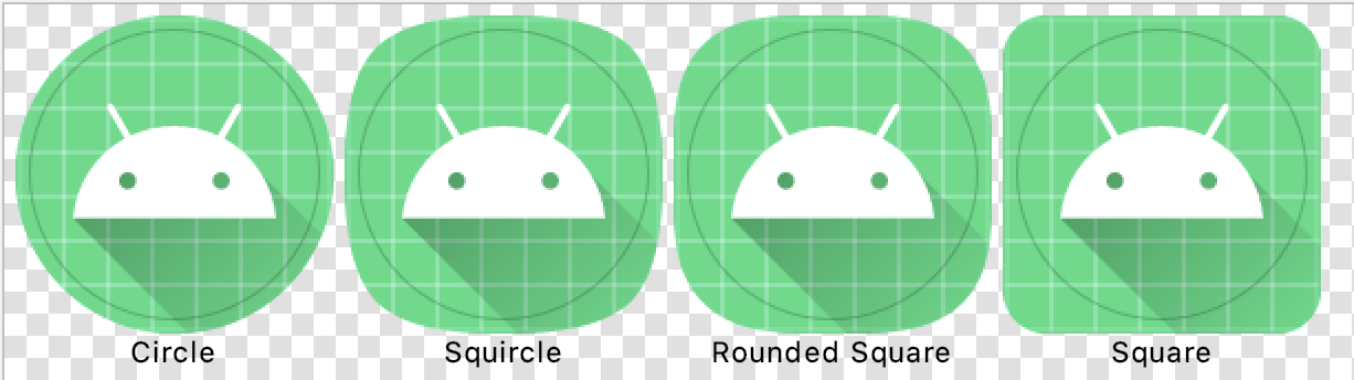
Regardless of the shape the device manufacturer chooses, the goal is for all the app icons on a single device to have a uniform shape for a consistent user experience.
That’s why the Android platform introduced support for adaptive icons (as of API level 26). By implementing an adaptive icon for your app, your app is able to accommodate a large range of devices by tailoring the launcher icon based on a device’s display.
This codelab provides you with image source files for the Affirmations app launcher icon. You will use a tool in Android Studio, called Image Asset Studio, to generate different versions of the launcher icons. Afterwards, you can take what you learned and apply it to app icons for other apps!

Prerequisites
Able to navigate the files of a basic Android project, including the resource files.
Able to install an Android app from Android Studio on the emulator or physical device.
What you’ll learn
How to change the launcher icon of an app.
How to use Image Asset Studio in Android Studio to generate launcher icon assets.
What an adaptive icon is and why it’s two layers.
What you’ll make
A custom launcher icon for the Affirmations app.
What you need
A computer with the latest stable version of Android Studio installed.
An internet connection to download the image resource files.
Access to GitHub
Download the starter code
Starter code: https://github.com/google-developer-training/basic-android-kotlin-compose-training-affirmations/tree/intermediate
Branch: intermediate
Launcher Icons
The goal is for your launcher icon to look crisp and clear, regardless of the device model or screen density. Screen density refers to how many pixels per inch or dots per inch (dpi) are on the screen. For a medium-density device (mdpi), there are 160 dots per inch on the screen, while an extra-extra-extra-high-density device (xxxhdpi) has 640 dots per inch on the screen.
To account for devices across a range of screen densities, you’ll need to provide different versions of your app icon.
Explore launcher icon files
In the Project window, switch to the Project view. This shows you the file structure of your project.
Navigate to the resources folder (
app/src/main/res) and expand some of themipmapfolders. Thesemipmapfolders are where you will put the launcher icon assets for your Android app.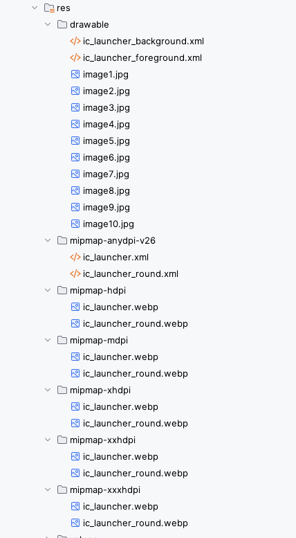
The
drawablefolders contain the vectors for the launcher icon in XML files. A vector, in the case of a drawable icon, is a series of instructions that draw an image when it is compiled.mdpi,hdpi,xhdpi, etc., are density qualifiers that you can append onto the name of a resource folder, likemipmap, to indicate that they are resources for devices of a certain screen density. Below is a list of density qualifiers on Android:mdpi- resources for medium-density screens (~160 dpi)hdpi- resources for high-density screens (~240 dpi)xhdpi- resources for extra-high-density screens (~320 dpi)xxhdpi- resources for extra-extra-high-density screens (~480 dpi)xxxhdpi- resources for extra-extra-extra-high-density screens (~640 dpi)nodpi- resources that are not meant to be scaled, regardless of the screen’s pixel densityanydpi- resources that scale to any density
Note
You may wonder why launcher icon assets are located in
mipmapdirectories, separate from other app assets located indrawabledirectories. This is because some launchers may display your app icon at a larger size than what’s provided by the device’s default density bucket. For example, on anhdpidevice, a certain device launcher may use thexhdpiversion of the app icon instead. These directories hold the icons that account for devices that require icons with a density that is higher or lower than the default density.If you open the image files, you’ll see a preview. The
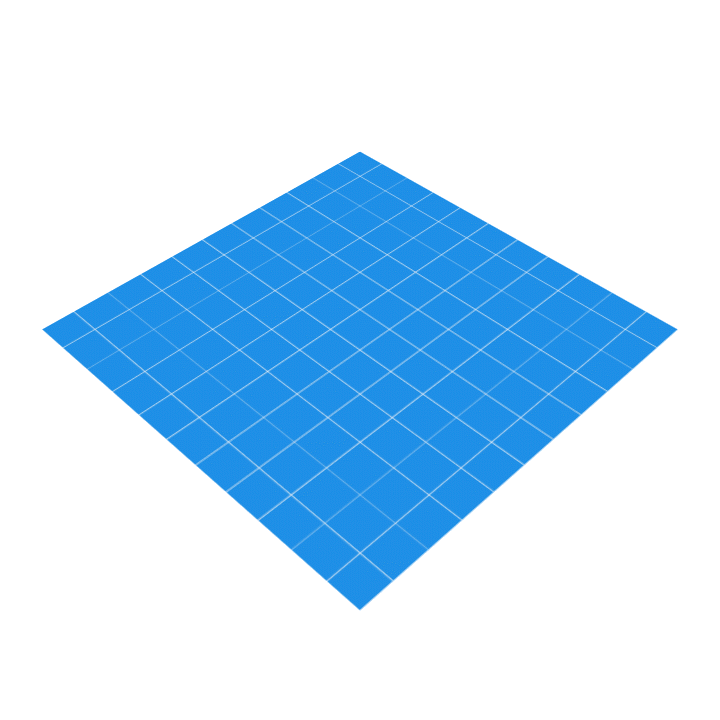
ic_launcher.webpfiles contain the square version of the icon, while theic_launcher_round.webpfiles contain the circular version of the icon. Both are provided in each mipmap folder.For example, this is what
res/mipmap-xxxhdpi/ic_launcher_round.webplooks like. Notice the size of the asset is in the top right. This image is 192x192 pixels in size.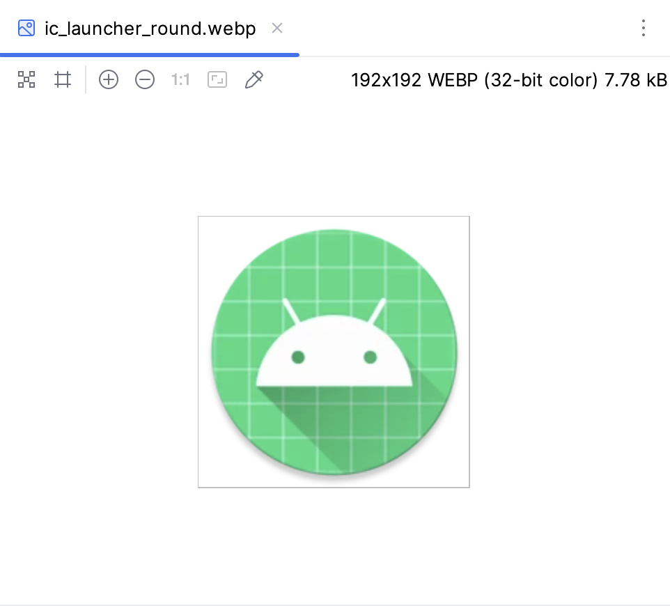
This is what
res/mipmap-mdpi/ic_launcher_round.webplooks like. It’s only 48x48 pixels in size.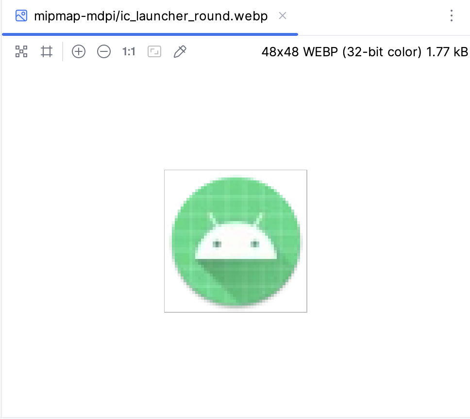
As you can see, these bitmap image files are composed of a fixed grid of pixels. They were created for a certain screen resolution. Hence, the quality can degrade as you resize them.
Note
To avoid a blurry app icon, be sure to provide different bitmap images of the icon for each density bucket (
mdpi,hdpi,xhdpi, etc.). Note that device screen densities won’t be precisely 160 dpi, 240 dpi, 320 dpi, etc. Based on the device’s screen density, Android selects the resource at the closest larger density bucket and then scales it down.Now that you have some background on launcher icons, you’ll learn about adaptive icons.
Adaptive Icons
Foreground and Background Layers
As of the Android 8.0 release (API level 26), there is support for adaptive icons, which allows for more flexibility and interesting visual effects. For developers, that means that your app icon is made up of two layers: a foreground layer and a background layer.
In the above example, the white Android icon is in the foreground layer, while the blue and white grid is in the background layer. The foreground layer is stacked on top of the background layer. A mask (circular in this case), is then applied on top to produce a circular shaped app icon.
Explore adaptive icon files
Look at the default adaptive icon files already provided in your Affirmations app code.
In the Project window of Android Studio, find and expand the
res/mipmap-anydpi-v26resource folder.
Note
Adaptive icons were added in API level 26 of the platform, so they should be declared in the
mipmapresource folder that has the -v26 resource qualifier on it. That means the resources in this folder will only be applied on devices that are running API 26 (Android 8.0) or higher. The resource files in this folder are ignored on devices running version 25 or older in favor of the density bucketed mipmap directories.Open the
ic_launcher.xmlfile. In the Code view, you will see this:<?xml version="1.0" encoding="utf-8"?> <adaptive-icon xmlns:android="http://schemas.android.com/apk/res/android"> <background android:drawable="@drawable/ic_launcher_background"/> <foreground android:drawable="@drawable/ic_launcher_foreground"/> <monochrome android:drawable="@drawable/ic_launcher_foreground"/> </adaptive-icon>
Note
If you see a pic instead, switch to the Code view.
Notice how the
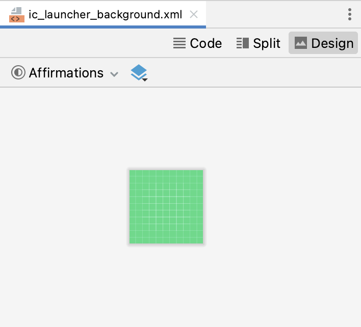
<adaptive-icon>element is used to declare the<background>and<foreground>layers of the app icon by providing resource drawables for each.Go back to the Project view and locate the background and foreground drawables:
res/drawable/ic_launcher_background.xmlandres/drawable/ic_launcher_foreground.xml.Switch to Design view to see a preview of each:
Background:
Foreground:
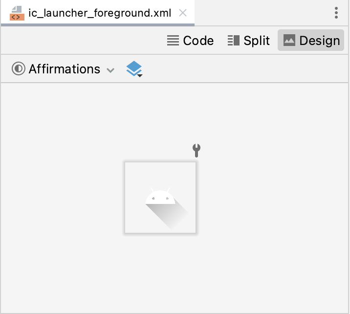
These are both vector drawable files. They don’t have a fixed size in pixels. If you switch to Code view, you can see the XML declaration for the vector drawable using the
<vector>element. Inic_launcher_foreground.xml:<!-- Copyright (C) 2023 The Android Open Source Project Licensed under the Apache License, Version 2.0 (the "License"); you may not use this file except in compliance with the License. You may obtain a copy of the License at https://www.apache.org/licenses/LICENSE-2.0 Unless required by applicable law or agreed to in writing, software distributed under the License is distributed on an "AS IS" BASIS, WITHOUT WARRANTIES OR CONDITIONS OF ANY KIND, either express or implied. See the License for the specific language governing permissions and limitations under the License. --> <vector xmlns:android="http://schemas.android.com/apk/res/android" xmlns:aapt="http://schemas.android.com/aapt" android:width="108dp" android:height="108dp" android:viewportWidth="108" android:viewportHeight="108"> <path android:pathData="M31,63.928c0,0 6.4,-11 12.1,-13.1c7.2,-2.6 26,-1.4 26,-1.4l38.1,38.1L107,108.928l-32,-1L31,63.928z"> <aapt:attr name="android:fillColor"> <gradient android:endX="85.84757" android:endY="92.4963" android:startX="42.9492" android:startY="49.59793" android:type="linear"> <item android:color="#44000000" android:offset="0.0" /> <item android:color="#00000000" android:offset="1.0" /> </gradient> </aapt:attr> </path> <path android:fillColor="#FFFFFF" android:fillType="nonZero" android:pathData="M65.3,45.828l3.8,-6.6c0.2,-0.4 0.1,-0.9 -0.3,-1.1c-0.4,-0.2 -0.9,-0.1 -1.1,0.3l-3.9,6.7c-6.3,-2.8 -13.4,-2.8 -19.7,0l-3.9,-6.7c-0.2,-0.4 -0.7,-0.5 -1.1,-0.3C38.8,38.328 38.7,38.828 38.9,39.228l3.8,6.6C36.2,49.428 31.7,56.028 31,63.928h46C76.3,56.028 71.8,49.428 65.3,45.828zM43.4,57.328c-0.8,0 -1.5,-0.5 -1.8,-1.2c-0.3,-0.7 -0.1,-1.5 0.4,-2.1c0.5,-0.5 1.4,-0.7 2.1,-0.4c0.7,0.3 1.2,1 1.2,1.8C45.3,56.528 44.5,57.328 43.4,57.328L43.4,57.328zM64.6,57.328c-0.8,0 -1.5,-0.5 -1.8,-1.2s-0.1,-1.5 0.4,-2.1c0.5,-0.5 1.4,-0.7 2.1,-0.4c0.7,0.3 1.2,1 1.2,1.8C66.5,56.528 65.6,57.328 64.6,57.328L64.6,57.328z" android:strokeWidth="1" android:strokeColor="#00000000" /> </vector>
While a vector drawable and a bitmap image both describe a graphic, there are important differences.
A bitmap image doesn’t understand much about the image that it holds, except for the color information at each pixel. On the other hand, a vector graphic knows how to provide instructions to draw the shapes that define an image. These instructions are composed of a set of points, lines, and curves along with color information. The advantage is that a vector graphic can be scaled for any canvas size, for any screen density, without losing quality.
A vector drawable is Android’s implementation of vector graphics, intended to be flexible on mobile devices. You can define them in XML with these possible elements. Instead of providing versions of a bitmap asset for all density buckets, you only need to define the image once. Thus, reducing the size of your app and making it easier to maintain.
Note
There are tradeoffs to using a vector drawable versus a bitmap image. For example, icons can be ideal as vector drawables because they are made up of simple shapes, while a photograph would be harder to describe as a series of shapes. It would be more efficient to use a bitmap asset in that case.
Now it’s time to move on to actually changing the app icon!
Download new assets
Download the following two new assets that enable you to create an adaptive icon for the Affirmations app. You don’t need to worry about understanding every detail of the vector drawable files. Their contents are auto-generated for you from design tools.
Download ic_launcher_background.xml, which is the vector drawable for the background layer. If your browser shows the file instead of downloading it, select File > Save Page As… to save it to your computer.
Download ic_launcher_foreground.xml, which is the vector drawable for the foreground layer.
Note that there are certain requirements for these foreground and background layer assets, such as both must be 108 dpi x 108 dpi in size. You can view more details in the AdaptiveIconDrawable docs and you can also view design guidance on Android icons on the Material Design site.
Because the edges of your icon could get clipped, depending on the shape of the mask from the device manufacturer, it’s important to put the key information about your icon in the “safe zone.” The safe zone is a circle of diameter 66 dpi in the center of the foreground layer. The content outside of the safe zone should not be essential, such as the background color, and okay if it gets clipped.
Change the app icon
Go back to Android Studio to use the new assets you just downloaded.
First, delete the old drawable resources that contain the Android icon and green grid background. In the Project view, right-click on the file and choose Delete. Delete:
drawable/ic_launcher_background.xmldrawable/ic_launcher_foreground.xmlmipmap-anydpi-v26/mipmap-hdpi/mipmap-mdpi/mipmap-xhdpi/mipmap-xxhdpi/mipmap-xxxhdpi/
You can uncheck the box Safe delete (with usage search) and click OK. The Safe delete (with usage search) feature searches the code for usages of the resource you are about to delete. In this case, you will replace these folders with new ones of the same name, so you don’t need to worry about Safe delete.
Create a new Image Asset. You can either right-click on the
resfolder and choose New > Image Asset, or you can click on the Resource Manager tab, click the + icon, then select Image Asset from the dropdown.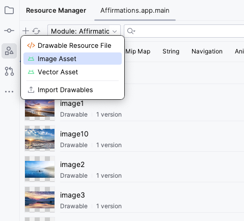
Android Studio’s Image Asset Studio tool opens.
Leave the default settings:
Icon Type: Launcher Icons (Adaptive and Legacy)
Name: ic_launcher
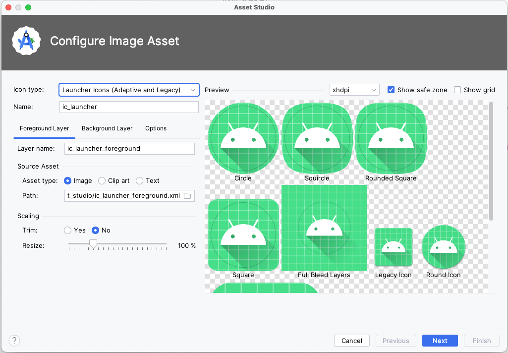
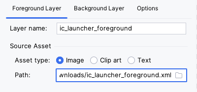
With the Foreground Layer tab already selected, go to the Source Asset subsection. In the Path field, click the folder icon.
A prompt pops up to browse your computer and select a file. Find the location of the new
ic_launcher_foreground.xmlfile you just downloaded. It may be in the Downloads folder of your computer. Once you find it, click Open.The Path is now updated with the location of the new foreground vector drawable. Leave Layer Name as ic_launcher_foreground and Asset Type as Image.
Next, switch to the Background Layer tab of the interface. Leave the default values.
Click the folder icon in the Path field.
Find the location of the
ic_launcher_background.xmlfile you just downloaded. Click Open.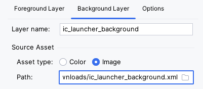
The preview should update as you select the new resource files. This is what it should look like with the new foreground and background layers. It’s ok if the colors are different.
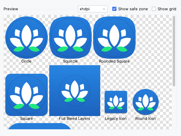
By representing your app icon in two layers, device manufacturers — called original equipment manufacturers or OEMs for short — can create different shapes, depending on the Android device, as shown in the preview above. The OEM provides a mask that gets applied to all app icons on the device.
When a circular mask is applied to both layers of your app icon, the result is the circular icon in the top left. Alternatively, a rounded square mask could be applied to produce the app icon in the top right.
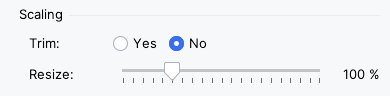
Having both a foreground and a background layer allows for interesting visual effects because the two layers can move independently of one another, and be scaled. For some fun examples of how the visual effects can look, view the Designing Adaptive Icons blogpost under Design Considerations. Because you don’t know what device your user will have or what mask the OEM will apply to your icon, you need to set up your adaptive icon so important information doesn’t get clipped.
If important content is clipped or appears too small, then you can use the Resize slider bar under the Scaling section of each layer to make sure everything appears in the safe zone. To ensure nothing is clipped, resize the foreground and background images by dragging the Resize slider in the Foreground Layer and Background Layer tabs, from 100% (shown below) to 99%.
Click Next.
This step is to Confirm Icon Path. You can click the individual files to see the preview.
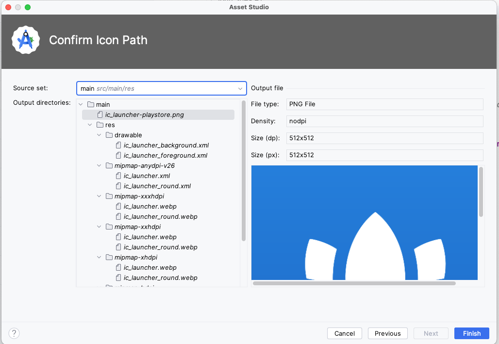
Click Finish.
Verify all the generated assets look correct in the mipmap folders. Examples (it’s ok if the colors are different):

Great work! Now you’ll make one more change.
Test your app
Test that your new app icon appears. Run the app on your device (emulator or physical device). If Android Studio says Gradle sync needed, go ahead and Sync project.
Hit the Home button on your device.
Swipe up to show the All Apps list.
Look for the app you just updated. You should see the new app icon displayed.
Note
Depending on your device model, you may see a launcher icon of a different shape. Nevertheless, it should show your foreground layer on top of your background layer with some type of mask applied to it.
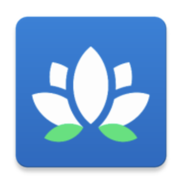
Nice job! The new app icon looks great.
Adaptive and legacy launcher icons
Now that your adaptive icon works well, you may wonder why you can’t get rid of all the app icon bitmap images. You still need those files so that your app icon appears high-quality on older versions of Android, which is referred to as backwards compatibility.
For devices running Android 8.0 or higher (API version 26 and above), Adaptive icons can be used (combination of foreground vector drawable, background vector drawable, with an OEM mask applied on top of it). These are the relevant files in your project:
res/drawable/ic_launcher_background.xml
res/drawable/ic_launcher_foreground.xml
res/mipmap-anydpi-v26/ic_launcher.xml
res/mipmap-anydpi-v26/ic_launcher_round.xml
On devices running anything below Android 8.0 (but above the minimum required API level of your app), Legacy launcher icons are used (the bitmap images in the
mipmapfolders of different density buckets). These are the relevant files in your project:res/mipmap-mdpi/ic_launcher.webp res/mipmap-mdpi/ic_launcher_round.webp res/mipmap-hdpi/ic_launcher.webp res/mipmap-hdpi/ic_launcher_round.webp res/mipmap-xhdpi/ic_launcher.png res/mipmap-xhdpi/ic_launcher_round.webp res/mipmap-xxhdpi/ic_launcher.webp res/mipmap-xxhdpi/ic_launcher_round.webp res/mipmap-xxxhdpi/ic_launcher.webp res/mipmap-xxxhdpi/ic_launcher_round.webp
Essentially, Android falls back to the bitmap images on older devices without adaptive icon support.
Congratulations, you completed all the steps for changing an app icon!
Get the solution code
Solution code: https://github.com/google-developer-training/basic-android-kotlin-compose-training-affirmations/tree/main
Branch: main
To clone:
$ git clone https://github.com/google-developer-training/basic-android-kotlin-compose-training-affirmations.git
$ cd basic-android-kotlin-compose-training-affirmations
$ git checkout main
Summary
Place app icon files in the
mipmapresource directories.Provide different versions of an app icon bitmap image in each density bucket (
mdpi,hdpi,xhdpi,xxhdpi,xxxhdpi) for backwards compatibility with older versions of Android.Add resource qualifiers onto resource directories to specify resources that should be used on devices with a certain configuration (
v24orv26).Vector drawables are Android’s implementation of vector graphics. They are defined in XML as a set of points, lines, and curves, along with associated color information. Vector drawables can be scaled for any density without loss of quality.
Adaptive icons were introduced to the Android platform in API 26. They are made up of a foreground and background layer that follow specific requirements, so that your app icon looks high-quality on a range of devices with different OEM masks.
Use Image Asset Studio in Android Studio to create legacy and adaptive icons for your app.