Unit 3 Pathway 2 Activity 2: Add a scrollable list
Before you begin
In this codelab, you learn how to make a scrollable list in your app using Jetpack Compose.
You will be working with the Affirmations app, which displays a list of affirmations paired with beautiful images to bring positivity to your day!
The data is already there, all you need to do is take that data and display it in the UI.
Prerequisites
Familiarity with lists
Experience building layouts
Experience running apps on a device or emulator
What you’ll learn
How to create a material design card using Jetpack Compose
How to create a scrollable list using Jetpack Compose
What you’ll build
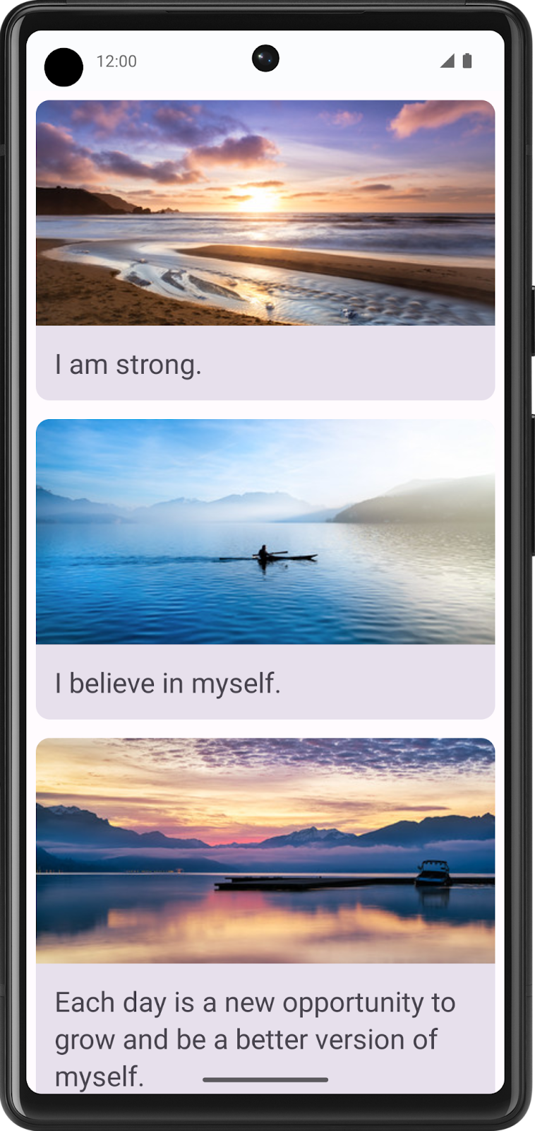
You will take an existing application and add a scrollable list to the UI
The finished product will look like this:
What you’ll need
A computer with internet access, a web browser, and Android Studio
GitHub access
Download the starter code
Starter code: https://github.com/google-developer-training/basic-android-kotlin-compose-training-affirmations/tree/starter
Branch:
starterThe app is expected to display a blank screen when built from the
starterbranch code.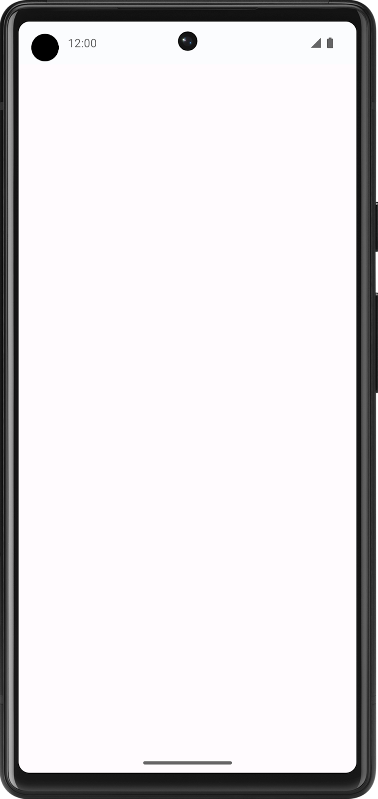
Create a list item data class
Create a data class for an Affirmation
In Android apps, lists are made up of list items. For single pieces of data, this could be something simple like a string or an integer. For list items that have multiple pieces of data, like an image and text, you will need a class that contains all of these properties.
Data class: a class that only contains properties, and possibly some utility methods to work with those properties.
Create a new package under
com.example.affirmations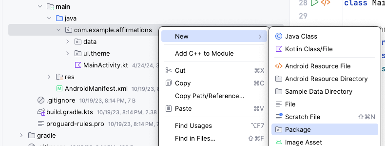
Packages are folders that contain classes and other folders.
Name the new package model. The model package will contain the data model that will be represented by a data class. The data class will contain 2 properties that are related to an “Affirmation”: a string resource, and an image resource.

Create a new class in the
com.example.affirmations.modelpackage.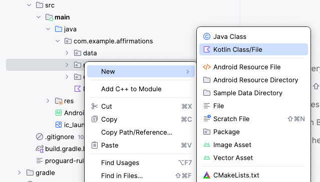
Name the new class
Affirmationand make it aDataclass.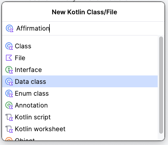
An
Affirmationconsists of one image and one string. InAffirmation.kt:data class Affirmation( @DrawableRes val imageResourceId: Int @StringRes val stringResourceId: Int, )
imports
import androidx.annotation.DrawableRes
import androidx.annotation.StringRes
imageResourceId: ID of the affirmation image stored in a drawable resourcestringResourceId: ID of the affirmaiton text stored in a string resource
In the
com.example.affirmations.datapackage, openDatasource.ktand uncomment the two import statements and the contents of theDatasourceclass. InDatasource.kt:import com.example.affirmations.R import com.example.affirmations.model.Affirmation class Datasource() { fun loadAffirmations(): List<Affirmation> { return listOf<Affirmation>( Affirmation(R.string.affirmation1, R.drawable.image1), Affirmation(R.string.affirmation2, R.drawable.image2), Affirmation(R.string.affirmation3, R.drawable.image3), Affirmation(R.string.affirmation4, R.drawable.image4), Affirmation(R.string.affirmation5, R.drawable.image5), Affirmation(R.string.affirmation6, R.drawable.image6), Affirmation(R.string.affirmation7, R.drawable.image7), Affirmation(R.string.affirmation8, R.drawable.image8), Affirmation(R.string.affirmation9, R.drawable.image9), Affirmation(R.string.affirmation10, R.drawable.image10)) } }
loadAffirmations()gathers all the affirmations provided in the starter code, and returns them as a list. This will be used later to build the scrollable list.
Add a list to your app
Create a list item card
This app is meant to display a list of affirmations. The first step is to create a list item for each affirmation.
The item will be comprised of a
Cardcomposable, containing anImageand aTextcomposable. ACarddisplays content and actions. The Affirmation card will look like this in the preview:
The card shows an image with some text beneath it. This vertical layout can be achieved using a
Columncomposable wrapped in aCardcomposable. Follow the steps below to achieve this.Open
MainActivity.kt.Create two new composables, one for the app, and one for the card.
Under
AffirmationsApp(), create a newAffirmationCard()composable. It is a best practice to pass a modifier to every composable and set it to a default value likeModifier.@Composable fun AffirmationsApp() { } @Composable fun AffirmationCard(affirmation: Affirmation, modifier: Modifier = Modifier) { }
imports
import com.example.affirmations.model.Affirmation
Inside
AffirmationCard(), callCard(), and passmodifierto it, sinceCardis the root element.@Composable fun AffirmationCard(affirmation: Affirmation, modifier: Modifier = Modifier) { Card(modifier = modifier) { } }
imports
import androidx.compose.material3.Card
Inside
Card, add aColumn. This makes the affirmation image and text to be stacked vertically.@Composable fun AffirmationCard(affirmation: Affirmation, modifier: Modifier = Modifier) { Card(modifier = modifier) { Column { } } }
imports
import androidx.compose.foundation.layout.Column
Inside
Column, add anImage.@Composable fun AffirmationCard(affirmation: Affirmation, modifier: Modifier = Modifier) { Card(modifier = modifier) { Column { Image( painter = painterResource(affirmation.imageResourceId), contentDescription = stringResource(affirmation.stringResourceId), modifier = Modifier .fillMaxWidth() .height(194.dp), contentScale = ContentScale.Crop ) } } }
imports
import androidx.compose.foundation.Image
import androidx.compose.foundation.layout.fillMaxWidth
import androidx.compose.foundation.layout.height
import androidx.compose.ui.layout.ContentScale
import androidx.compose.ui.res.painterResource
import androidx.compose.ui.res.stringResource
import androidx.compose.ui.unit.dp
fillMaxWidth(): makes theImageoccupy the full width of its container, in this case stretching it horizontally to fill theColumn.height(194.dp): sets a fixed height for the Image to 194 density-independent pixels (dp). Ensures all images in the affirmation cards have a consistent height, regardless of their original sizes.contentScale = ContentScale.Crop: scales the image to cover the entire target area. If the aspect ratio doesn’t match the target area, may result in parts of the image being cropped.
After
Image, add aTextcomposable.@Composable fun AffirmationCard(affirmation: Affirmation, modifier: Modifier = Modifier) { Card(modifier = modifier) { Column { Image( painter = painterResource(affirmation.imageResourceId), contentDescription = stringResource(affirmation.stringResourceId), modifier = Modifier .fillMaxWidth() .height(194.dp), contentScale = ContentScale.Crop ) Text( text = LocalContext.current.getString(affirmation.stringResourceId), modifier = Modifier.padding(16.dp), style = MaterialTheme.typography.headlineSmall ) } } }
imports
import androidx.compose.material3.Text
import androidx.compose.foundation.layout.padding
import androidx.compose.ui.platform.LocalContext
LocalContext.current.getString(affirmation.stringResourceId): retrieves the string with the IDaffirmation.stringResourceIdModifier.padding(16.dp): adds padding around the textMaterialTheme.typography.headlineSmall: sets the text style to a smaller headline
Preview the AffirmationCard composable
In
MainActivity.kt, create a private method calledAffirmationCardPreview():import androidx.compose.ui.tooling.preview.Preview @Preview @Composable private fun AffirmationCardPreview() { AffirmationCard(Affirmation(R.string.affirmation1, R.drawable.image1)) }
Open the Split tab and you will see a preview of the
AffirmationCard. If necessary, click Build & Refresh in the Design pane to display the preview.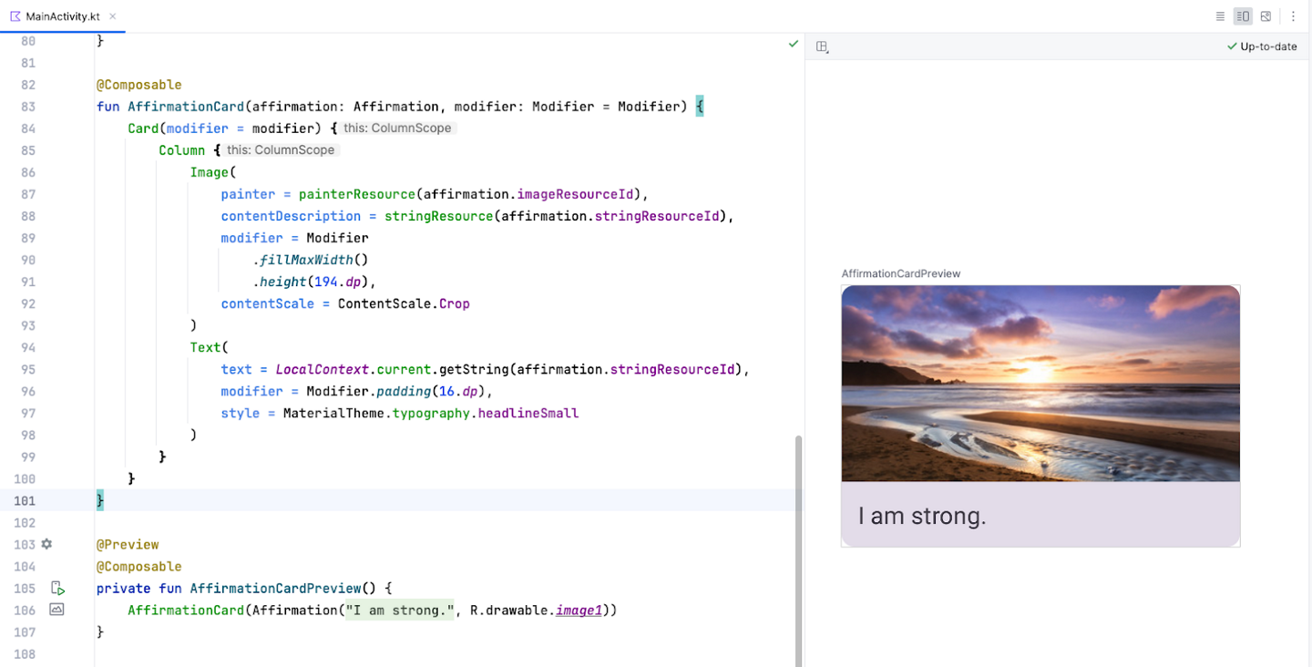
Create the list
Create list items first, then use them to make the list component.
Create a function called
AffirmationList():@Composable fun AffirmationList(affirmationList: List<Affirmation>, modifier: Modifier = Modifier) { }
A scrollable list can be made using the
LazyColumncomposable. The difference between aLazyColumnand aColumnis that aColumnloads all the items at once, and should be used when you have only a small number of items to display. AColumncan only hold a predefined, or fixed, number of composables.A
LazyColumncan add content on demand, which makes it good for long lists and particularly when the length of the list is unknown. It’s suitable for apps like Instagram. ALazyColumnalso provides scrolling by default, without additional code.Declare a
LazyColumncomposable insideAffirmationList(). SinceLazyColumnis the root element, passmodifierto it.@Composable fun AffirmationList(affirmationList: List<Affirmation>, modifier: Modifier = Modifier) { LazyColumn(modifier = modifier) { items(affirmationList) { affirmation -> AffirmationCard( affirmation = affirmation, modifier = Modifier.padding(8.dp) ) } } }
imports
import androidx.compose.foundation.lazy.items
import androidx.compose.foundation.lazy.LazyColumn
The
items()method adds items to theLazyColumn. This method is somewhat unique to this composable, not a common practice for most composables.items()takes a lambda function as an argument. The function takes one list item (an affirmation) as input, and callsAffirmationCard()to display that affirmation.
Display the list
The layout direction defines whether items should be laid out from left to right or right to left. Each user has their own setting, which can be retrieved using
LocalLayoutDirection.current.In
AffirmationsApp, save the current layout direction in a variable. This will be used to configure the padding later.import com.example.affirmations.data.Datasource @Composable fun AffirmationsApp() { val layoutDirection = LocalLayoutDirection.current }
Now add the rest of the code:
@Composable
fun AffirmationsApp() {
    val layoutDirection = LocalLayoutDirection.current
    Surface(
        Modifier = Modifier
        .fillMaxSize()
        .statusBarsPadding()
        .padding(
            start = WindowInsets.safeDrawing.asPaddingValues()
                    .calculateStartPadding(layoutDirection),
            end = WindowInsets.safeDrawing.asPaddingValues()
                    .calculateEndPadding(layoutDirection),
        ),
    ) {
        AffirmationList(
            affirmationList = Datasource().loadAffirmations(),
        )
    }
}
imports
import com.example.affirmations.data.Datasource
fillMaxSize(): makes theSurfacefill the max width and height of its parentstatusBarsPadding(): sets a padding to avoid overlapping with the status barpadding(): sets the start and end padding to suit thelayoutDirection.
Run the Affirmations app on a device or emulator and see the finished product!

Get the solution code
Solution code: https://github.com/google-developer-training/basic-android-kotlin-compose-training-affirmations/tree/intermediate
Branch: intermediate
Clone:
$ git clone https://github.com/google-developer-training/basic-android-kotlin-compose-training-affirmations.git
$ cd basic-android-kotlin-compose-training-affirmations
$ git checkout intermediate
Conclusion
You now know how to create cards, list items, and scrollable lists using Jetpack Compose! Keep in mind that these are just basic tools for creating a list. You can let your creativity roam and customize list items however you like!
Use
Cardcomposables to create list items.Modify the UI contained within a
Cardcomposable.Create a scrollable list using the
LazyColumncomposable.Build a list using custom list items.