Unit 4 Pathway 3 Activity 4: Build an app with an adaptive layout
Introduction
In the previous codelab, you started transforming the Reply app to be adaptive by using window size classes and implementing dynamic navigation.
In this codelab, you’ll build on a concept you learned to further implement adaptive layout in your app. The adaptive layout that you’ll implement is part of canonical layouts - a set of commonly-used patterns for large screen displays. You’ll also learn about more tooling and testing techniques to help you to quickly build robust apps.
Prerequisites
Completion of the Build an adaptive app with dynamic navigation codelab
Familiar with Kotlin programming, including classes, functions and conditionals
Familiar with
ViewModelclassesFamiliar with
ComposablefunctionsExperience building layouts with Jetpack Compose
Experience running apps on a device or emulator
Experience using
WindowSizeClassAPI
What you’ll learn
How to create a list-view pattern adaptive layout using Jetpack Compose
How to create previews for different screen sizes
How to test code for multiple screen sizes (optional)
What you’ll build
You will continue updating the Reply app to be adaptive for all screen sizes.
What you’ll need
A computer with internet access, a web browser, and Android Studio
Access to GitHub
Solution code
Branch: main
Clone:
$ git clone https://github.com/google-developer-training/basic-android-kotlin-compose-training-reply-app.git
$ cd basic-android-kotlin-compose-training-reply-app
$ git checkout main
Previews for different screen sizes
Create previews for different screen sizes
For an adaptive app, it is best practice to create multiple previews to show the app on different screen sizes. With multiple previews, you can see your changes on all screen sizes at once. Moreover, the previews also serve as documentation for other developers who review your code to see that your app is compatible with different screen sizes.
Example:
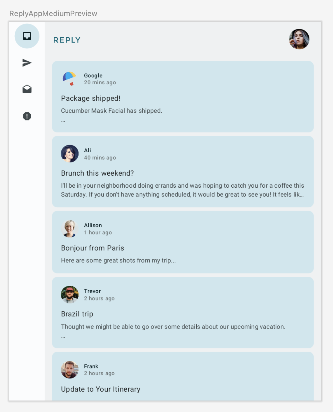
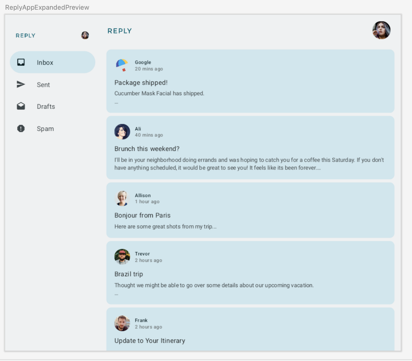
Code for adding previews for different screen sizes:
@Preview(showBackground = true)
@Composable
fun ReplyAppCompactPreview() {
    ReplyTheme {
        Surface {
            ReplyApp(windowSize = WindowWidthSizeClass.Compact)
        }
    }
}

@Preview(showBackground = true, widthDp = 700)
@Composable
fun ReplyAppMediumPreview() {
    ReplyTheme {
        Surface {
            ReplyApp(windowSize = WindowWidthSizeClass.Medium)
        }
    }
}

@Preview(showBackground = true, widthDp = 1000)
@Composable
fun ReplyAppExpandedPreview() {
    ReplyTheme {
        Surface {
            ReplyApp(windowSize = WindowWidthSizeClass.Expanded)
        }
    }
}
Implement adaptive content layout
Introduction to list-detail view
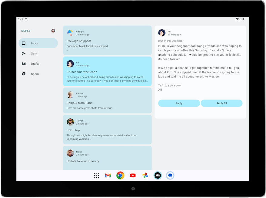
In the expanded screen below, the content looks stretched out and doesn’t make good use of the available screen real estate.
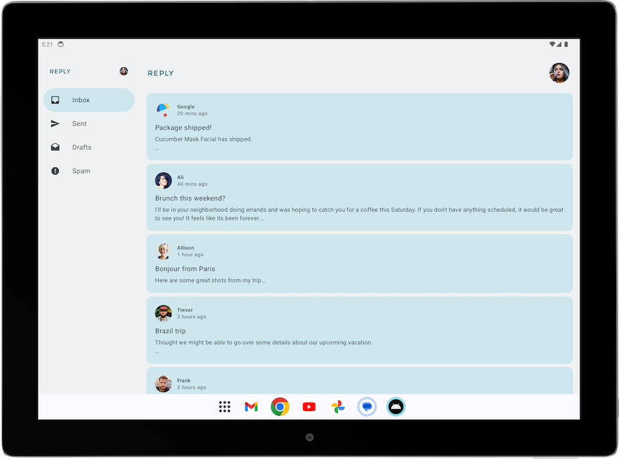
The layout could be improved by applying one of the canonical layouts. Canonical layouts are large screen compositions that serve as starting points. You can use the three available layouts to guide how you organize common elements in an app, list-view, supporting panel, and feed. Each layout considers common use cases and components to address expectations and user needs for how apps adapt across screen sizes and breakpoints.
For the Reply app, the list-detail view is best for browsing content and quickly seeing details. With a list-detail view layout, there’ll be another pane next to the email list screen to display the email details. This layout allows you to use the available screen to show more information to the user.
Implement list-detail view
This is the code for implementing the list-detail view.
In
ui/utils/WindowStateUtils.kt, anEnumis used for representing the different content types.enum class ReplyContentType { LIST_AND_DETAIL, // For expanded screen LIST_ONLY, // For other screens }
In
ReplyApp.kt➜ReplyApp(), the reply content type depends on the window size, and is passed to ReplyHomeScreen()@Composable fun ReplyApp( windowSize: WindowWidthSizeClass, modifier: Modifier = Modifier, ) { // ... when (windowSize) { WindowWidthSizeClass.Compact -> { // ... contentType = ReplyContentType.LIST_ONLY } WindowWidthSizeClass.Medium -> { // ... contentType = ReplyContentType.LIST_ONLY } WindowWidthSizeClass.Expanded -> { // ... contentType = ReplyContentType.LIST_AND_DETAIL } else -> { // ... contentType = ReplyContentType.LIST_ONLY } } ReplyHomeScreen( // ... contentType = contentType, // ... ) // ... }
In
ReplyHomeScreen.kt➜ReplyHomeScreen(), the contentType is passed on toReplyAppContent().@Composable fun ReplyHomeScreen( // ... contentType: ReplyContentType, // ... ) { // ... if (navigationType == ReplyNavigationType.PERMANENT_NAVIGATION_DRAWER) { // .. PermanentNavigationDrawer( // .. ) { ReplyAppContent( // ... contentType = contentType, // ... ) } } else { if (replyUiState.isShowingHomepage) { ReplyAppContent( // ... contentType = contentType, // ... ) } else { // .. } } }
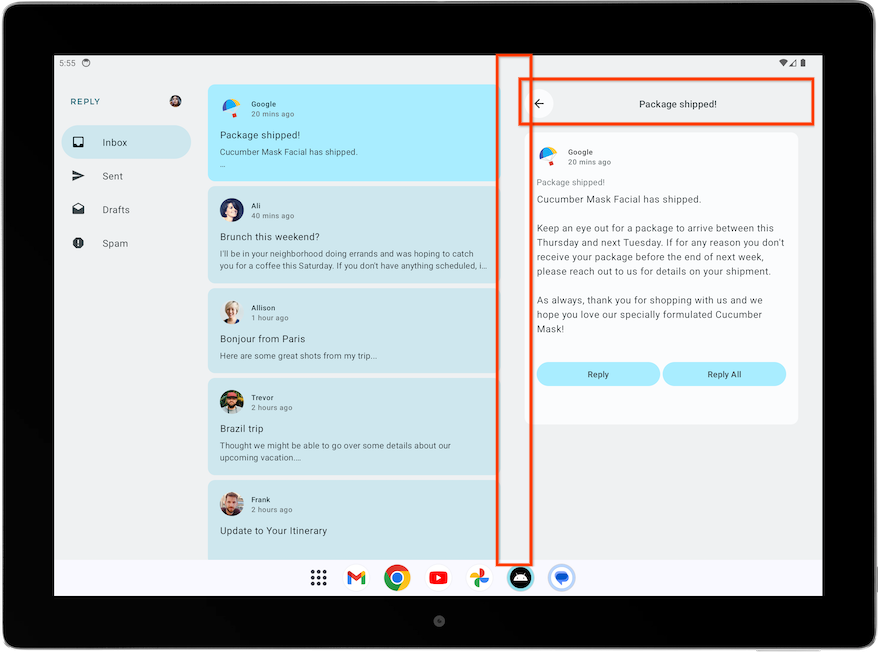
ReplyAppContent()then uses it to decide whether to display a list-detail view.@Composable private fun ReplyAppContent( // ... contentType: ReplyContentType, // ... ) { Box(modifier = modifier) { Row(modifier = Modifier.fillMaxSize()) { // ... if (contentType == ReplyContentType.LIST_AND_DETAIL) { // Display list-detail view ReplyListAndDetailContent( replyUiState = replyUiState, onEmailCardPressed = onEmailCardPressed, modifier = Modifier .statusBarsPadding() .weight(1f), ) } else { // Display list-only view ReplyListOnlyContent( replyUiState = replyUiState, onEmailCardPressed = onEmailCardPressed, modifier = Modifier .weight(1f) .padding(horizontal = dimensionResource(R.dimen.email_list_only_horizontal_padding)) ) } // ... } } } }
The result:

Improve UI elements for list-detail view
When a screen is designed to be displayed in full screen on a phone, and it is later displayed in list-detail view on a tablet, some adjustments are needed to reduce extra elements and space.
Example: The Details screen was initially designed to be displayed full screen, on a phone. Without improvements, when it’s displayed on a pane on an expanded screen, it looks like this:
The screen contains extraneous elements, such as the back button, the subject header, and additional paddings, as it was designed for a standalone details screen.
Here’s the code that improves the Details screen for expanded view.
ReplyDetailsScreen.kt➜ReplyDetailsScreen()contains anisFullScreenvariable which is true when the screen is displayed as a standalone details screen, e.g. filling up the full screen on a phone.ReplyDetailsScreen.kt:... @Composable fun ReplyDetailsScreen( // ... isFullScreen: Boolean = false ) { ...
ReplyDetailsScreen.kt➜ReplyDetailsScreen()adjusts the content accordingly.isFullScreenis passed on toReplyEmailDetailsCard().@Composable fun ReplyDetailsScreen( // ... isFullScreen: Boolean = false ) { BackHandler { onBackPressed() } Box(modifier = modifier) { LazyColumn( // ... ) { item { // Add a top bar only when the screen is standalone and fills the full screen if (isFullScreen) { ReplyDetailsScreenTopBar( onBackPressed, replyUiState, Modifier .fillMaxWidth() .padding( bottom = dimensionResource(R.dimen.detail_topbar_padding_bottom), top = dimensionResource(R.dimen.topbar_padding_vertical) ) ) } ReplyEmailDetailsCard( email = replyUiState.currentSelectedEmail, mailboxType = replyUiState.currentMailbox, isFullScreen = isFullScreen, modifier = if (isFullScreen) { // Add padding only when the screen is standalone Modifier.padding(horizontal = dimensionResource(R.dimen.detail_card_outer_padding_horizontal)) } else { Modifier } ) } } } }
ReplyDetailsScreen.kt➜ReplyEmailDetailsCard(): only show the email subject text when the app is not in full screen, as the full screen layout already displays the email subject as the header. If it is full screen, add a spacer@Composable private fun ReplyEmailDetailsCard( email: Email, mailboxType: MailboxType, modifier: Modifier = Modifier, isFullScreen: Boolean = false ) { // ... if (isFullScreen) { Spacer(modifier = Modifier.height(dimensionResource(R.dimen.detail_content_padding_top))) } else { Text( text = stringResource(email.subject), style = MaterialTheme.typography.bodyMedium, color = MaterialTheme.colorScheme.outline, modifier = Modifier.padding( top = dimensionResource(R.dimen.detail_content_padding_top), bottom = dimensionResource(R.dimen.detail_expanded_subject_body_spacing) ), ) } // ... }
The result:
Adjust back handling for list-detail view
With the expanded screens, there is no need to navigate to the
ReplyDetailsScreenat all. Instead, you want the app to close when the user selects the back button. That’s why the back handler is different when list-detail view is usedIn
ReplyHomeContent.kt➜ReplyListAndDetailContent():@Composable fun ReplyListAndDetailContent( replyUiState: ReplyUiState, onEmailCardPressed: (Email) -> Unit, modifier: Modifier = Modifier ) { // .. ReplyDetailsScreen( replyUiState = replyUiState, modifier = Modifier .weight(1f) .padding(end = dimensionResource(R.dimen.email_list_only_horizontal_padding)), onBackPressed = { activity.finish() } // close app when user presses back button ) // .. }
Verify for different screen sizes
Large screen app quality guideline
To build a great and consistent experience for Android users, it is important to build and test your app with quality in mind. You can refer to the Core app quality guidelines to determine how to improve your app quality.
To build a great quality app for all form factors, review the Large screen app quality guidelines. Your app must also meet the Tier 3 - Large screen ready requirements.
Manually test your app for large screen readiness
The app quality guidelines provide test device recommendations and procedures to check your app quality. Let’s take a look at a test example relevant to the Reply app.
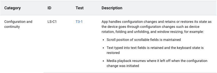
The above app quality guideline requires the app to retain or restore its state after configuration changes. The guideline also provides instructions about how to test apps, as shown in the following figure:
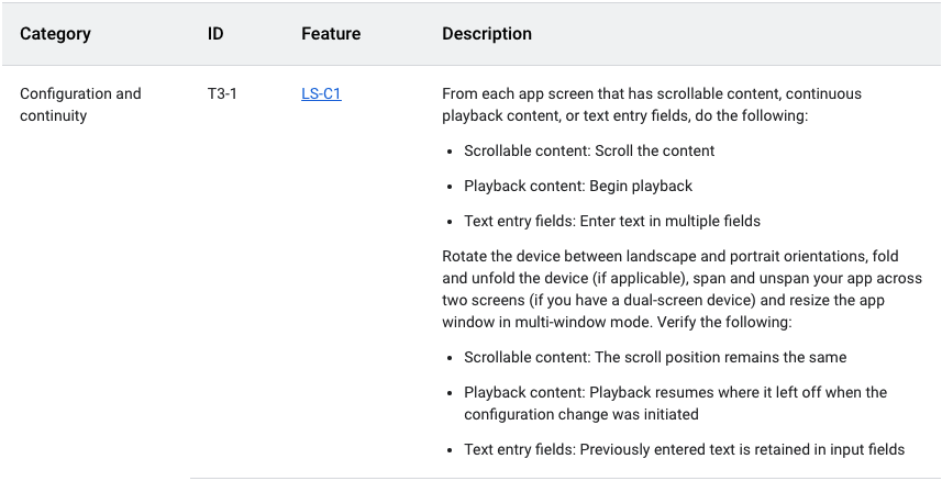
To manually test the Reply app for configuration continuity, complete the following steps.
Run the Reply app on a medium-sized device or, if you are using the resizable emulator, in unfolded foldable mode.
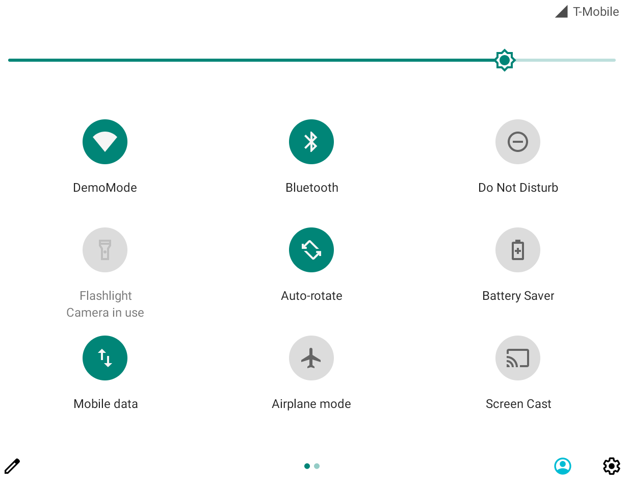
Ensure that Auto rotate on the emulator is set to on.
Scroll down the email list.

Click on an email card. For example, open the email from Ali.
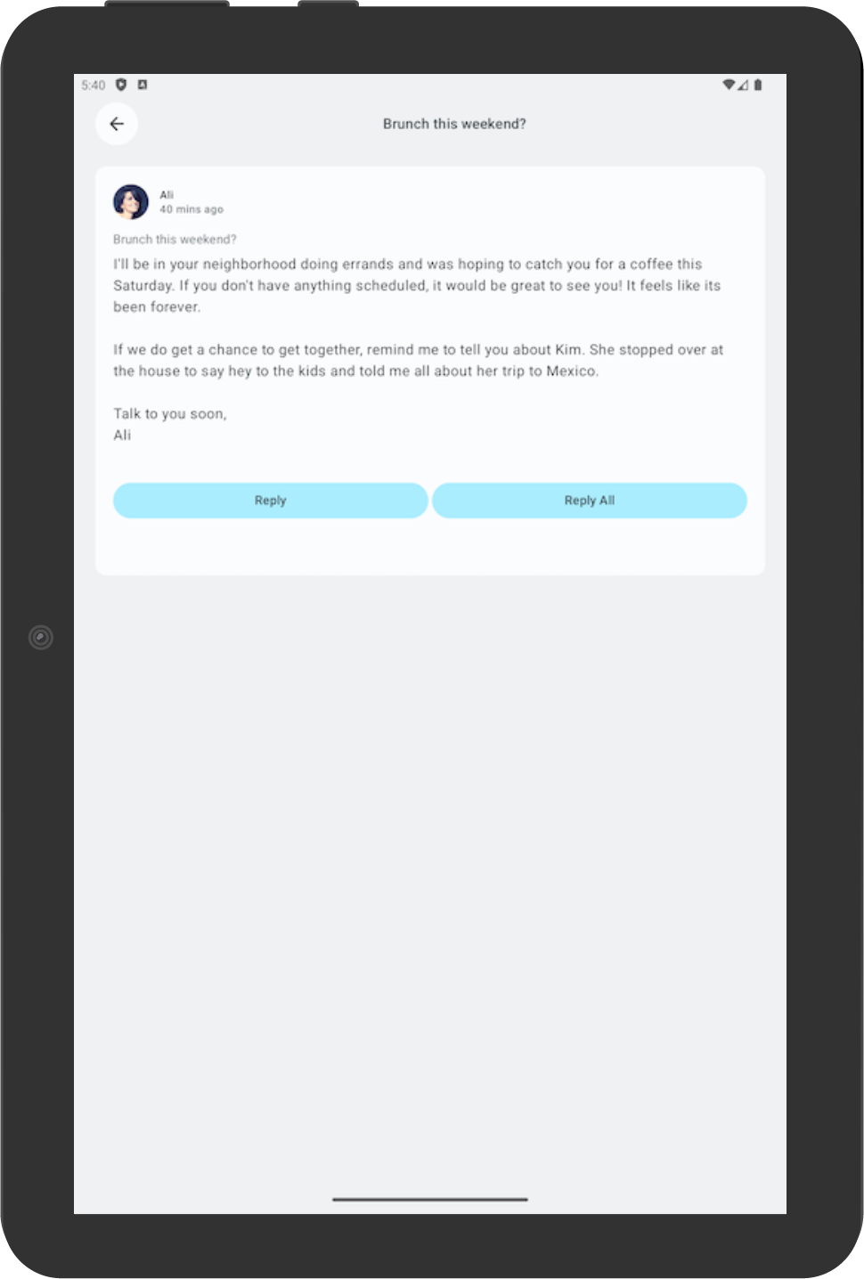
Rotate the device to check that the selected email is still consistent with the email selected in portrait orientation. In this example, an email from Ali is still shown.
Rotate back to portrait orientation to check that the app still displays the same email.
Add automated test for adaptive apps (optional)
Configure test for the compact screen size
In the Test the Cupcake App codelab, you learned to create UI tests. Now let’s learn how to create specific tests for different screen sizes.
In the Reply app, you use different navigation elements for different screen sizes. For example, you expect to see a permanent navigation drawer when the user sees the expanded screen. It is useful to create tests to verify the existence of various navigation elements, such as the bottom navigation, navigation rail, and navigation drawer for different screen sizes.
To create a test to verify the existence of a bottom navigation element in a compact screen, complete the following steps:
In the test directory, create a new Kotlin class called
ReplyAppTest.kt.In
ReplyAppTest, create a test rule usingcreateAndroidComposeRuleand passingComponentActivityas the type parameter.ComponentActivityis used to access an empty activity instead of theMainActivity.ReplyAppTest.kt:... class ReplyAppTest { @get:Rule val composeTestRule = createAndroidComposeRule<ComponentActivity>() ...
To differentiate between navigation elements in the screens, add a
testTagin theReplyBottomNavigationBarcomposable.Define a string resource for Navigation Bottom. In
strings.xml:... <resources> ... <string name="navigation_bottom">Navigation Bottom</string> ... </resources>
Add the string name as the
testTagargument for theModifier’stestTagmethod in theReplyBottomNavigationBarcomposable. InReplyHomeScreen.kt:... val bottomNavigationContentDescription = stringResource(R.string.navigation_bottom) ReplyBottomNavigationBar( ... modifier = Modifier .fillMaxWidth() .testTag(bottomNavigationContentDescription) ) ...
In the
ReplyAppTestclass, create a test function to test for a compact size screen. Set the content of thecomposeTestRulewith theReplyAppcomposable and pass theWindowWidthSizeClass.Compactas thewindowSizeargument.Note
Adding a composable that accepts
WindowWidthSizeClassas an argument is a good practice to make testable code.ReplyAppTest.kt... @Test fun compactDevice_verifyUsingBottomNavigation() { // Set up compact window composeTestRule.setContent { ReplyApp( windowSize = WindowWidthSizeClass.Compact ) } }
Assert that the bottom navigation element exists with the test tag. Call the extension function
onNodeWithTagForStringIdon thecomposeTestRuleand pass the navigation bottom string and call theassertExists()method.ReplyAppTest.kt... @Test fun compactDevice_verifyUsingBottomNavigation() { // Set up compact window composeTestRule.setContent { ReplyApp( windowSize = WindowWidthSizeClass.Compact ) } // Bottom navigation is displayed composeTestRule.onNodeWithTagForStringId( R.string.navigation_bottom ).assertExists() }
Run the test and verify that it passes.
Configure test for the medium and expanded screen sizes
Now that you successfully created a test for the compact screen, let’s create corresponding tests for medium and expanded screens.
To create tests to verify the existence of a navigation rail and permanent navigation drawer for medium and expanded screens, complete the following steps.
Define a string resource for the Navigation Rail to be used as a test tag later. In
strings.xml:... <resources> ... <string name="navigation_rail">Navigation Rail</string> ... </resources>
Pass the string as the test tag through the
Modifierin thePermanentNavigationDrawercomposable. InReplyHomeScreen.kt:... val navigationDrawerContentDescription = stringResource(R.string.navigation_drawer) PermanentNavigationDrawer( ... modifier = Modifier.testTag(navigationDrawerContentDescription) ) ...
Pass the string as the test tag through the
ModifierinReplyNavigationRail. InReplyHomeScreen.kt:... val navigationRailContentDescription = stringResource(R.string.navigation_rail) ReplyNavigationRail( ... modifier = Modifier .testTag(navigationRailContentDescription) ) ...
Add a test to verify that a navigation rail element exists in the medium screens. In
ReplyAppTest.kt:... @Test fun mediumDevice_verifyUsingNavigationRail() { // Set up medium window composeTestRule.setContent { ReplyApp( windowSize = WindowWidthSizeClass.Medium ) } // Navigation rail is displayed composeTestRule.onNodeWithTagForStringId( R.string.navigation_rail ).assertExists() }
Add a test to verify that a navigation drawer element exists in the expanded screens. In
ReplyAppTest.kt:... @Test fun expandedDevice_verifyUsingNavigationDrawer() { // Set up expanded window composeTestRule.setContent { ReplyApp( windowSize = WindowWidthSizeClass.Expanded ) } // Navigation drawer is displayed composeTestRule.onNodeWithTagForStringId( R.string.navigation_drawer ).assertExists() }
Use a tablet emulator or a resizable emulator in Tablet mode to run the test.
Run all the tests and verify that they pass.
Test for a configuration change in a compact screen
A configuration change is a common occurrence that happens in your app lifecycle. For example, when you change orientation from portrait to landscape, a configuration change occurs. When a configuration change occurs, it is important to test that your app retains its state. Next, you’ll create tests, which simulate a configuration change, to test that your app retains its state in a compact screen.
In the test directory, create a new Kotlin class called
ReplyAppStateRestorationTest.kt.In the
ReplyAppStateRestorationTestclass, create a test rule usingcreateAndroidComposeRuleand passingComponentActivityas the type parameter.ReplyAppStateRestorationTest.kt:... class ReplyAppStateRestorationTest { /** * Note: To access to an empty activity, the code uses ComponentActivity instead of * MainActivity. */ @get:Rule val composeTestRule = createAndroidComposeRule<ComponentActivity>() } ...
Create a test function to verify that an email is still selected in the compact screen after a configuration change. In
ReplyAppStateRestorationTest.kt:... @Test fun compactDevice_selectedEmailEmailRetained_afterConfigChange() { } ...
To test for a configuration change, you need to use
StateRestorationTester.Setup
stateRestorationTesterby passing thecomposeTestRuleas an argument toStateRestorationTester.Use
setContent()with theReplyAppcomposable and pass theWindowWidthSizeClass.Compactas thewindowSizeargument.ReplyAppStateRestorationTest.kt:... @Test fun compactDevice_selectedEmailEmailRetained_afterConfigChange() { // Setup compact window val stateRestorationTester = StateRestorationTester(composeTestRule) stateRestorationTester.setContent { ReplyApp(windowSize = WindowWidthSizeClass.Compact) } } ...
Verify that a third email is displayed in the app. Use the
assertIsDisplayed()method on thecomposeTestRule, which looks for the text of the third email. InReplyAppStateRestorationTest.kt:... @Test fun compactDevice_selectedEmailEmailRetained_afterConfigChange() { // Setup compact window val stateRestorationTester = StateRestorationTester(composeTestRule) stateRestorationTester.setContent { ReplyApp(windowSize = WindowWidthSizeClass.Compact) } // Given third email is displayed composeTestRule.onNodeWithText( composeTestRule.activity.getString(LocalEmailsDataProvider.allEmails[2].body) ).assertIsDisplayed() } ...
Navigate to the email’s details screen by clicking on the email subject. Use the
performClick()method to navigate. InReplyAppStateRestorationTest.kt:... @Test fun compactDevice_selectedEmailEmailRetained_afterConfigChange() { // Setup compact window val stateRestorationTester = StateRestorationTester(composeTestRule) stateRestorationTester.setContent { ReplyApp(windowSize = WindowWidthSizeClass.Compact) } // Given third email is displayed composeTestRule.onNodeWithText( composeTestRule.activity.getString(LocalEmailsDataProvider.allEmails[2].body) ).assertIsDisplayed() // Open detailed page composeTestRule.onNodeWithText( composeTestRule.activity.getString(LocalEmailsDataProvider.allEmails[2].subject) ).performClick() } ...
Verify that the third email is displayed in the details screen. Assert the existence of the back button to confirm that the app is in the details screen, and verify that the third email’s text is displayed. In
ReplyAppStateRestorationTest.kt:... @Test fun compactDevice_selectedEmailEmailRetained_afterConfigChange() { ... // Open detailed page composeTestRule.onNodeWithText( composeTestRule.activity.getString(LocalEmailsDataProvider.allEmails[2].subject) ).performClick() // Verify that it shows the detailed screen for the correct email composeTestRule.onNodeWithContentDescriptionForStringId( R.string.navigation_back ).assertExists() composeTestRule.onNodeWithText( } ...
Simulate a config change using
stateRestorationTester.emulateSavedInstanceStateRestore(). InReplyAppStateRestorationTest.kt:... @Test fun compactDevice_selectedEmailEmailRetained_afterConfigChange() { ... // Verify that it shows the detailed screen for the correct email composeTestRule.onNodeWithContentDescriptionForStringId( R.string.navigation_back ).assertExists() composeTestRule.onNodeWithText( composeTestRule.activity.getString(LocalEmailsDataProvider.allEmails[2].body) ).assertExists() // Simulate a config change stateRestorationTester.emulateSavedInstanceStateRestore() } ...
Verify again that the third email is displayed in the details screen. Assert the existence of the back button to confirm that the app is in the details screen, and verify that the third email’s text is displayed. In
ReplyAppStateRestorationTest.kt:... @Test fun compactDevice_selectedEmailEmailRetained_afterConfigChange() { // Setup compact window val stateRestorationTester = StateRestorationTester(composeTestRule) stateRestorationTester.setContent { ReplyApp(windowSize = WindowWidthSizeClass.Compact) } // Given third email is displayed composeTestRule.onNodeWithText( composeTestRule.activity.getString(LocalEmailsDataProvider.allEmails[2].body) ).assertIsDisplayed() // Open detailed page composeTestRule.onNodeWithText( composeTestRule.activity.getString(LocalEmailsDataProvider.allEmails[2].subject) ).performClick() // Verify that it shows the detailed screen for the correct email composeTestRule.onNodeWithContentDescriptionForStringId( R.string.navigation_back ).assertExists() composeTestRule.onNodeWithText( composeTestRule.activity.getString(LocalEmailsDataProvider.allEmails[2].body) ).assertExists() // Simulate a config change stateRestorationTester.emulateSavedInstanceStateRestore() // Verify that it still shows the detailed screen for the same email composeTestRule.onNodeWithContentDescriptionForStringId( R.string.navigation_back ).assertExists() composeTestRule.onNodeWithText( composeTestRule.activity.getString(LocalEmailsDataProvider.allEmails[2].body) ).assertExists() } ...
Run the test with a phone emulator or resizable emulator in Phone mode.
Verify that the test passes.
Test for a configuration change in the expanded screen
To test for a configuration change in the expanded screen by simulating a configuration change and passing the appropriate WindowWidthSizeClass, complete the following steps.
Create a test function to verify that an email is still selected in the details screen after a configuration change. In
ReplyAppStateRestorationTest.kt:... @Test fun expandedDevice_selectedEmailEmailRetained_afterConfigChange() { } ...
To test for a configuration change, you need to use
StateRestorationTester.Setup
stateRestorationTesterby passing the composeTestRule as an argument toStateRestorationTester.Use
setContent()with theReplyAppcomposable and passWindowWidthSizeClass.Expandedas thewindowSizeargument. InReplyAppStateRestorationTest.kt:... @Test fun expandedDevice_selectedEmailEmailRetained_afterConfigChange() { // Setup expanded window val stateRestorationTester = StateRestorationTester(composeTestRule) stateRestorationTester.setContent { ReplyApp(windowSize = WindowWidthSizeClass.Expanded) } } ...
Verify that a third email is displayed in the app. Use the
assertIsDisplayed()method on thecomposeTestRule, which looks for the text of the third email. InReplyAppStateRestorationTest.kt:... @Test fun expandedDevice_selectedEmailEmailRetained_afterConfigChange() { // Setup expanded window val stateRestorationTester = StateRestorationTester(composeTestRule) stateRestorationTester.setContent { ReplyApp(windowSize = WindowWidthSizeClass.Expanded) } // Given third email is displayed composeTestRule.onNodeWithText( composeTestRule.activity.getString(LocalEmailsDataProvider.allEmails[2].body) ).assertIsDisplayed() } ...
Select the third email on the details screen. Use the
performClick()method to select the email. InReplyAppStateRestorationTest.kt:... @Test fun expandedDevice_selectedEmailEmailRetained_afterConfigChange() { // Setup expanded window val stateRestorationTester = StateRestorationTester(composeTestRule) stateRestorationTester.setContent { ReplyApp(windowSize = WindowWidthSizeClass.Expanded) } // Given third email is displayed composeTestRule.onNodeWithText( composeTestRule.activity.getString(LocalEmailsDataProvider.allEmails[2].body) ).assertIsDisplayed() // Select third email composeTestRule.onNodeWithText( composeTestRule.activity.getString(LocalEmailsDataProvider.allEmails[2].subject) ).performClick() ... } ...
Verify that the details screen displays the third email by using the
testTagon the details screen and looking for text on its children. This approach makes sure that you can find the text in the details section and not in the email list. InReplyAppStateRestorationTest.kt:... @Test fun expandedDevice_selectedEmailEmailRetained_afterConfigChange() { ... // Select third email composeTestRule.onNodeWithText( composeTestRule.activity.getString(LocalEmailsDataProvider.allEmails[2].subject) ).performClick() // Verify that third email is displayed on the details screen composeTestRule.onNodeWithTagForStringId(R.string.details_screen).onChildren() .assertAny(hasAnyDescendant(hasText( composeTestRule.activity.getString(LocalEmailsDataProvider.allEmails[2].body))) ) ... } ...
Simulate a configuration change using
stateRestorationTester.emulateSavedInstanceStateRestore(). InReplyAppStateRestorationTest.kt:... @Test fun expandedDevice_selectedEmailEmailRetained_afterConfigChange() { ... // Verify that third email is displayed on the details screen composeTestRule.onNodeWithTagForStringId(R.string.details_screen).onChildren() .assertAny(hasAnyDescendant(hasText( composeTestRule.activity.getString(LocalEmailsDataProvider.allEmails[2].body))) ) // Simulate a config change stateRestorationTester.emulateSavedInstanceStateRestore() ... } ...
Verify again that the details screen displays the third email after a configuration change. In
ReplyAppStateRestorationTest.kt... @Test fun expandedDevice_selectedEmailEmailRetained_afterConfigChange() { // Setup expanded window val stateRestorationTester = StateRestorationTester(composeTestRule) stateRestorationTester.setContent { ReplyApp(windowSize = WindowWidthSizeClass.Expanded) } // Given third email is displayed composeTestRule.onNodeWithText( composeTestRule.activity.getString(LocalEmailsDataProvider.allEmails[2].body) ).assertIsDisplayed() // Select third email composeTestRule.onNodeWithText( composeTestRule.activity.getString(LocalEmailsDataProvider.allEmails[2].subject) ).performClick() // Verify that third email is displayed on the details screen composeTestRule.onNodeWithTagForStringId(R.string.details_screen).onChildren() .assertAny(hasAnyDescendant(hasText( composeTestRule.activity.getString(LocalEmailsDataProvider.allEmails[2].body))) ) // Simulate a config change stateRestorationTester.emulateSavedInstanceStateRestore() // Verify that third email is still displayed on the details screen composeTestRule.onNodeWithTagForStringId(R.string.details_screen).onChildren() .assertAny(hasAnyDescendant(hasText( composeTestRule.activity.getString(LocalEmailsDataProvider.allEmails[2].body))) ) } ...
Run the test with a tablet emulator or resizable emulator in Tablet mode.
Verify that the test passes.
Use annotations to group test for different screen sizes
You might realize from the previous tests that some tests fail when they are run on devices with an incompatible screen size. While you can run the test one by one using an appropriate device, this approach might not scale when you have many test cases.
To solve this problem, you can create annotations to denote the screen sizes that the test can run on, and configure the annotated test for the appropriate devices.
To run a test based on screen sizes, complete the following steps.
In the test directory, create
TestAnnotations.kt, which contains three annotation classes:TestCompactWidth,TestMediumWidth,TestExpandedWidth. InTestAnnotations.kt:... annotation class TestCompactWidth annotation class TestMediumWidth annotation class TestExpandedWidth ...
Use the annotations on the test functions for compact tests by putting the
TestCompactWidthannotation after the test annotation for a compact test inReplyAppTestandReplyAppStateRestorationTest. InReplyAppTest.kt:... @Test @TestCompactWidth fun compactDevice_verifyUsingBottomNavigation() { ...
In
ReplyAppStateRestorationTest.kt:... @Test @TestCompactWidth fun compactDevice_selectedEmailEmailRetained_afterConfigChange() { ...
Use the annotations on the test functions for medium tests by putting the
TestMediumWidthannotation after the test annotation for a medium test inReplyAppTest. InReplyAppTest.kt:... @Test @TestMediumWidth fun mediumDevice_verifyUsingNavigationRail() { ...
Use the annotations on the test functions for expanded tests by putting the
TestExpandedWidthannotation after the test annotation for an expanded test inReplyAppTestandReplyAppStateRestorationTest. InReplyAppTest.kt:... @Test @TestExpandedWidth fun expandedDevice_verifyUsingNavigationDrawer() { ...
In
ReplyAppStateRestorationTest.kt:... @Test @TestExpandedWidth fun expandedDevice_selectedEmailEmailRetained_afterConfigChange() { ...
To ensure success, configure the test to only run tests that are annotated with
TestCompactWidth.Select Run > Edit Configurations…
Rename the test as Compact tests, and select to run the test All in Package.
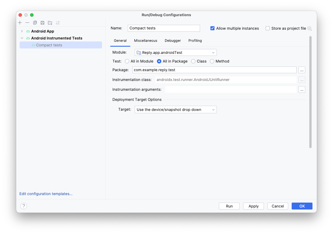
Click the three dots (…) to the right of the Instrumentation arguments field.
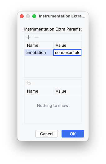
Click the plus (+) button and add the extra parameters: annotation with the value com.example.reply.test.TestCompactWidth.
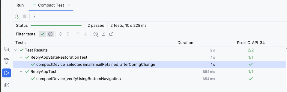
Run the tests with a compact emulator. Check that only compact tests were run.
Repeat the steps for medium and expanded screens.