Unit 3 Pathway 3 Activity 5: Practice: Build Superheroes app
Before you begin
Congratulations! In this pathway you learned the basics of Material Design, and how to add simple animations to your app. Now it is time to put what you learned into practice.
In this practice set, you’ll build on the concepts you learned in this pathway by creating a Superheroes app. This app focuses on creating the components necessary to build a scrollable list and a polished UI using the Material Design principles you learned in Material Theming with Jetpack Compose codelab.
The solution code is available at the end, but try to solve the exercises before you check it. Consider the solutions as one way to implement the app. There’s a lot of room for improvement, so feel free to experiment and try different things.
Work through the problems at a pace that’s comfortable to you. You’re encouraged to take as much time as you need to solve each problem thoughtfully.
Prerequisites
Complete Android Basics in Compose course work through the Simple Animation with Jetpack Compose.
What you’ll need
A computer with internet access and Android Studio installed.
What you’ll build
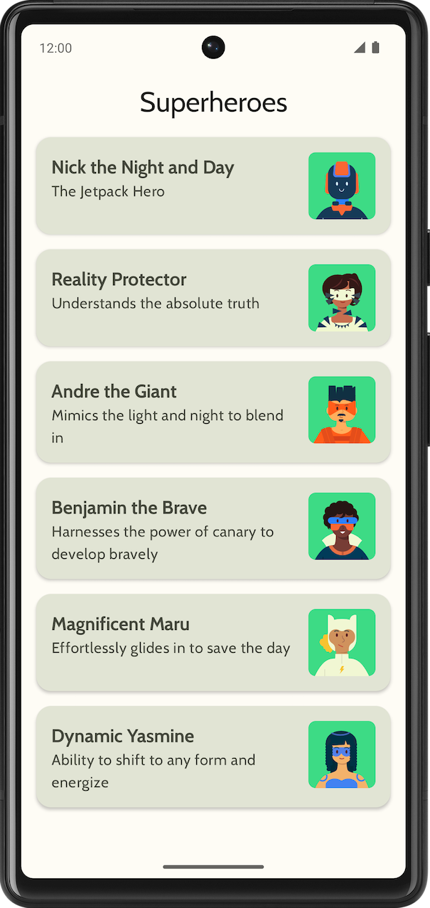
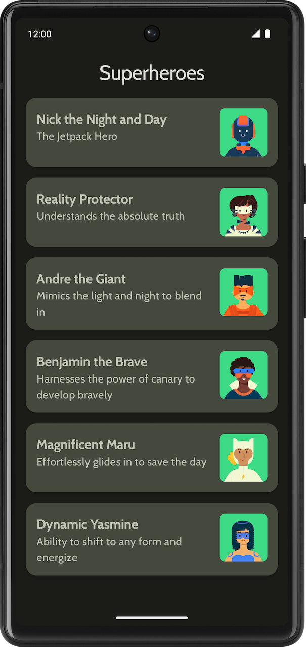
A Superheroes app that displays a list of superheroes.
The final app will look like the following in both light and dark theme:
Get started
In this task, you set up the project and create the dummy data for the superheroes.
Create a new project with the Empty Activity template and a minimum SDK of 24.
Download the assets for the app: superhero images, and app logo from Image assets.zip. Refer to the Change the app icon codelab for a refresher on how to add an app icon. Refer to Create an interactive Dice Roller app codelab for a refresher on how to add images to your app.
Download the Cabin bold and Cabin regular font files from https://fonts.google.com. Explore the different font files available. Refer to Material Theming with Jetpack Compose codelab for customizing the typography in your app.
Create a data class to hold the data for each superhero. Create a new package named
modelfor theHerodata class to organize your code. Your list item can look something like the following: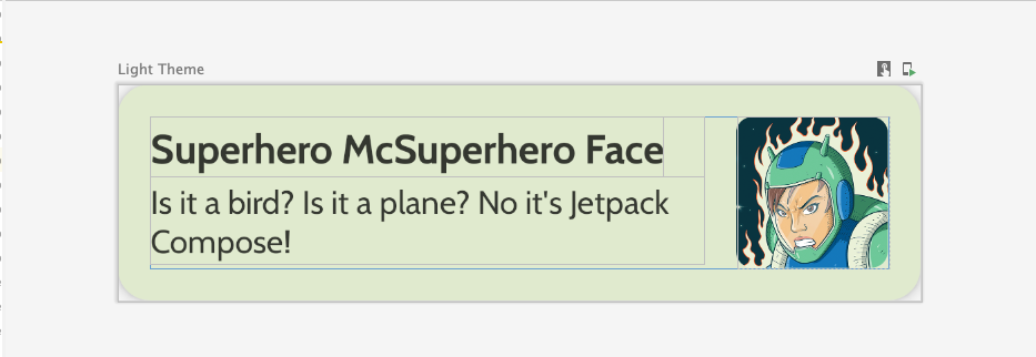
Each superhero list item displays three pieces of unique information: name, description, and an image.
In the same
modelpackage, create another file for all the heroes information you would like to display. For example, name, description, and image resource. The following is a sample data set for your inspiration.
object HeroesRepository {
    val heroes = listOf(
        Hero(
            nameRes = R.string.hero1,
            descriptionRes = R.string.description1,
            imageRes = R.drawable.android_superhero1
        ),
        Hero(
            nameRes = R.string.hero2,
            descriptionRes = R.string.description2,
            imageRes = R.drawable.android_superhero2
        ),
        Hero(
            nameRes = R.string.hero3,
            descriptionRes = R.string.description3,
            imageRes = R.drawable.android_superhero3
        ),
        Hero(
            nameRes = R.string.hero4,
            descriptionRes = R.string.description4,
            imageRes = R.drawable.android_superhero4
        ),
        Hero(
            nameRes = R.string.hero5,
            descriptionRes = R.string.description5,
            imageRes = R.drawable.android_superhero5
        ),
        Hero(
            nameRes = R.string.hero6,
            descriptionRes = R.string.description6,
            imageRes = R.drawable.android_superhero6
        )
    )
}
Add the heroes name and description strings in the
strings.xmlfile.<resources> <string name="app_name">Superheroes</string> <string name="hero1">Nick the Night and Day</string> <string name="description1">The Jetpack Hero</string> <string name="hero2">Reality Protector</string> <string name="description2">Understands the absolute truth</string> <string name="hero3">Andre the Giant</string> <string name="description3">Mimics the light and night to blend in</string> <string name="hero4">Benjamin the Brave</string> <string name="description4">Harnesses the power of canary to develop bravely</string> <string name="hero5">Magnificent Maru</string> <string name="description5">Effortlessly glides in to save the day</string> <string name="hero6">Dynamic Yasmine</string> <string name="description6">Ability to shift to any form and energize</string> </resources>
Material Theming
In this section you will add the app’s color palette, typography, and shapes to improve the look and feel of the app.
The following Color, Type, and Shape are just recommendations for the theme. Explore and modify different color schemes.
Use Material Theme Builder to create a new theme for the app.
Color
ui.theme/Color.ktimport androidx.compose.ui.graphics.Color val md_theme_light_primary = Color(0xFF466800) val md_theme_light_onPrimary = Color(0xFFFFFFFF) val md_theme_light_primaryContainer = Color(0xFFC6F181) val md_theme_light_onPrimaryContainer = Color(0xFF121F00) val md_theme_light_secondary = Color(0xFF596248) val md_theme_light_onSecondary = Color(0xFFFFFFFF) val md_theme_light_secondaryContainer = Color(0xFFDDE6C6) val md_theme_light_onSecondaryContainer = Color(0xFF161E0A) val md_theme_light_tertiary = Color(0xFF396661) val md_theme_light_onTertiary = Color(0xFFFFFFFF) val md_theme_light_tertiaryContainer = Color(0xFFBCECE6) val md_theme_light_onTertiaryContainer = Color(0xFF00201D) val md_theme_light_error = Color(0xFFBA1A1A) val md_theme_light_errorContainer = Color(0xFFFFDAD6) val md_theme_light_onError = Color(0xFFFFFFFF) val md_theme_light_onErrorContainer = Color(0xFF410002) val md_theme_light_background = Color(0xFFFEFCF5) val md_theme_light_onBackground = Color(0xFF1B1C18) val md_theme_light_surface = Color(0xFFFEFCF5) val md_theme_light_onSurface = Color(0xFF1B1C18) val md_theme_light_surfaceVariant = Color(0xFFE1E4D4) val md_theme_light_onSurfaceVariant = Color(0xFF45483D) val md_theme_light_outline = Color(0xFF75786C) val md_theme_light_inverseOnSurface = Color(0xFFF2F1E9) val md_theme_light_inverseSurface = Color(0xFF30312C) val md_theme_light_inversePrimary = Color(0xFFABD468) val md_theme_light_surfaceTint = Color(0xFF466800) val md_theme_light_outlineVariant = Color(0xFFC5C8B9) val md_theme_light_scrim = Color(0xFF000000) val md_theme_dark_primary = Color(0xFFABD468) val md_theme_dark_onPrimary = Color(0xFF223600) val md_theme_dark_primaryContainer = Color(0xFF344E00) val md_theme_dark_onPrimaryContainer = Color(0xFFC6F181) val md_theme_dark_secondary = Color(0xFFC1CAAB) val md_theme_dark_onSecondary = Color(0xFF2B331D) val md_theme_dark_secondaryContainer = Color(0xFF414A32) val md_theme_dark_onSecondaryContainer = Color(0xFFDDE6C6) val md_theme_dark_tertiary = Color(0xFFA0D0CA) val md_theme_dark_onTertiary = Color(0xFF013733) val md_theme_dark_tertiaryContainer = Color(0xFF1F4E4A) val md_theme_dark_onTertiaryContainer = Color(0xFFBCECE6) val md_theme_dark_error = Color(0xFFFFB4AB) val md_theme_dark_errorContainer = Color(0xFF93000A) val md_theme_dark_onError = Color(0xFF690005) val md_theme_dark_onErrorContainer = Color(0xFFFFDAD6) val md_theme_dark_background = Color(0xFF1B1C18) val md_theme_dark_onBackground = Color(0xFFE4E3DB) val md_theme_dark_surface = Color(0xFF1B1C18) val md_theme_dark_onSurface = Color(0xFFE4E3DB) val md_theme_dark_surfaceVariant = Color(0xFF45483D) val md_theme_dark_onSurfaceVariant = Color(0xFFC5C8B9) val md_theme_dark_outline = Color(0xFF8F9285) val md_theme_dark_inverseOnSurface = Color(0xFF1B1C18) val md_theme_dark_inverseSurface = Color(0xFFE4E3DB) val md_theme_dark_inversePrimary = Color(0xFF466800) val md_theme_dark_surfaceTint = Color(0xFFABD468) val md_theme_dark_outlineVariant = Color(0xFF45483D) val md_theme_dark_scrim = Color(0xFF000000)
Shape
ui.theme/Shape.ktimport androidx.compose.foundation.shape.RoundedCornerShape import androidx.compose.material3.Shapes import androidx.compose.ui.unit.dp val Shapes = Shapes( small = RoundedCornerShape(8.dp), medium = RoundedCornerShape(16.dp), large = RoundedCornerShape(16.dp) )
Typography
ui.theme/Type.ktimport androidx.compose.material3.Typography import androidx.compose.ui.text.TextStyle import androidx.compose.ui.text.font.Font import androidx.compose.ui.text.font.FontFamily import androidx.compose.ui.text.font.FontWeight import androidx.compose.ui.unit.sp import com.example.superheroes.R val Cabin = FontFamily( Font(R.font.cabin_regular, FontWeight.Normal), Font(R.font.cabin_bold, FontWeight.Bold) ) // Set of Material typography styles to start with val Typography = Typography( bodyLarge = TextStyle( fontFamily = Cabin, fontWeight = FontWeight.Normal, fontSize = 16.sp, lineHeight = 24.sp, letterSpacing = 0.5.sp ), displayLarge = TextStyle( fontFamily = Cabin, fontWeight = FontWeight.Normal, fontSize = 30.sp ), displayMedium = TextStyle( fontFamily = Cabin, fontWeight = FontWeight.Bold, fontSize = 20.sp ), displaySmall = TextStyle( fontFamily = Cabin, fontWeight = FontWeight.Bold, fontSize = 20.sp ) )
Theme
ui.theme/Theme.ktimport android.app.Activity import android.os.Build import androidx.compose.foundation.isSystemInDarkTheme import androidx.compose.material3.MaterialTheme import androidx.compose.material3.darkColorScheme import androidx.compose.material3.dynamicDarkColorScheme import androidx.compose.material3.dynamicLightColorScheme import androidx.compose.material3.lightColorScheme import androidx.compose.runtime.Composable import androidx.compose.runtime.SideEffect import androidx.compose.ui.graphics.toArgb import androidx.compose.ui.platform.LocalContext import androidx.compose.ui.platform.LocalView import androidx.core.view.WindowCompat private val LightColors = lightColorScheme( primary = md_theme_light_primary, onPrimary = md_theme_light_onPrimary, primaryContainer = md_theme_light_primaryContainer, onPrimaryContainer = md_theme_light_onPrimaryContainer, secondary = md_theme_light_secondary, onSecondary = md_theme_light_onSecondary, secondaryContainer = md_theme_light_secondaryContainer, onSecondaryContainer = md_theme_light_onSecondaryContainer, tertiary = md_theme_light_tertiary, onTertiary = md_theme_light_onTertiary, tertiaryContainer = md_theme_light_tertiaryContainer, onTertiaryContainer = md_theme_light_onTertiaryContainer, error = md_theme_light_error, errorContainer = md_theme_light_errorContainer, onError = md_theme_light_onError, onErrorContainer = md_theme_light_onErrorContainer, background = md_theme_light_background, onBackground = md_theme_light_onBackground, surface = md_theme_light_surface, onSurface = md_theme_light_onSurface, surfaceVariant = md_theme_light_surfaceVariant, onSurfaceVariant = md_theme_light_onSurfaceVariant, outline = md_theme_light_outline, inverseOnSurface = md_theme_light_inverseOnSurface, inverseSurface = md_theme_light_inverseSurface, inversePrimary = md_theme_light_inversePrimary, surfaceTint = md_theme_light_surfaceTint, outlineVariant = md_theme_light_outlineVariant, scrim = md_theme_light_scrim, ) private val DarkColors = darkColorScheme( primary = md_theme_dark_primary, onPrimary = md_theme_dark_onPrimary, primaryContainer = md_theme_dark_primaryContainer, onPrimaryContainer = md_theme_dark_onPrimaryContainer, secondary = md_theme_dark_secondary, onSecondary = md_theme_dark_onSecondary, secondaryContainer = md_theme_dark_secondaryContainer, onSecondaryContainer = md_theme_dark_onSecondaryContainer, tertiary = md_theme_dark_tertiary, onTertiary = md_theme_dark_onTertiary, tertiaryContainer = md_theme_dark_tertiaryContainer, onTertiaryContainer = md_theme_dark_onTertiaryContainer, error = md_theme_dark_error, errorContainer = md_theme_dark_errorContainer, onError = md_theme_dark_onError, onErrorContainer = md_theme_dark_onErrorContainer, background = md_theme_dark_background, onBackground = md_theme_dark_onBackground, surface = md_theme_dark_surface, onSurface = md_theme_dark_onSurface, surfaceVariant = md_theme_dark_surfaceVariant, onSurfaceVariant = md_theme_dark_onSurfaceVariant, outline = md_theme_dark_outline, inverseOnSurface = md_theme_dark_inverseOnSurface, inverseSurface = md_theme_dark_inverseSurface, inversePrimary = md_theme_dark_inversePrimary, surfaceTint = md_theme_dark_surfaceTint, outlineVariant = md_theme_dark_outlineVariant, scrim = md_theme_dark_scrim, ) @Composable fun SuperheroesTheme( darkTheme: Boolean = isSystemInDarkTheme(), // Dynamic color is available on Android 12+ // Dynamic color in this app is turned off for learning purposes dynamicColor: Boolean = false, content: @Composable () -> Unit ) { val colorScheme = when { dynamicColor && Build.VERSION.SDK_INT >= Build.VERSION_CODES.S -> { val context = LocalContext.current if (darkTheme) dynamicDarkColorScheme(context) else dynamicLightColorScheme(context) } darkTheme -> DarkColors else -> LightColors } val view = LocalView.current if (!view.isInEditMode) { SideEffect { val window = (view.context as Activity).window window.statusBarColor = colorScheme.background.toArgb() WindowCompat.getInsetsController(window, view).isAppearanceLightStatusBars = !darkTheme } } MaterialTheme( colorScheme = colorScheme, typography = Typography, shapes = Shapes, content = content ) }
Display list
The first step in creating a list is to create a list item.
Create a file called
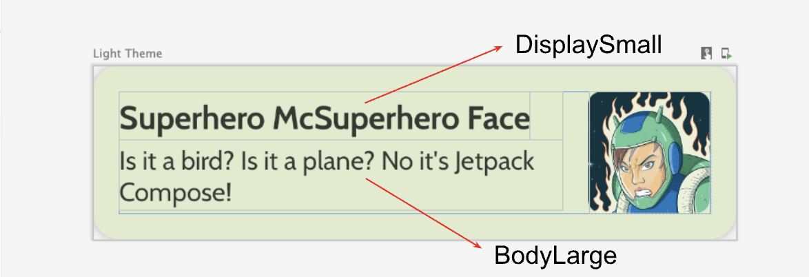
HeroesScreen.kt, under thecom.example.superheroespackage. You will be creating a list item and list composables in this file.Create a composable to represent a superhero list item, which looks like the following screenshot and UI specifications.

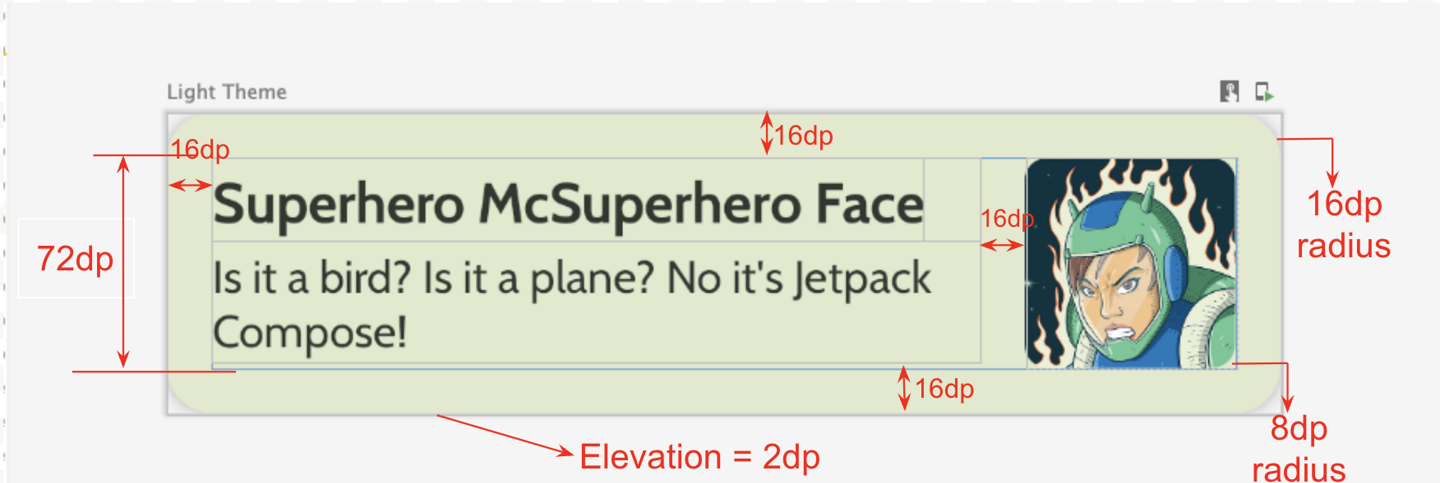
Follow this UI specification or be creative and design your own list item:
Card elevation is 2dp
Height of the list item is 72dp with 16dp padding
Clip radius of the list item is 16dp
Box layout with image with size 72dp
Clip radius of the image is 8dp
Space between the image and the text is 16dp
Style for superhero’s name is DisplaySmall
Style for superhero’s description is BodyLarge
Explore different padding and size options, as per the Material 3 guidelines, padding should be increments of 4dp.
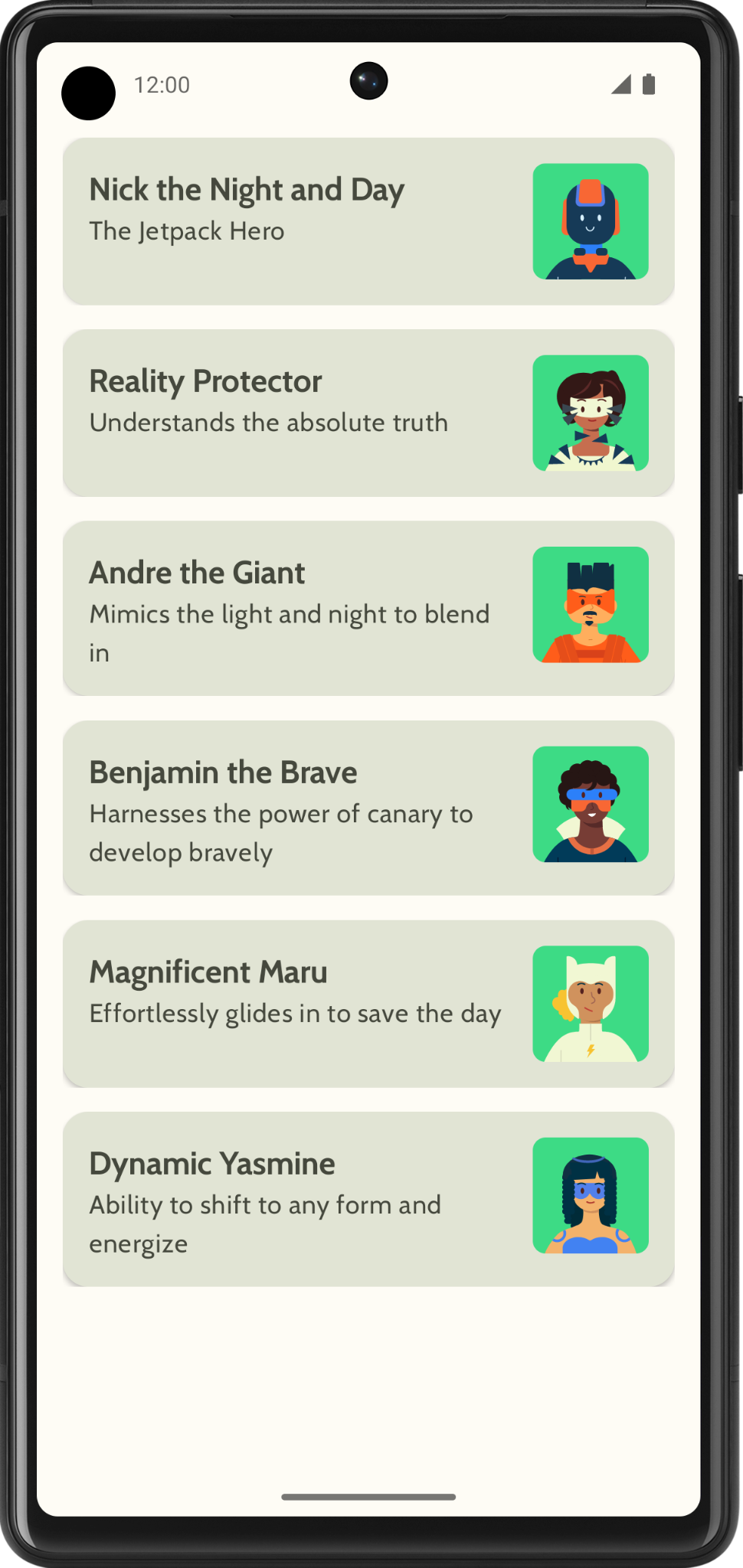
Create the lazy column
Create another composable that takes the list of heroes and displays the list. This is where you use a
LazyColumn.Use the following UI specifications for the padding.

After you finish the implementation, your app should match the following screenshot:
Add Top app bar
Add a top app bar for your app.
In
MainActivity.kt, add a composable to display the top app bar. Add text to the top app bar; it could be the app name. Align it in the center both horizontally and vertically.You could set the top app bar with style as
DisplayLarge.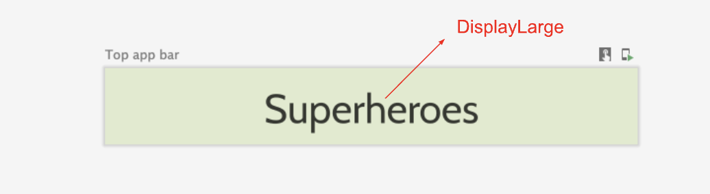
Use
scaffoldto display the top app bar. Refer to the Top app bar – Material Design 3 documentation if needed.
Customize status bar color
To make your app edge-to-edge, you can customize the status bar color to match the background color.
In the
Theme.kt, add this new method to change the status bar and navigation bar colors for edge to edge./** * Sets up edge-to-edge for the window of this [view]. The system icon colors are set to either * light or dark depending on whether the [darkTheme] is enabled or not. */ private fun setUpEdgeToEdge(view: View, darkTheme: Boolean) { val window = (view.context as Activity).window WindowCompat.setDecorFitsSystemWindows(window, false) window.statusBarColor = Color.Transparent.toArgb() val navigationBarColor = when { Build.VERSION.SDK_INT >= 29 -> Color.Transparent.toArgb() Build.VERSION.SDK_INT >= 26 -> Color(0xFF, 0xFF, 0xFF, 0x63).toArgb() // Min sdk version for this app is 24, this block is for SDK versions 24 and 25 else -> Color(0x00, 0x00, 0x00, 0x50).toArgb() } window.navigationBarColor = navigationBarColor val controller = WindowCompat.getInsetsController(window, view) controller.isAppearanceLightStatusBars = !darkTheme controller.isAppearanceLightNavigationBars = !darkTheme }
In the
SuperheroesTheme()function, call thesetUpEdgeToEdge()function from within the SideEffect block.fun SuperheroesTheme( darkTheme: Boolean = isSystemInDarkTheme(), // Dynamic color is available on Android 12+ // Dynamic color in this app is turned off for learning purposes dynamicColor: Boolean = false, content: @Composable () -> Unit ) { //... val view = LocalView.current if (!view.isInEditMode) { SideEffect { setUpEdgeToEdge(view, darkTheme) } } //... }
Solution code
https://github.com/google-developer-training/basic-android-kotlin-compose-training-superheroes
Branch: main
Clone:
$ git clone https://github.com/google-developer-training/basic-android-kotlin-compose-training-superheroes.git