Unit 5 Pathway 2 Activity 3: Load and display images from the internet
Before you begin
Introduction
In previous codelabs, you learned how to get data from a web service using a repository pattern and parse the response into a Kotlin object. In this codelab, you build on that knowledge to load and display photos from a web URL. You also revisit how to build a
LazyVerticalGridand use it to display a grid of images on the overview page.
Prerequisites
Knowledge of how to retrieve JSON from a REST web service and the parsing of that data into Kotlin objects
Knowledge of a REST web service
Familiarity with Android architecture components, such as a data layer and repository
Knowledge of dependency injection
Knowledge of
ViewModelandViewModelProvider.FactoryKnowledge of coroutine implementation for your app
Knowledge of the repository pattern
What you’ll learn
How to use the Coil library to load and display an image from a web URL.
How to use a LazyVerticalGrid to display a grid of images.
How to handle potential errors as the images download and display.
What you’ll build
Modify the Mars Photos app to get the image URL from the Mars data, and use Coil to load and display that image.
Add a loading animation and error icon to the app.
Add status and error handling to the app.
What you’ll need
A computer with a modern web browser, such as the latest version of Chrome
Starter code for the Mars Photos app with REST web services
App overview
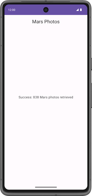
In this codelab, you continue working with the Mars Photos app from a previous codelab. The Mars Photos app connects to a web service to retrieve and display the number of Kotlin objects retrieved. These Kotlin objects contain the URLs of real-life photos from the Mars surface captured from NASA’s Mars Rovers.
In this codelab, the app will display Mars photos in a grid of images. The images are retrieved from the web service. The Coil library loads and displays the images. A
LazyVerticalGridcreates the grid layout for the images. The app also handles network errors gracefully by displaying an error message.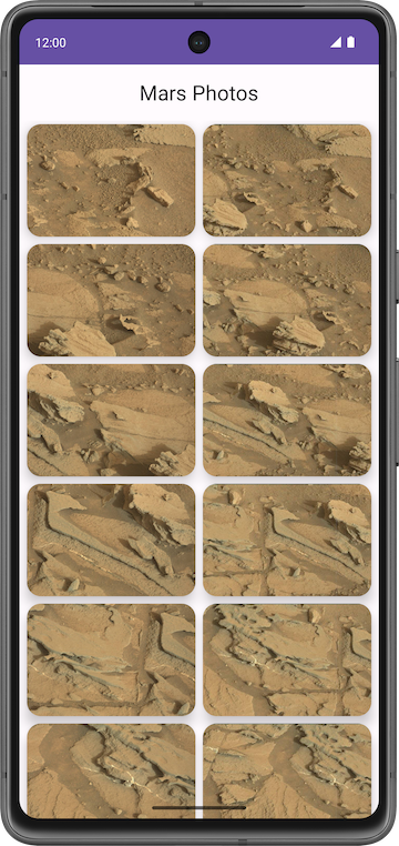
Solution code
Branch: main
Clone:
$ git clone https://github.com/google-developer-training/basic-android-kotlin-compose-training-mars-photos.git
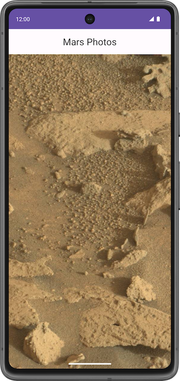
Display a downloaded image
Displaying a photo from a web URL might sound straightforward, but there is quite a bit of engineering to make it work well. The image has to be downloaded, cached, and decoded from its compressed format to an image that Android can use. You can cache the image to an in-memory cache, a storage-based cache, or both. All this has to happen in low-priority background threads, so the UI remains responsive. Also, for the best network and CPU performance, it’s best to fetch and decode more than one image at once.
A community-developed library called Coil simplifies this process. Without the use of Coil, much more work has to be done.
Coil needs two things:
The URL of the image you want to load and display.
An
AsyncImagecomposable to actually display that image.
Displaying a single image from the Mars web service looks like this:
Coil dependency
In
build.gradle.kts (Module :app), in thedependenciessection, this line is added for Coil:// Coil implementation("io.coil-kt:coil-compose:2.4.0")
The AsyncImage composable
The
AsyncImagecomposable loads and displays a single photo.AsyncImageis a composable that executes an image request asynchronously, and renders the result. Example:AsyncImage( model = "https://android.com/sample_image.jpg", contentDescription = null )
The
modelargument is either anImageRequestobject, or itsImageRequest.data. In the preceding example, theImageRequest.datavalue is used, which is the image URLhttps://android.com/sample_image.jpg. The following example code shows how to assign anImageRequesttomodelAsyncImage( model = ImageRequest.Builder(LocalContext.current) .data("https://example.com/image.jpg") .crossfade(true) .build(), placeholder = painterResource(R.drawable.placeholder), contentDescription = stringResource(R.string.description), contentScale = ContentScale.Crop, modifier = Modifier.clip(CircleShape) )
AsyncImagesupports the same arguments as the standard Image composable. Additionally, it supports settingplaceholder/error/fallbackpainters andonLoading/onSuccess/onErrorcallbacks. The preceding example code loads the image with a circle crop and crossfade and sets a placeholder.contentDescriptionsets the text used by accessibility services to describe what this image represents.In
ui/screens/HomeScreen.kt, the composable function calledMarsPhotoCard()usesAsyncImage()and displays only a single image:@Composable fun MarsPhotoCard(photo: MarsPhoto, modifier: Modifier = Modifier) { Card( modifier = modifier, shape = MaterialTheme.shapes.medium, elevation = CardDefaults.cardElevation(defaultElevation = 8.dp) ) { AsyncImage( model = ImageRequest.Builder(context = LocalContext.current).data(photo.imgSrc) .crossfade(true).build(), error = painterResource(R.drawable.ic_broken_image), placeholder = painterResource(R.drawable.loading_img), contentDescription = stringResource(R.string.mars_photo), contentScale = ContentScale.Crop, // Fill the available space on screen modifier = Modifier.fillMaxWidth() ) } }
crossfade(true)enables a crossfade animation when the request completes successfully.
Loading and error images
To improve the user experience, show a placeholder image while loading the image. You can also display an error image if the loading fails due to an issue, such as a missing or corrupt image file.
Open
res/drawable/ic_broken_image.xmland click the Design or Split tab on the right. It’s a broken-image icon that’s available in the built-in icon library. This can be used for the error image. This vector drawable uses theandroid:tintattribute to color the icon gray.
Open
res/drawable/loading_img.xml. This drawable is an animation that rotates an image drawable,loading_img.xml, around the center point. (You don’t see the animation in the preview.)
Error and placeholder attributes can be added to
AsyncImageas shown:// ... AsyncImage( // ... error = painterResource(R.drawable.ic_broken_image), placeholder = painterResource(R.drawable.loading_img), // ... )
This code sets the placeholder loading image to use while loading (the
loading_imgdrawable). It also sets the image to use if image loading fails (theic_broken_imagedrawable).
Display a grid of images with a LazyVerticalGrid
MarsPhotoCarddisplays a single image. To display a grid of images, use aLazyVerticalGridwith a Grid layout manager.
Lazy grids
The LazyVerticalGrid and LazyHorizontalGrid composables provide support to display items in a grid. A lazy vertical grid displays its items in a vertically scrollable container, spanned across multiple columns, while a lazy horizontal grid has the same behavior on the horizontal axis.
From a design perspective, Grid Layout is best for displaying Mars photos as icons or images.
The
columnsparameter inLazyVerticalGridandrowsparameter inLazyHorizontalGridcontrol how cells are formed into columns or rows. The following example code displays items in a grid, usingGridCells.Adaptiveto set each column to be at least128.dpwide:// Sample code, not for the app @Composable fun PhotoGrid(photos: List<Photo>) { LazyVerticalGrid( columns = GridCells.Adaptive(minSize = 150.dp) ) { items(photos) { photo -> PhotoItem(photo) } } }
LazyVerticalGridlets you specify a width for items, and the grid then fits as many columns as possible. After calculating the number of columns, the grid distributes any remaining width equally among the columns. This adaptive way of sizing is especially useful for displaying sets of items across different screen sizes.Note
If you know the exact amount of columns to be used, you can instead provide an instance of
GridCells.Fixedcontaining the number of required columns.In this codelab, to display Mars photos, you use the
LazyVerticalGridcomposable withGridCells.Adaptive, with each column set to150.dpwide.
Use LazyVerticalGrid
In
HomeScreen.ktthePhotosGridScreen()composable takes a list ofMarsPhotoand amodifieras arguments, and displays a grid.@Composable fun PhotosGridScreen( photos: List<MarsPhoto>, modifier: Modifier = Modifier, contentPadding: PaddingValues = PaddingValues(0.dp), ) { LazyVerticalGrid( columns = GridCells.Adaptive(150.dp), modifier = modifier.padding(horizontal = 4.dp), contentPadding = contentPadding, ) { items(items = photos, key = { photo -> photo.id }) { photo -> MarsPhotoCard( photo, modifier = Modifier .padding(4.dp) .fillMaxWidth() .aspectRatio(1.5f) ) } } }
Inside the
LazyVerticalGridlambda,items()takes in the list ofMarsPhotoand an item key asphoto.id.When the user scrolls through the grid (a
LazyRowwithin aLazyColumn), the list item position changes. However, due to an orientation change or if the items are added or removed, the user can lose the scroll position within the row. Item keys help you maintain the scroll position based on the key.By providing keys, you help Compose handle reorderings correctly. For example, if your item contains a remembered state, setting keys allows Compose to move this state together with the item when its position changes.
Conclusion
Congratulations on completing the Mars Photos app! It’s time to show off your app with real life Mars pictures to your family and friends.