Unit 4 Pathway 3 Activity 3: Build an adaptive app with dynamic navigation
Introduction
One of the great advantages of developing your app on the Android platform is the vast opportunity to reach users in different kinds of form factors, such as wearables, foldables, tablets, desktop, and even TV. When using an app, your users may want to use the same app on large screen devices to take advantage of the increased real estate. Increasingly, Android users use their apps on multiple devices of varying screen sizes, and expect a high-quality user experience across all devices.
So far, you learned to make apps primarily for mobile devices. In this codelab, you’ll learn how to transform your apps to make them adaptive to other screen sizes. You’ll use adaptive navigation layout patterns that are beautiful and usable for both mobile and large screen devices, such as foldables, tablets, and desktop.
Prerequisites
Familiarity with Kotlin programming, including classes, functions, and conditionals
Familiarity using
ViewModelclassesFamiliarity creating
ComposablefunctionsExperience building layouts with Jetpack Compose
Experience running apps on a device or emulator
What you’ll learn
How to create navigation between screens without Navigation Graph for simple apps
How to create an adaptive navigation layout using Jetpack Compose
How to create a custom back handler
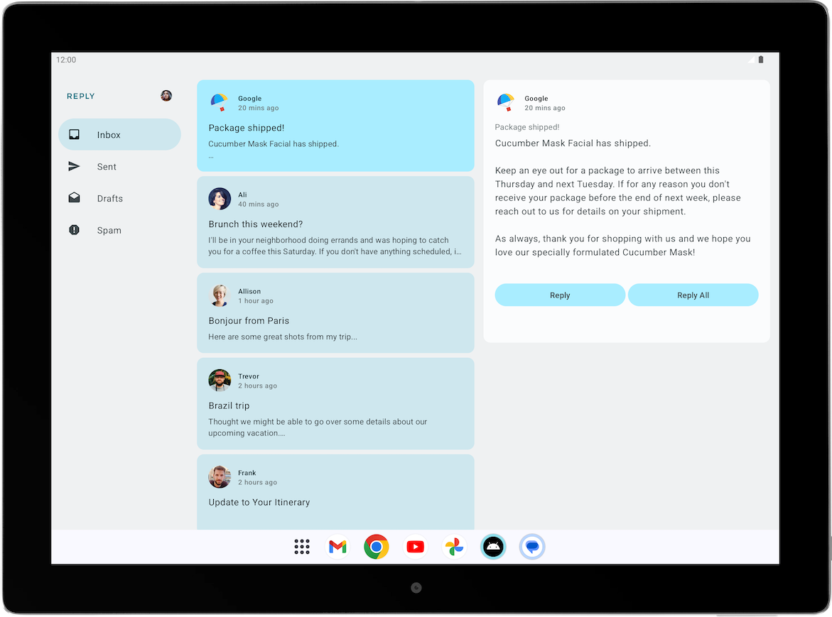
What you’ll build
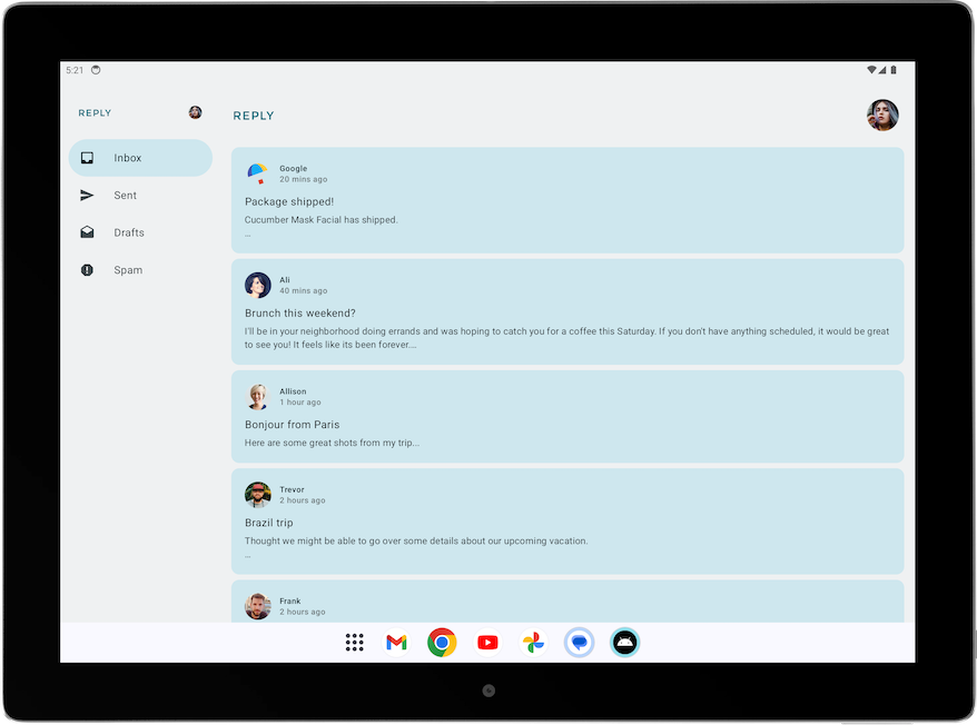
A Reply app with dynamic navigation that makes its layout adapt to all screen sizes
The finished product will look like the image below:
What you need
A computer with internet access, a web browser, and Android Studio
Access to GitHub
App overview
Reply app is a multiscreen app which resembles an email client.
It contains 4 different categories which are displayed by different tabs, namely: inbox, sent, draft, and spam.
We’ll use the solution code to to learn about adaptive navigation.
Solution code
Branch: nav-update
Clone:
$ git clone https://github.com/google-developer-training/basic-android-kotlin-compose-training-reply-app.git
$ cd basic-android-kotlin-compose-training-reply-app
$ git checkout nav-update
Solution code walkthrough
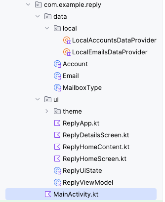
Important directories in Reply app
The data and UI layers of the Reply app project are separated into different folders.
UI layer, in
uifolder: containsReplyViewModel,ReplyUiState, and other composablesData layer, in
datafolder: contains thedataandenumclasses that define the data layer and the data provider classes.
Data initialization in Reply app
The Reply app is initialized with data through the
initializeUIState()method inReplyViewModel.kt, which is executed in theinitfunction.... init { initializeUIState() } private fun initializeUIState() { var mailboxes: Map<MailboxType, List<Email>> = LocalEmailsDataProvider.allEmails.groupBy { it.mailbox } _uiState.value = ReplyUiState( mailboxes = mailboxes, currentSelectedEmail = mailboxes[MailboxType.Inbox]?.get(0) ?: LocalEmailsDataProvider.defaultEmail ) } ...
The screen level composable
As with other apps, the Reply app uses the
ReplyAppcomposable as the main composable where theviewModelanduiStateare declared. VariousviewModel()functions are also passed as lambda arguments for theReplyHomeScreencomposable. InReplyApp.kt:... @Composable fun ReplyApp(modifier: Modifier = Modifier) { val viewModel: ReplyViewModel = viewModel() val replyUiState = viewModel.uiState.collectAsState().value ReplyHomeScreen( replyUiState = replyUiState, onTabPressed = { mailboxType: MailboxType -> viewModel.updateCurrentMailbox(mailboxType = mailboxType) viewModel.resetHomeScreenStates() }, onEmailCardPressed = { email: Email -> viewModel.updateDetailsScreenStates( email = email ) }, onDetailScreenBackPressed = { viewModel.resetHomeScreenStates() }, modifier = modifier ) }
Other composables
ReplyHomeScreen.kt: screen composables for home screen, including navigation elements.ReplyHomeContent.kt: composables that define more detailed composables of the home screen.ReplyDetailsScreen.kt: screen composables and smaller composables for the details screen.
Change screens without a navigation graph
A
NavHostControllerclass is used to navigate from one screen to another. With Compose, you can also change screens with simple conditional statements by making use of runtime mutable states. This is especially useful in small applications like the Reply app, where you only want to switch between two screens.
Change screens with state changes
In Compose, screens are recomposed when a state change occurs. You can change screens using simple conditionals to respond to changes in states.
This code in
ReplyHomeScreen.ktshows the content of the home screen when the user is at the home screen, and the details screen when the user is not.@Composable fun ReplyHomeScreen( navigationType: ReplyNavigationType, replyUiState: ReplyUiState, onTabPressed: (MailboxType) -> Unit, onEmailCardPressed: (Email) -> Unit, onDetailScreenBackPressed: () -> Unit, modifier: Modifier = Modifier ) { // ... if (replyUiState.isShowingHomepage) { ReplyAppContent( navigationType = navigationType, replyUiState = replyUiState, onTabPressed = onTabPressed, onEmailCardPressed = onEmailCardPressed, navigationItemContentList = navigationItemContentList, modifier = modifier, ) } else { ReplyDetailsScreen( replyUiState = replyUiState, onBackPressed = onDetailScreenBackPressed, modifier = modifier ) } // ... }
The
replyUiStateobject is a state object. As such, when there is a change in theisShowingHomepageproperty of thereplyUiStateobject, theReplyHomeScreencomposable is recomposed and theif/elsestatement is reevaluated at runtime. This approach supports navigation between different screens without the use of aNavHostControllerclass.
Create custom back handler
One advantage of using the
NavHostcomposable to switch between screens is that the directions of previous screens are saved in the backstack. These saved screens allow the system back button to easily navigate to the previous screen when invoked. Since the Reply app doesn’t use aNavHost, the app code has handle the back button manually.In
ReplyDetailsScreen.kt➜ReplyDetailsScreen(), this is the code for a custom back handler:@Composable fun ReplyDetailsScreen( replyUiState: ReplyUiState, onBackPressed: () -> Unit, modifier: Modifier = Modifier ) { BackHandler { onBackPressed() } // ... }
Run app on large screen devices
Check your app with the resizable emulator
To make usable apps, developers need to understand their users’ experience in various form factors. Therefore, you must test apps on various form factors from the beginning of the development process.
You can use many emulators of different screen sizes to achieve this goal. However, doing so can be cumbersome, especially when you are building for multiple screen sizes at once. You might also need to test how an app that is running responds to screen size changes , such as orientation changes, window size changes in a desktop, and fold state changes in foldable.
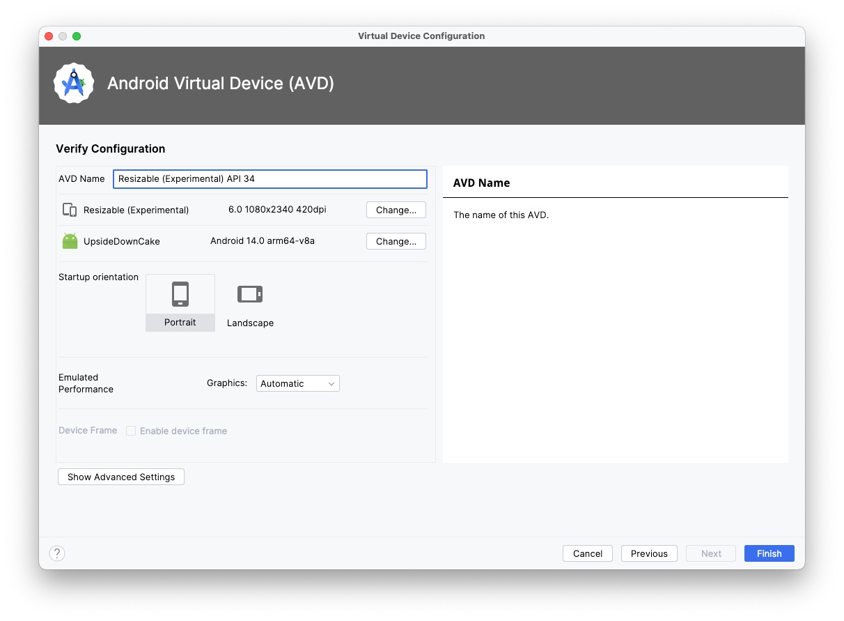
Android Studio helps you to test these scenarios with the introduction of the resizable emulator. Complete the following steps to set up the resizable emulator.
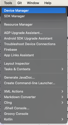
In Android Studio, select Tools > Device Manager.
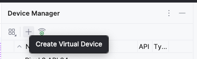
In Device Manager, click + icon to create a virtual device.
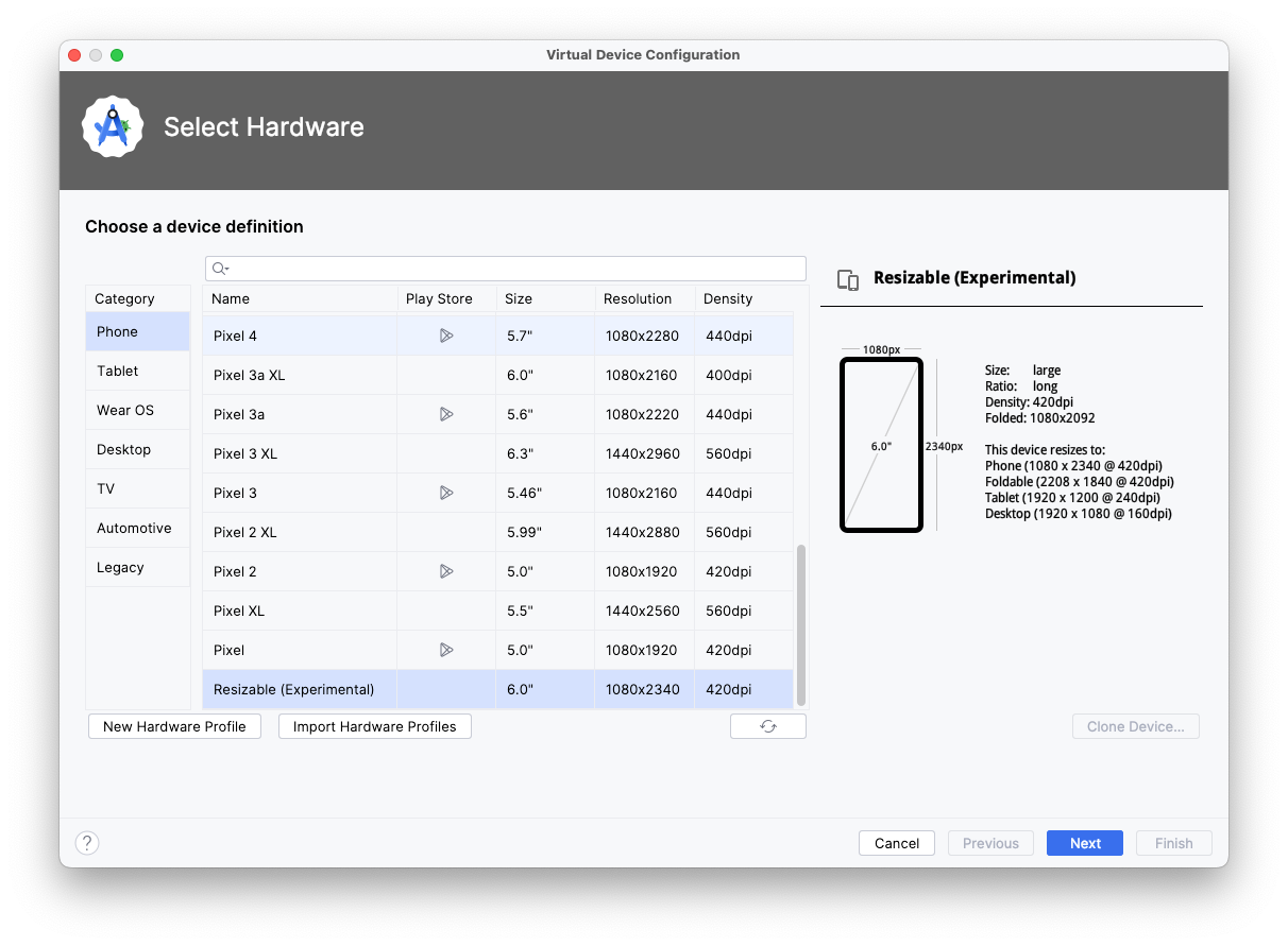
Select the Phone category and the Resizable (Experimental) device.
Click Next.
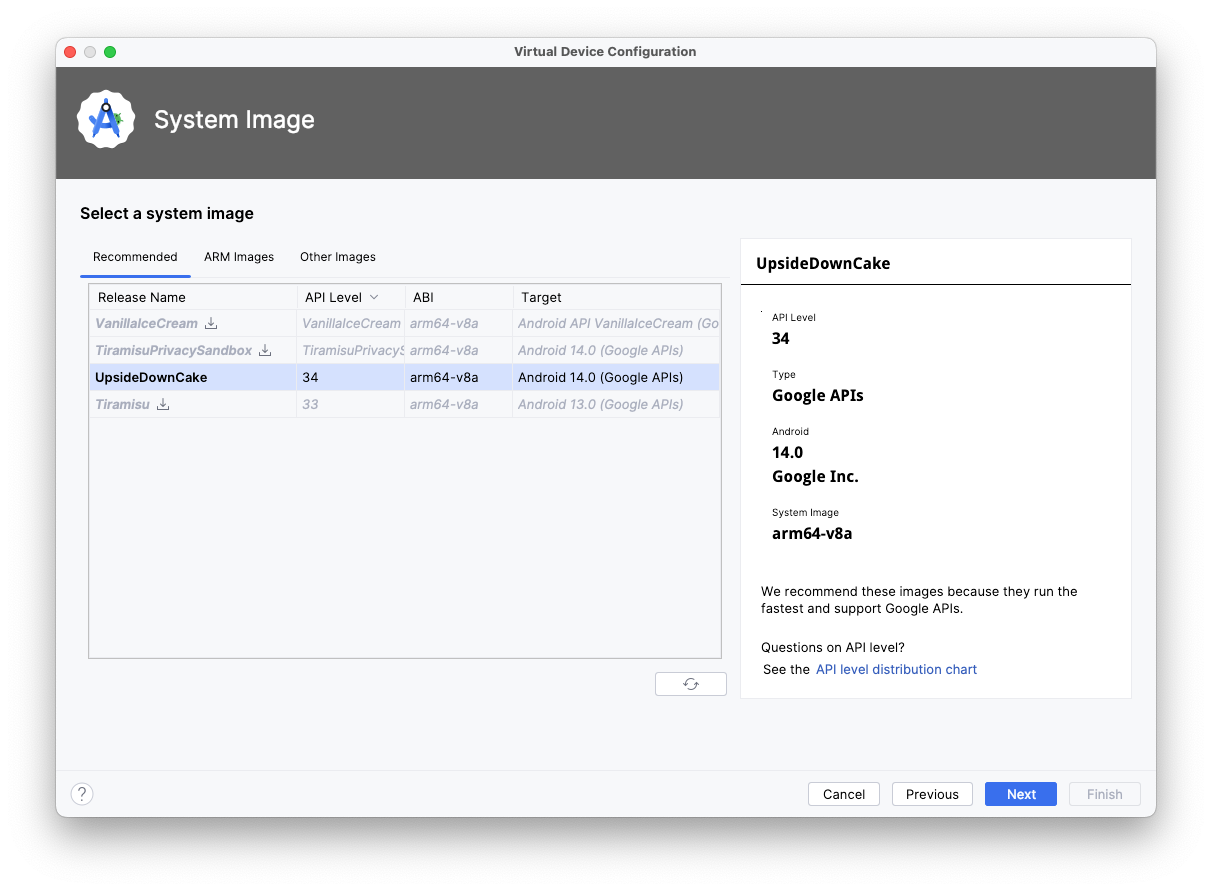
Select API Level 34 or higher.
Click Next.
Name your new Android Virtual Device.
Click Finish.
Run app on a large screen emulator
Now that you have the resizable emulator setup, let’s see how the app looks on a large screen.
Run the app on the resizable emulator.
Select Tablet for the display mode.
Inspect the app in the Tablet mode in landscape mode. You should see this:
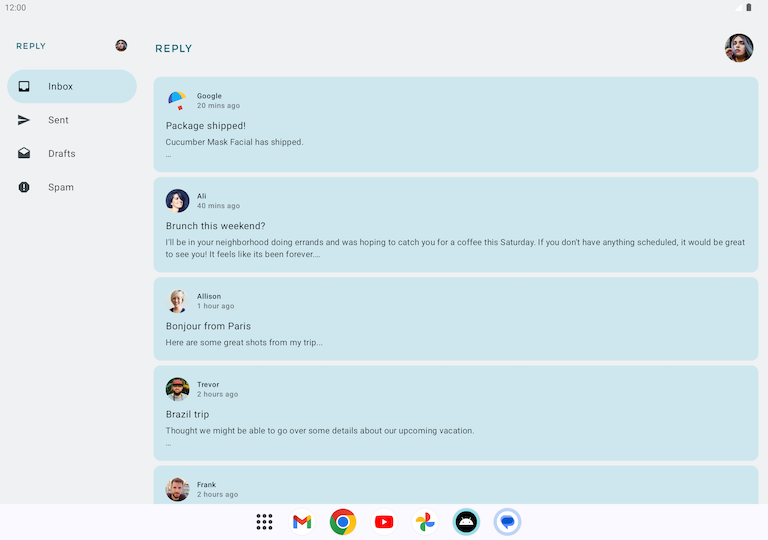
Notice that as compared to a phone, the navigation bar has shifted to the left.
What if the phone layout were used to display the app on a tablet? Then it would look rather odd, like this:
Design for large screens
When designing for large screens, such as tablets and foldables, you have to consider user ergonomics and the proximity of the user’s fingers to the screen. With mobile devices, user’s fingers can easily reach most of the screen; the location of interactive elements, such as buttons and navigation elements, are not as critical. However, for large screens, having critical interactive elements in the middle of the screen can make them hard to reach.
As you see in the Reply app, design for large screens is not just stretching or enlarging UI elements to fit the screen. It is an opportunity to use the increased real estate to create a different experience for your users. For example, you can add another layout on the same screen to prevent the need to navigate to another screen or make multitasking possible.
This is an example, the app doesn’t actually do this:
This design can increase user productivity and fosters greater engagement. But before you deploy this design, you must first learn how to create different layouts for different screen sizes.
Note
Portrait mode is the primary orientation for phones, but landscape mode is the primary orientation for tablets. When designing for adaptivity, the relevant screen size is affected by the current window size and the device orientation, not just the device size.
Make your layout adapt to different screen sizes
What are breakpoints?
You may wonder how you can show different layouts for the same app. The short answer is by using conditionals on different states, the way you did in the beginning of this codelab.
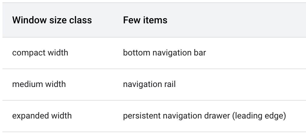
To create an adaptive app, you need the layout to change based on screen size. The measurement point where a layout changes is known as a breakpoint. Material Design created an opinionated breakpoint range that covers most Android screens.
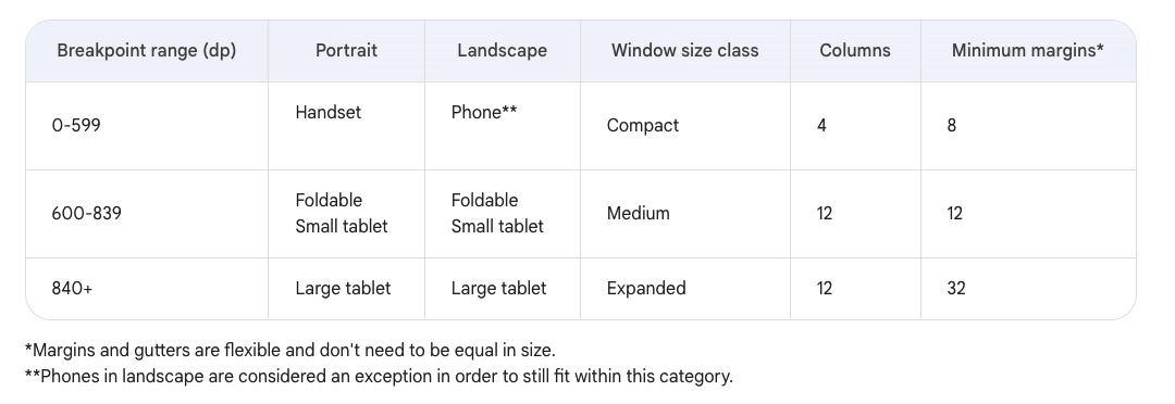
This breakpoint range table shows, for example, that if your app is currently running on a device with a screen size less than 600 dp, you should show the mobile layout.
Note
The breakpoints concept in adaptive layouts is different from the breakpoints term in debugging.
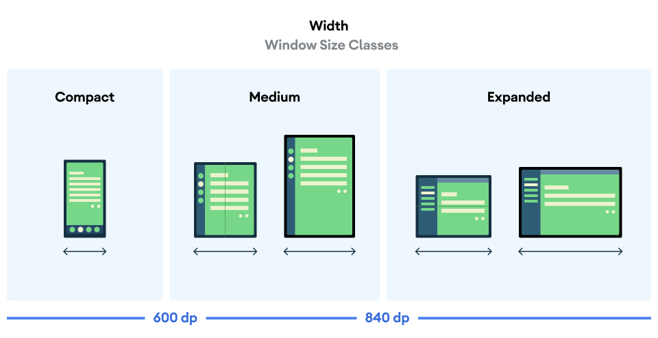
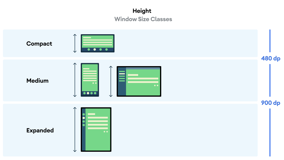
Use Window Size Classes
The
WindowSizeClassAPI introduced for Compose makes the implementation of Material Design breakpoints simpler.Window Size Classes introduces three categories of sizes: Compact, Medium, and Expanded, for both width and height.
The Reply app uses the
WindowSizeClassAPI. Here’s how.The
build.gradle.kts (Module :app)file contains this dependency:... dependencies { ... implementation("androidx.compose.material3:material3-window-size-class") ...
In
MainActivity.kt➜onCreate():@OptIn(ExperimentalMaterial3WindowSizeClassApi::class) // This annotation is needed because the ``material3-window-size-class`` API is still in an alpha version. override fun onCreate(savedInstanceState: Bundle?) { // ... setContent { ReplyTheme { val layoutDirection = LocalLayoutDirection.current Surface ( // ... ){ val windowSize = calculateWindowSizeClass(this) ReplyApp( windowSize = windowSize.widthSizeClass, ) } } } }
The
windowSize.widthSizeClassis passed to theReplyAppcomposable. Watch what happens next.
In
ReplyApp.kt➜ReplyApp:@Composable fun ReplyApp( windowSize: WindowWidthSizeClass, modifier: Modifier = Modifier, ) { val navigationType: ReplyNavigationType val viewModel: ReplyViewModel = viewModel() val replyUiState = viewModel.uiState.collectAsState().value when (windowSize) { WindowWidthSizeClass.Compact -> { navigationType = ReplyNavigationType.BOTTOM_NAVIGATION } WindowWidthSizeClass.Medium -> { navigationType = ReplyNavigationType.NAVIGATION_RAIL } WindowWidthSizeClass.Expanded -> { navigationType = ReplyNavigationType.PERMANENT_NAVIGATION_DRAWER } else -> { navigationType = ReplyNavigationType.BOTTOM_NAVIGATION } } // ... }
Don’t know what
navigationType =does? Keep reading to uncover the shocking truth.
Implement adaptive navigation layout
Implement adaptive UI navigation
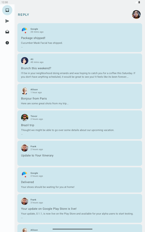
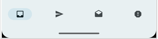
The bottom navigation looks like this:
On larger screens, this navigation element is not ideal, because users can find it difficult to reach. Fortunately, there are recommended patterns for different navigation elements for various window size classes in navigation for responsive UIs. The Reply app uses these:
The navigation rail is another navigation component by Material Design which allows compact navigation options for primary destinations to be accessible from the side of the app.

Similarly, a persistent/permanent navigation drawer is created by Material Design as another option to provide ergonomic access for larger screens.
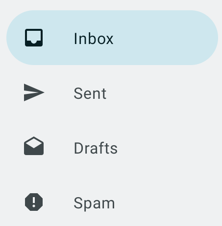
Implement a navigation drawer
To create a navigation drawer for expanded screens, use the
navigationTypeparameter.The
ui/utils/WindowStateUtils.ktcontains anenumclass to reprsent different types of navigation elements.package com.example.reply.ui.utils /** * Different type of navigation supported by app depending on size and state. */ enum class ReplyNavigationType { BOTTOM_NAVIGATION, NAVIGATION_RAIL, PERMANENT_NAVIGATION_DRAWER }
To represent different types of navigation elements, create a new file
WindowStateUtils.ktin a new packageutils, which is under theuidirectory.Add an
Enumclass to represent different types of navigation elements.To successfully implement the navigation drawer, we need to determine the navigation type based on the app’s window size.
In
ReplyApp.kt➜ReplyApp:@Composable fun ReplyApp( windowSize: WindowWidthSizeClass, modifier: Modifier = Modifier, ) { val navigationType: ReplyNavigationType val viewModel: ReplyViewModel = viewModel() val replyUiState = viewModel.uiState.collectAsState().value when (windowSize) { WindowWidthSizeClass.Compact -> { navigationType = ReplyNavigationType.BOTTOM_NAVIGATION } WindowWidthSizeClass.Medium -> { navigationType = ReplyNavigationType.NAVIGATION_RAIL } WindowWidthSizeClass.Expanded -> { navigationType = ReplyNavigationType.PERMANENT_NAVIGATION_DRAWER } else -> { navigationType = ReplyNavigationType.BOTTOM_NAVIGATION } } // The navigationType gets passed to ReplyHomeScreen ReplyHomeScreen( navigationType = navigationType, // ... ) }
The
navigationTypegets passed toReplyHomeScreeen.In
ReplyHomeScreen.kt➜ReplyHomeScreen(),navigationTypeis used:@Composable fun ReplyHomeScreen( navigationType: ReplyNavigationType, replyUiState: ReplyUiState, onTabPressed: (MailboxType) -> Unit, onEmailCardPressed: (Email) -> Unit, onDetailScreenBackPressed: () -> Unit, modifier: Modifier = Modifier ) { // ... if (navigationType == ReplyNavigationType.PERMANENT_NAVIGATION_DRAWER && replyUiState.isShowingHomepage) { // Show the app content with a navigation drawer when the user opens the app on an expanded screen and displays the homescreen val navigationDrawerContentDescription = stringResource(R.string.navigation_drawer) PermanentNavigationDrawer( drawerContent = { PermanentDrawerSheet(Modifier.width(dimensionResource(R.dimen.drawer_width)), drawerContainerColor = MaterialTheme.colorScheme.inverseOnSurface ) { NavigationDrawerContent( selectedDestination = replyUiState.currentMailbox, onTabPressed = onTabPressed, navigationItemContentList = navigationItemContentList, modifier = Modifier .wrapContentWidth() .fillMaxHeight() .padding(dimensionResource(R.dimen.drawer_padding_content)) ) } }, modifier = Modifier.testTag(navigationDrawerContentDescription) ) { ReplyAppContent( navigationType = navigationType, // navigationType is passed to ReplyAppContent, important later. replyUiState = replyUiState, onTabPressed = onTabPressed, onEmailCardPressed = onEmailCardPressed, navigationItemContentList = navigationItemContentList, modifier = modifier, ) } } else { // Show the app content without a navigation drawer. This is for non-expanded screens. if (replyUiState.isShowingHomepage) { ReplyAppContent( navigationType = navigationType, // navigationType is passed to ReplyAppContent, important later. replyUiState = replyUiState, onTabPressed = onTabPressed, onEmailCardPressed = onEmailCardPressed, navigationItemContentList = navigationItemContentList, modifier = modifier, ) } else { ReplyDetailsScreen( replyUiState = replyUiState, onBackPressed = onDetailScreenBackPressed, modifier = modifier ) } } }
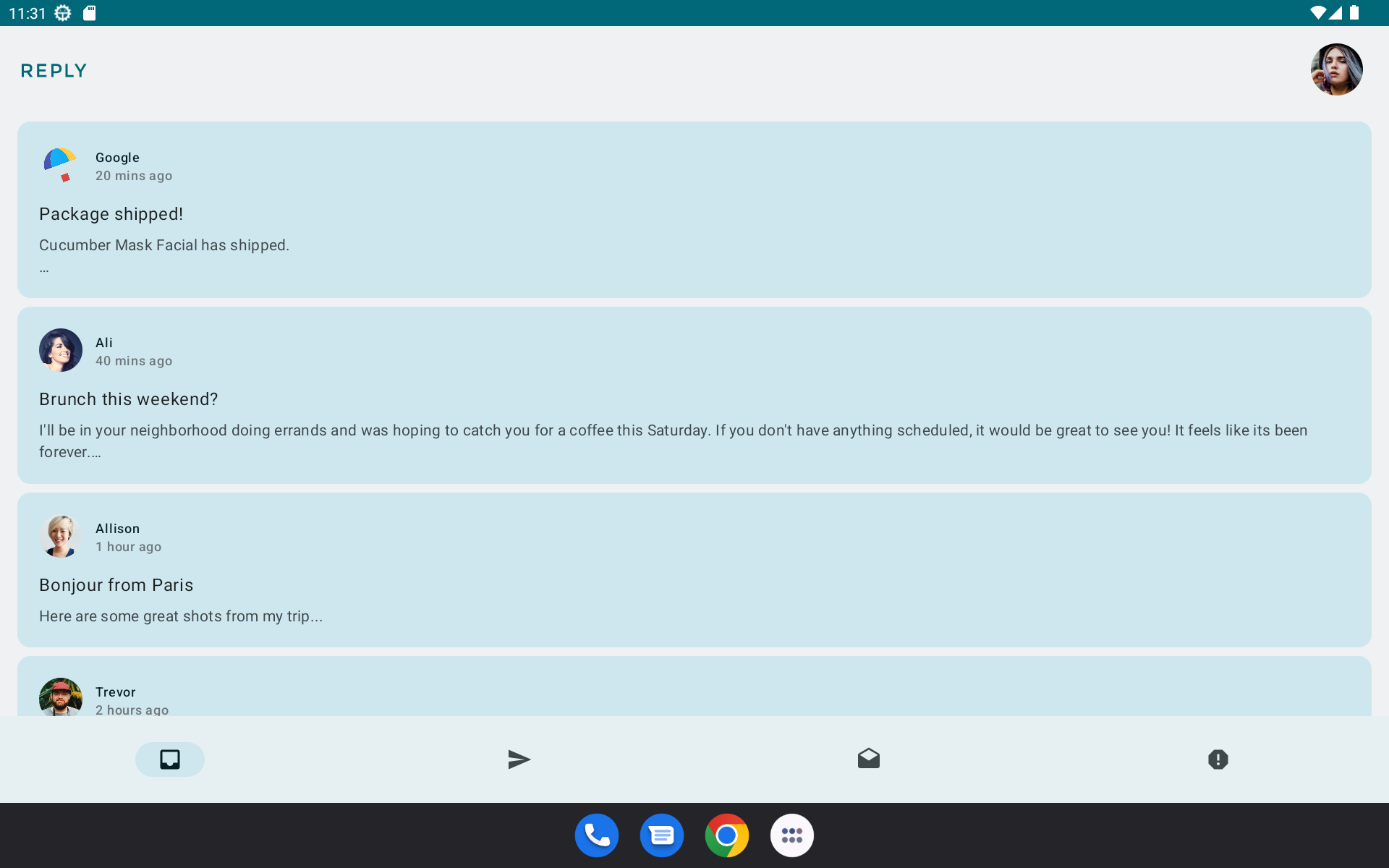
This makes the permanent navigation drawer appear for expanded screens:
Implement a navigation rail
Similar to the navigation drawer, the
navigationTypeparameter can be used to turn the navigation rail on/off.The code in
ReplyHomeScreen.kt➜ReplyAppContent():@Composable private fun ReplyAppContent( navigationType: ReplyNavigationType, // ... ) { Box(modifier = modifier) { Row(modifier = Modifier.fillMaxSize()) { // Navigation rail displayed only if navigationType == ReplyNavigationType.NAVIGATION_RAIL AnimatedVisibility(visible = navigationType == ReplyNavigationType.NAVIGATION_RAIL) { val navigationRailContentDescription = stringResource(R.string.navigation_rail) ReplyNavigationRail( currentTab = replyUiState.currentMailbox, onTabPressed = onTabPressed, navigationItemContentList = navigationItemContentList, modifier = Modifier.testTag(navigationRailContentDescription) ) } } } } @Composable private fun ReplyNavigationRail( currentTab: MailboxType, onTabPressed: ((MailboxType) -> Unit), navigationItemContentList: List<NavigationItemContent>, modifier: Modifier = Modifier ) { NavigationRail(modifier = modifier) { for (navItem in navigationItemContentList) { NavigationRailItem( selected = currentTab == navItem.mailboxType, onClick = { onTabPressed(navItem.mailboxType) }, icon = { Icon( imageVector = navItem.icon, contentDescription = navItem.text ) } ) } } }
The navigation rail appears:

Conclusion
Congratulations! You are one step closer to making the Reply app adaptive for all screen sizes by implementing an adaptive navigation layout. You enhanced the user experience using many Android form factors. In the next codelab, you’ll further improve your skills working with adaptive apps by implementing adaptive content layout, testing, and previews.